Checkbox
What Does This Widget Do?
The Checkbox widget allows you to select an option.
When Should I Use This Widget?
Use a Checkbox when:
• You want to give the experience user multiple choices.
• You want to give the experience user a checklist. For example, if there are several prerequisites that must be done before a service technician can service a machine, use checkboxes to ensure that the technician meets all requirements before they begin to service the machine.
• You want to present the user with a setting or property that they can enable or disable.
Are There Any Special Properties, Services, Events, or Actions?
To view a list of common widget properties, services, and events, see Common Widget Properties, Services, and Events.
|
Event
|
JavaScript
|
Description
|
|---|---|---|
|
Deselected
|
deselected
|
Triggered when the checkbox is deselected.
|
The Widget in Action
Here’s an example of what your widget might look like!
|
Minimum Steps Required for Use
|
What It Looks Like
|
|---|---|
|
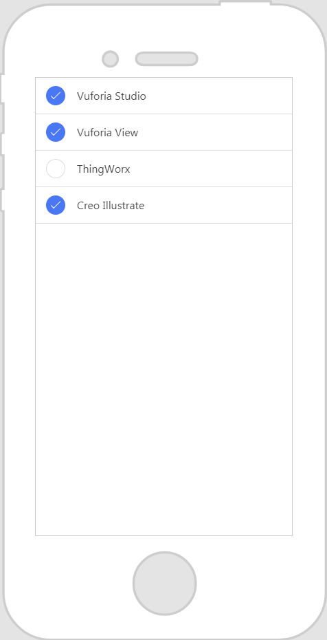
1. Drag and drop a Checkbox widget onto the canvas. For this example, we’ve added four checkboxes to the canvas.
2. Enter a label or the text you want displayed for the checkbox in the Label field. For this example, we’ve entered PTC product names.
|
 |
Style the Widget with CSS
You can use CSS to style the widget! The following is an example of a CSS class you could create and apply:
 |
Keep in mind that it’s best to give your classes unique names so they do not conflict with other classes or OOTB properties.
|
|
CSS Example
|
What It Looks Like
|
|---|---|
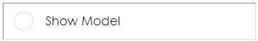
.ptc-checkbox {
|
 |
For more information on implementing CSS classes, see Application Styles.