Button
What Does This Widget Do?
A Button communicates an action that occurs when tapped in runtime.
When Should I Use This Widget?
Buttons allow the experience user to interact and navigate throughout the experience. Use the Button widget to clearly communicate to the user what action will occur once the button is tapped. You can style buttons using CSS or out-of-the-box themes. For more information on themes, see Themes
Are There Any Special Properties, Services, Events, or Actions?
This widget does not have any unique properties, services, or events.
To view a list of common widget properties, services, and events, see Common Widget Properties, Services, and Events.
The Widget in Action
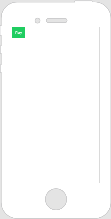
Here’s an example of what your widget might look like!
|
Minimum Steps Required for Use
|
What It Looks Like
|
||
|---|---|---|---|
|
1. Drag and drop a Button widget onto the canvas.
2. Enter the button name in the Text field. For example, Play.
3. Bind the Click event of the button to another widget and select the type of binding you want to create. For example, if you bind the Click event to a model, and select Play All on the Select Binding Target window, when the button is tapped in an experience, all steps in the sequence associated with the model will play.
|
|
Style the Widget with CSS
You can use CSS to style the widget! The following is an example of a CSS class you could create and apply:
 |
Keep in mind that it’s best to give your classes unique names so they do not conflict with other classes or OOTB properties.
|
|
CSS Example
|
What It Looks Like
|
|---|---|
.ptc-button {
|
 |
For more information on implementing CSS classes, see Application Styles.