|
Field Name
|
Description
|
Applies to Goal Types:
|
||
|
Model Status
|
The current state of the model. Can include Queued, Running, Completed, or Failed.
|
All
|
||
|
Model Result ID
|
An automatically generated identifier for the model results.
|
All
|
||
|
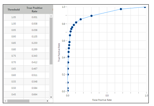
ROC
|
Represents the area under the ROC (Receiver Operating Characteristics) curve. This statistic indicates how well the model separates positives and negatives. It’s a measurement of the model's ability to correctly classify predictions as true or false across various discrimination thresholds. Displays when either a ROC curve or a confusion matrix graph is shown.
|
Boolean
|
||
|
Precision
|
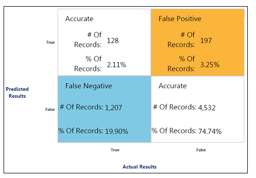
Represents the fraction of instances, classified as positive, that are actually positive. This statistic indicates the exactness or quality of the results. A model has maximum precision if all of its positive predictions are correct (even if some positives are missed). A model has poor precision if it incorrectly classifies many negatives as positive. Displays when either a ROC curve or a confusion matrix graph is shown.
Precision and Recall are often considered together to interpret the quality and completeness of prediction results. A model can exhibit high precision but low recall, if it classifies everything as negative. Conversely, a model can exhibit low precision but high recall, if it classifies everything as positive.
|
Boolean
|
||
|
Recall
|
Represents the fraction of all positive instances that are correctly classified as positive. This statistic indicates the completeness of the results, or the extent to which true positives are not missed. A model has maximum recall if it correctly classifies all of the positive instances (even if it also incorrectly classifies all of the negatives as positive). A model has poor recall if it misses many positives (even if it correctly classifies all the negatives). Displays when either a ROC curve or a confusion matrix graph is shown.
Recall is also known as Sensitivity or True Positive Rate (TPR).
|
Boolean
|
||
|
Specificity
|
Represents the fraction of all negative instances that are correctly classified as negative. This statistic indicates how well the model avoided incorrectly classifying negative instances as positive (false positives). A model has perfect specificity if it correctly classifies all negative instances as negative (even if it incorrectly classifies all of the positives as negative). A model has poor specificity if it incorrectly classifies most negatives as positives. Displays when either a ROC curve or a confusion matrix graph is shown.
Specificity is also known as True Negative Rate (TNR).
Sensitivity (Recall) and Specificity are often considered together to interpret how often the model detects the result it is looking for, and how often the model mistakes something else for the result it is looking for. A model can exhibit high sensitivity but low specificity, if it classifies everything as positive. Conversely, a model can exhibit low sensitivity but high specificity, if it classifies everything as negative.
|
Boolean
|
||
|
RMSE
|
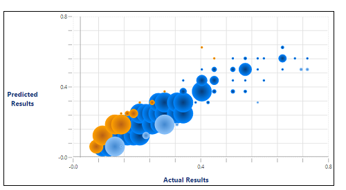
Root Mean Square Error is a measurement of the difference between values predicted by the model and the values actually observed. A low RMSE value is better than a high value. Displays when a bubble plot is shown.
|
Continuous
|
||
|
Pearson Correlation
|
A measure of the linear correlation (or dependence) between the predicted and actual results. Values can range between -1 (total negative correlation) and +1 (total positive correlation). A score of 0 shows no correlation at all. Displays when a bubble plot is shown.
|
Continuous
|
||
|
R-squared
|
Represents the fraction of variance in a goal (dependent variable) that is predicted by the independent variables in the model. This statistic indicates how well the model fits the data. The R-squared value will be 1 if all of the predictions were perfect. Displays when a bubble plot is shown.
|
Continuous
|
||
|
Adjusted R-squared
|
Similar to the R-squared value but adjusted to account for the number of variables included in the model. This calculation tries to account for the fact that R-squared accuracy increases whenever additional variables are added to the model, even if those variables are not relevant to predicting the goal. Adjusted R-squared can be useful for comparing models created with different numbers of variables. It allows selection of the model with the best fit, without unnecessary additional variables. Displays when a bubble plot is shown.
|
Continuous
|


 Highly over-predicted – Includes predicted results that are 75% above the actual value.
 Over-predicted – Includes predicted results that are 25 to 75% over the actual value.
 Accurate – Includes predicted results that are within 25% of the actual value.
 Under-predicted – Includes predicted results that are 25 to 75% below the actual value.
 Highly under-predicted – Includes predicted results that are 75% below the actual value.