示例:示例工具栏配置
创建数据服务
1. 在 Composer 中创建事物或事物模板,然后打开“服务”选项卡。
2. 单击“添加”,为工具栏新建一个服务。
3. 在“服务信息”下,键入服务的名称,然后单击“保存并继续”。
4. 在代码编辑器中,使用 ToolbarAction 数据形状定义一个新信息表。
或者,也可使用可用的代码片断:
a. 在左侧窗格中,展开“片段”。在“代码片段”下,展开 Infotable。
b. 选择用于创建信息表的 Create Infotable from datashape 代码片段。将打开一个对话框。
c. 在对话框中,选择 ToolbarAction 数据形状,然后单击“插入代码片段”。代码片段即会添加到代码编辑器中。
5. 定义工具栏操作,方法是使用数据形状为每个信息表字段添加具有值的行。用于定义行的语法如下所示:
<infotable_name>.AddRow(<Row_Object>);
6. 定义完服务后,单击“完成”。
7. 单击“保存”以保存对实体所做的更改。
 |
单击“执行”,预览从数据服务返回的输出。
|
创建操作信息表
以下数据服务显示了一个使用 ToolbarAction 数据形状创建工具栏的示例。
在第一部分中,使用 CreateInfoTableFromDataShape() 方法创建信息表:
var toolbarData = Resources["InfoTableFunctions"].CreateInfoTableFromDataShape(toolbarData);
然后使用可用于 ToolbarAction 数据形状中操作类型的选项来定义工具栏操作。可以使用 AddRows() 信息表方法以 JSON 对象的形式传递数据字段值。将信息表数据存储在名为 result 的变量中。以下服务定义了一个信息表,其中包含工具栏小组件的多个操作。
var toolbarData = {
infoTableName: "InfoTable",
dataShapeName : "ToolbarAction"
};
var toolbarData = Resources["InfoTableFunctions"].CreateInfoTableFromDataShape(toolbarData);
// Link Action
toolbarData.AddRow({
actionId: "L1",
actionType: "link",
actionLabel: "Link",
actionTooltip: "A link to an external resource.",
actionDisabled: false,
actionVisible: true,
linkDestination: 'https://www.ptc.com/',
linkType: "Primary",
actionMaxWidth: 100
});
// Toggle Button Action
toolbarData.AddRow({
actionId: "T1",
actionType: "toggle",
actionLabel: "Hide Header",
actionTooltip: "Hides the grid header row.",
actionDisabled: false,
actionVisible: true,
toggleChipIcon: true,
toggleState: false,
toggleLabelPosition: 'left',
actionMaxWidth: 160
});
// Dropdown Action
toolbarData.AddRow({
actionId: "DD2",
actionType: "dropdown",
actionLabel: "Row Height:",
actionTooltip: "Controls the height of the body rows.",
actionDisabled: false,
actionVisible: true,
dropdownLabelPosition: "left",
dropdownData: [{label:" Compact 32px", value: "32"}, {label:"Default 48px", value: "48"}, {label:"Tall 64px", value: "64"}],
dropdownSelectedText: "48",
actionMaxWidth: 220,
alignRight: true
});
// Button Action
toolbarData.AddRow({
actionId: "B1",
actionType: "button",
actionLabel: "Edit",
actionTooltip: "The tooltip for the Edit button.",
buttonIcon: "ResetIcon",
actionDisabled: true,
actionVisible: true,
buttonType: "transparent",
actionMaxWidth: 140,
alignRight: true,
});
// Button Action
toolbarData.AddRow({
actionId: "B2",
actionType: "button",
actionLabel: "Reset",
actionTooltip: "The tooltip for the Reset button.",
actionDisabled: false,
actionVisible: true,
buttonType: "transparent",
buttonIcon: "EditIcon",
actionMaxWidth: 140,
alignRight: true
});
result=toolbarData;
下图显示了执行数据服务后的信息表输出:
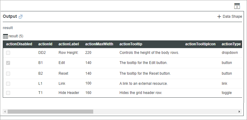
该信息表共有五行,可用于定义和配置五个操作。下图显示了运行时工具栏小组件上的操作。

这些操作会显示在工具栏上的不同区域,具体取决于它们在信息表中的顺序以及 alignRight 选项的值。可创建具有各种配置的工具栏,以为混搭中的小组件、服务或功能提供精简控制。例如,可在工具栏小组件和栅格小组件之间创建绑定,以在运行时配置和筛选栅格。