将自定义 CSS 样式应用于 Web 组件小组件
建议通过创建自定义样式主题或使用 Mashup Builder 的“样式属性”面板中提供的样式属性来设置组件小组件的样式。不建议将自定义 CSS 样式应用于 Web 组件小组件。有关详细信息,请参阅样式主题和使用样式属性面板。
将 CSS 应用于 Web 组件小组件时,应考虑以下指导原则:
• 如果 Web 组件的 DOM 结构在后续 ThingWorx 版本中发生了更改,则自定义 CSS 可能会失效。必须于升级后手动查看和更新自定义 CSS 规则。
• 与旧式小组件不同,Web 组件功能、行为和样式均封装在附加于主 DOM 的隐藏树中。该隐藏树名为 Shadow DOM。当对包含子组件的复杂小组件进行样式设置时,纯 CSS 可能不起作用。有关 Shadow DOM 概念的详细信息,请参阅文章使用 shadow DOM - Web 组件 | MDN (mozilla.org)。
• 要应用自定义 CSS,应熟练掌握 Web 组件结构,包括子组件、部件名称、可用状态和样式属性。有关 Web 组件及其样式属性、变型和状态的详细信息,请参阅文档 ThingWorx Web 组件 SDK。
• 要为通过 part 属性公开的子组件部件设置样式,请使用 CSS ::part() 伪选择器。
• 为支持 Shadow DOM 中的样式元素,大多数复杂的 Web 组件都支持将外部样式模块添加到组件中。这些样式模块可借助 CSS 选择器将组件的子部件及其所有状态选为目标。
• 并非所有浏览器均以相同方式支持 CSS 功能,因此用户在使用不同的浏览器时,样式的显示效果可能会有所不同。当纯 CSS 或阴影部分 CSS 语法不能正确应用于 Web 组件时,可添加 ptcs-style-unit。
使用纯 CSS
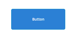
可使用纯 CSS 对附加 Shadow DOM 树的元素进行样式设置。以下为使用纯 CSS 将 ptcs-button 设置为大按钮样式的示例:
ptcs-button
{
color: #FAFAFA;
background-color: #2B80D5;
padding: 0px 60px;
font-size: 24px;
font-weight: bold;
height: 80px;
border-radius: 6px;
}
{
color: #FAFAFA;
background-color: #2B80D5;
padding: 0px 60px;
font-size: 24px;
font-weight: bold;
height: 80px;
border-radius: 6px;
}
预览
只能使用纯 CSS 为主 Web 组件设置样式,或指定可继承属性。当为包含多个子组件的组件设置样式时,此方法并不适用。以下各部分介绍了如何使用 Shadow DOM 中的 ptcs-style-unit 为子组件设置样式。
添加 ptcs-style-unit 元素
当纯 CSS 或阴影部分 CSS 不起作用时,可使用标准 @supports CSS 规则在 Web 组件内添加 ptcs-style-unit 元素。通过此元素可将 CSS 应用于 Shadow DOM 树内的子组件。使用 part 属性指定要在 Shadow DOM 层次结构内进行样式设置的元素。例如:
@supports (ptcs-style-unit: "PTCS-DATEPICKER") {
[part=date-field] {
background-color: red;
}
}
[part=date-field] {
background-color: red;
}
}
也可添加变型和状态选择器。以下各部分为使用 ptcs-style-unit 将自定义 CSS 应用于 Mashup Builder 内不同小组件的示例。
 | 可使用样式属性来实现以下部分样式。在条件允许时,建议使用样式属性,而非 CSS。 |
有关 ptcs-style-unit 和可用选择器的详细信息,请参阅 ptcs-style-unit - ThingWorx Web 组件 SDK。
示例:为按钮小组件设置样式
CSS | 说明 | 预览 |
|---|---|---|
@supports (ptcs-style-unit: "PTCS-BUTTON.primary") { :host { background-color: red !important; border-color: blue; border-width: 2px; } } | 将按钮的背景颜色设置为红色,并应用蓝色边界。 | 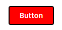 |
@supports (ptcs-style-unit: "PTCS-BUTTON.danger") { [part=label] { color: Blue; font-style: Italic; } } | 将按钮危险变型的标签颜色设置为蓝色,将字型设置为斜体。 | 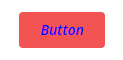 |
@supports (ptcs-style-unit: "PTCS-BUTTON.primary") { :host(:not([disabled]):hover) { border-color: red; border-width: 2px; } } | 悬停状态激活后,按钮周围将显示红色边界。 | 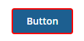 |
示例:为文本字段设置样式
CSS | 说明 | 预览 |
|---|---|---|
@supports (ptcs-style-unit: "PTCS-TEXTFIELD") { [part=clear-button] { color: red; } } | 将清除按钮的颜色设置为红色。 | 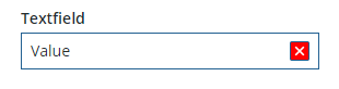 |
@supports (ptcs-style-unit: "PTCS-TEXTFIELD") { [part=text-box] { border-color: red; } } | 将文本框边界的颜色设置为红色。 | 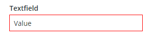 |
@supports (ptcs-style-unit: "PTCS-TEXTFIELD") { [part=counter] { color: red; } } | 将字符计数器的颜色设置为红色。 | 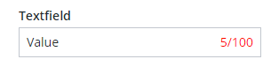 |
示例:为下拉小组件设置样式
CSS | 说明 | 预览 |
|---|---|---|
@supports (ptcs-style-unit: "PTCS-DROPDOWN") { [part=label] { color: red; } } | 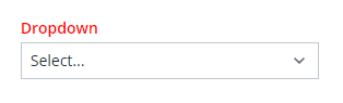 | |
@supports (ptcs-style-unit: "PTCS-DROPDOWN") { [part=icon] { color: red; } } | 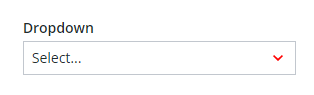 | |
@supports (ptcs-style-unit: "PTCS-DROPDOWN") { [part~=selected-item-value] { color: red; } } | 将选定项的值的颜色设置为红色。 | 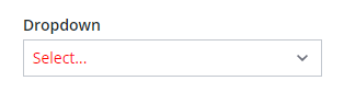 |
@supports (ptcs-style-unit: "PTCS-DROPDOWN") { [part=select-box] { background-color: red; border-color: blue; border-width: 2px; } } | 将下拉列表的背景颜色设置为红色,将边界设置为蓝色。 | 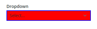 |
示例:为条形图设置样式
CSS | 说明 | 预览 |
|---|---|---|
@supports (ptcs-style-unit: "PTCS-CHART-AXIS") { [part=label] { color: red; } } | 将图表轴的颜色设置为红色。 | 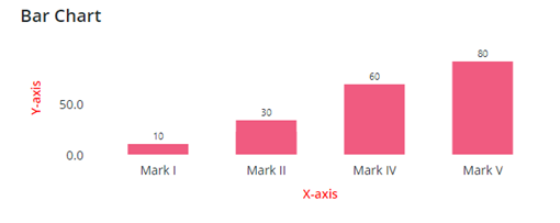 |
@supports (ptcs-style-unit: "PTCS-CHART-CORE-BAR") { [part=bar] { border-top-left-radius:15px; border-top-right-radius:15px; } } | 圆角化列的右上角和左上角。 | 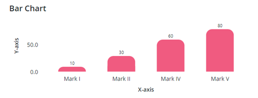 |
@supports (ptcs-style-unit: "PTCS-CHART-CORE-BAR") { [part=value] { color: red; font-style:bold; font-size:16px; } } | 设置列数据标签的颜色和字型。 | 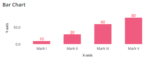 |