Wrapping Items in a Responsive Container
Limited container space can cause your Mashup layout to break when items overflow the container. Horizontal or vertical scroll bars appear, depending on the direction of items in your container. Use the Wrap option to fit items across new rows or columns, until there is no space left in the container. You can specify how to wrap lines horizontally and vertically from within the container as follows:
Horizontal
|
Command
|
Positioning
|
|---|---|
 |
From the start
|
 |
In the middle of the container
|
 |
At the end of the container
|
 |
Evenly from the start to the end
|
 |
With equal space before and after each line
|
Vertical
|
Command
|
Positioning
|
|---|---|
 |
At the start
|
 |
In the middle
|
 |
From the end of the container
|
 |
Evenly from the start of the container to the end of the container
|
 |
With equal space before and after each line
|
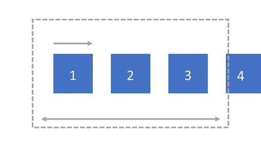
For example, the horizontal space in the following container is less than the width required to display all four of the unwrapped items. The fourth item overflows the available container width, and a scroll bar appears. Wrap items in the container to move the items to a new line when empty space is available.

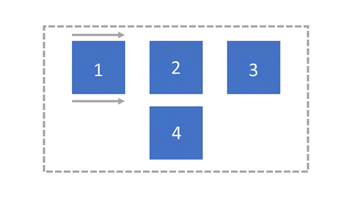
In the following container, the fourth item cannot fit the container on the horizontal axis, so it is moved to a new line as vertical space is available. The items are wrapped in the middle of the container.
