Creating Mashup Configuration Forms
Companioned configuration forms are enabled in the ThingWorx Composer. Users can associate a companioned configuration form to a mashup. This form is displayed when you click on the configuration icon  located in the Properties panel of the Contained Mashup widget, in the design mode. It is similar to the companioned configuration form of the Grid widget.
located in the Properties panel of the Contained Mashup widget, in the design mode. It is similar to the companioned configuration form of the Grid widget.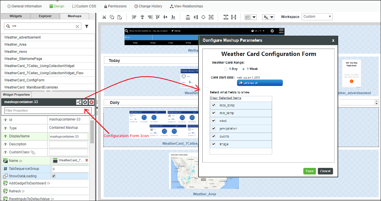
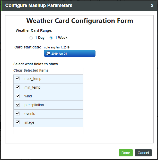
The example above displays a weather card, in which the form controls the content that is displayed in the card and the weather info range (One day weather info or the entire week). This kind of information can be configured easily by the form.
The form is a custom mashup, created as any other mashup. You can define the form that is being associated to a particular mashup.
Designing a companion configuration form to a mashup is useful when you want other users to use your mashup in Contained Mashup widget and likes to provide easy way to configure the mashup. This allows you to set different selections on the form that displays a different content of the contained mashup. By providing a companion configuration form with a mashup, the delivered mashup can be re-used in different ways and with multiple instances as desired by the users.
Associating a Configuration Form to a Mashup
The steps to associate a companioned configuration form to a mashup are as follows:
1. Create the mashup. (The one that is used in the Contained Mashup widget. For example, consider a Weather Card mashup.

2. Create the form.
a. Create another mashup that contains your form.
b. In the second mashup, create mashup parameters to each value that you want to expose in the contained Mashup (created in step 1). This impacts contained mashup display or content.

c. To keep the values in the form persistent when the user opens the form everytime, make sure that you have the binding in both directions; from the form parameters to the widgets/things in the form and vice versa.

3. Associate the form to the mashup.
a. Open the mashup created in step 1
b. Click the icon to open the Configure Mashup Parameters window.
to open the Configure Mashup Parameters window.c. On the Properties panel, use the ConfigurationMashup property to pick the form you created in step 2.
Once the form is associated to the mashup, all the form parameters are listed with other mashup binding parameters, and with a ConfigForm prefix.
You may need to refresh the mashup created in step 1 to see them in the Properties panel.

4. Bind the form parameters to the mashup widgets properties to get your desired impact. The binding is like any other binding between the parameters to any widgets or items that exist in the canvas.

The mashup is ready to use now. Every user who drags the mashup created in step 1 to the canvas, can open the associated form from the Contained Mashup widget by clicking on the configuration icon located in the Properties panel of the contained mashup.
located in the Properties panel of the contained mashup.Configuration Form Entity Example
An example is provided here that you can load to your Mashup Builder. The example contains 2 different Weather cards. One is a mashup that contains a collection widget. You can use its associated configuration form to configure whether the card should display 1-day weather info or entire week weather info (Example B in below picture). The other example is a simple mashup and displays only 1 day (Example A). Both mashups are using the same configuration form and in both you can identify the fields that you want to display on the card and the date range of the weather information.

The steps to use the example are:
1. Import the Mashups_WeatherCard_Example.xml in your ThingWorx Platform.
2. Open the CollectionExampleService Thing and Execute the InitWeatherTable service to fill the data for the example.

3. Open WeatherCard_MainBoardExamples mashup and you can see the names of the mashups for the 2 weather cards.
Click on the configuration icon in the property panel of the contained mashup widget to view the configuration forms of each contained mashup.
in the property panel of the contained mashup widget to view the configuration forms of each contained mashup.