Controlling the Grow and Shrink Ratio Distribution
|
|
This feature is only available in ThingWorx 9.0.4 and later.
|
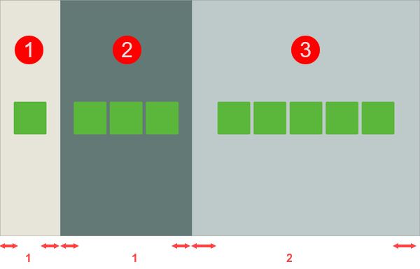
When you create mashup layouts with multiple containers on the same level, you can set Grow Ratio and Shrink Ratio values for each container. The ratio values are used to set the available space that is preserved for each container in the layout. There are two ways that you can apply ratio values to define a mashup layout. You can apply the ratios to the remaining empty space within the container, or to the full container size. By default, the ratios are applied to the remaining space around the widgets within the container. This method is more flexible, and you can use it to make use of the additional empty space in layout if required. Optionally, you can configure the ratio distribution to create layouts where the container ratio remains constant as the viewport dimensions change, without factoring the items within each container. For example, the following figure shows a mashup with three containers.

Each container displays a different number of items. The Grow Ratio of the first and second containers is set to 1 and the third container ratio is set to 2. By default, the space around widgets inside each container is calculated, and the grow and shrink ratios are applied to the remaining space. In this example, the full content of container 2 is displayed and it is larger than container 1, which has the same grow ratio and only one widget. The space around the widgets in container 3 is double the size of containers 1 and 2, as indicated by the red arrows.
To control how the ratios are distributed in a mashup layout, perform the following steps:
1. Select a container with one or more siblings on the canvas or using the Explorer panel.
2. On the Layout panel, under Advanced, select one of the following options:
◦  —Calculates the remaining space around widgets within a container and applies the ratios. This sets the flex-basis CSS property of the container to auto.
 —Calculates the remaining space around widgets within a container and applies the ratios. This sets the flex-basis CSS property of the container to auto.
◦  —Applies the ratios to the full size of the container. This sets the flex-basis CSS property of the container to 0.
 —Applies the ratios to the full size of the container. This sets the flex-basis CSS property of the container to 0.
3. Repeat Step 2 for each additional container on the same level in the layout.
4. Click Save to save your changes to the mashup.
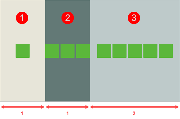
The grow and shrink ratios are applied to the full size of each container in a layout. The following figure shows the mashup example with the same grow and shrink ratios, with the flex-basis property set to 0.

The ratios are applied to the entire width of each container, and in this example, the empty space in the layout is used less efficiently. Container 3 uses half of the available space in the layout. Each one of the two remaining containers uses one fourth of the available space. Item dimensions within each container are ignored, and containers 1 and 2 have the same size despite the different number of widgets within each. The widgets of container 2 are partially displayed, as the defined ratio of 1 is not wide enough to display all the widgets on the current viewport.