Configuring the Collection Widget
Selecting a Layout for the Collection
You can configure the widget layout using the Layout property.
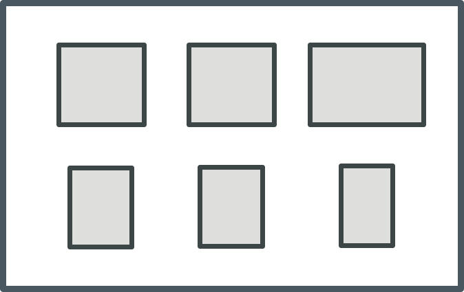
Flex—A responsive layout based on Flexbox layout rules. This mode places as many cells that can fit into the available space for each row. Cells automatically wrap onto a new row when the available space becomes limited. Each cell expands to fill the available space in a row or shrinks until the minimum space required to display the cell content is reached. When this limit is reached, the cell wraps onto a new line. To control the horizontal alignment of cells in the last row, use the AlignLastRow property.
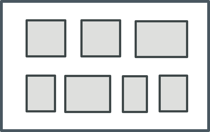
Grid—A responsive layout that displays the collection as a gird with cells organized as rows and columns. This mode fits the same number of cells in each row in the collection, based on the available space and the cell width. When a row cannot be displayed in the available width for the row, the last cell is wrapped onto a new line and the number of columns in the layout is reduced by one. The column width is set to fit the widest cell in the column and the row height is set to fit the highest cell in the row.
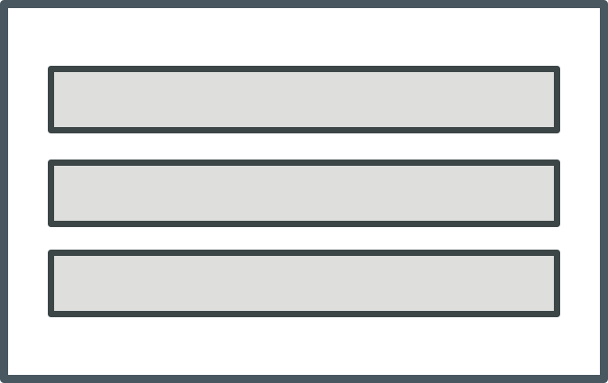
Table—Displays the collection cells as a single column.
You can control how cells are aligned within a row or a column using the VerticalAlignment and HorizontalAlignment properties. By default, the horizontal alignment within rows set to distribute the cells with equal spacing between the cells. You can control the space between the cells using the ColumnGap and RowGap properties. To control the alignment of the last row in the collection in a grid layout, use the LeftAlignLastRow. To make all rows in the collection the same height, set the UniformHeight property to true. The row height is increased to match the highest row in the collection.
 |
You can combine different layouts by nesting Collection widgets. For example, you can create a top-level collection where the layout is set to Table and a contained collection where the layout is set to Flex.
|
Grouping Collection Rows into Sections
You can group the collection rows into sections with headers or footers that contain titles and labels that visually separate groups or categories within a collection. This enables you to organize and label parts of the collection, making it easier for users to navigate and read the data. To group cells in a Collection widget, you must specify a column with a category identifier for related cells in the collection infotable. To group collection rows, perform the following steps:
1. In the collection data source, add a column that contains a category identifier. This column should contain values that represent the categories or groups you want to create within the collection.
2. Create two mashups to use as a template for the section headers and footers. These mashups can include labels, images, or other UI elements that you want to within the headers and footers.
3. Configure the Collection widget properties on the Properties panel.
◦ Next to the SectionField property, select the name of the column that contains the category data.
◦ Set the SectionHeaders and SectionFooters properties to Visible or Pinned. When pinned, headers and footers are fixed to the top and bottom of the viewport as scrolling a section.
◦ Next to the HeaderMashup and FooterMashup properties, select the mashup that you created in step 2.
◦ To sort the collection, you can use the SortField property.
◦ To set the header and footer heights, specify a numeric value in the HeaderHeight and FooterHeight properties.
◦ Optionally, if you want to pass dynamic content to the headers or footers, use the HeaderSectionParam and FooterSectionParam properties to bind column names from the data source to mashup parameters.
4. Save the mashup.
At runtime, the cells are grouped based on the infotable column that you selected for the SectionField property.
Configuring the Space between and Around the Collection Cells
To configure the space between cells in the collection, use the ColumnGap and RowGap properties.
To configure the space between the cell collection and the widget border, use the PaddingRight, PaddingLeft, PaddingTop, and PaddingBottom properties.
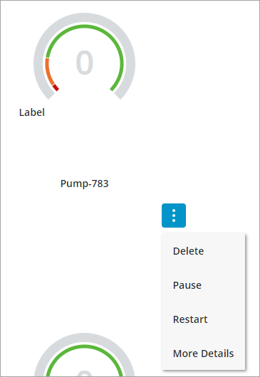
Adding a Menu Button to the Collection Cells
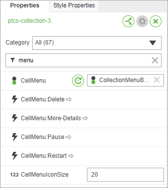
You can display a menu button under each cell in the collection by adding a state definition to the widget CellMenu property. The menu button allows users to perform a number of actions specific to each item in the collection. For examples, you can define menu items that allow users to edit, delete, or view more details about the cell. To add a menu button to the collection, perform the following steps.
1. In Composer, create a state definition that defines each menu item that you want to display for the collection cells.
|
|
Applying font or background colors and styles to each menu items using a style definition is not supported. Only icons are supported.
|
2. In Mashup Builder, select the Collection widget on the canvas or using the Explorer panel.
3. On the Properties panel, specify the state definition that you created for the CellMenu property.
An event is added for each menu item that you defined in the state definition using the following format: CellMenu:<MenuItem>
4. Bind the events for each menu item to a service, function, or widget to trigger an action when the menu item is clicked.
5. Click Save, then view the mashup.
At runtime, a menu button is added under each cell and menu items are displayed based on the selected state definition entity.