Collection Widget (Themeable)
The Collection widget is a responsive widget that enables you to display a series of repeated mashups as cells within a collection. You can configure advanced layouts and group cells to make it easier for users to display the collection on various screen sizes. To display data within the collection cells, you must define an infotable with data for the mashup cells. You can also configure the data loading behavior to optimize performance when loading large data sets.
 |
This widget is also available as a Web Component in the Web Component SDK.
|
Best Practices
Avoid executing services within each collection mashup cell. Executing multiple services repeatedly for each cell in a collection requires a significant number of network requests. Any services within the collection mashup are executed repeatedly when the parent mashup is initialized, which may cause significant performance issues as each cell loads. To prevent performance issues, execute data services on the parent mashup, and then pass the data to the contained mashups using mashup parameters and the MashupPropertyBinding property. For more information about working with parameters, see Configuring Mashup Parameters.
Click Event Behavior within Cells
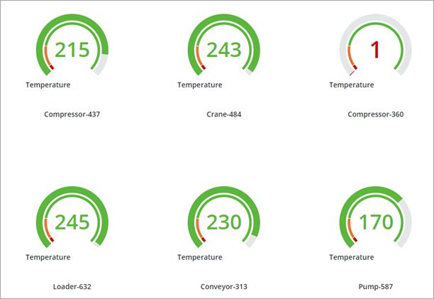
The collection cells can show multiple interactive and non-interactive widgets. When a cell contains an interactive widget that is clicked, an event handler checks if the widget has a bound Clicked event. When the event is bound, the widget click event is triggered. When the event is not bound, the widget is considered non-interactive, and the cell is selected instead. For example, the Collection can show a KPI Dial widget that has an optional Clicked event. When the event is bound, the event handler registers the event and the bound service or function is executed. When the event is not bound, the collection cell is selected.
Properties
|
Property Name
|
Description
|
Base Type
|
Default Value
|
Bindable
|
Localizable (Y/N)
|
||
|---|---|---|---|---|---|---|---|
|
Data
|
The infotable data source for the Collection widget.
|
INFOTABLE
|
Y
|
N
|
|||
|
ItemLoadBehavior
|
Controls the loading behavior of the collection data. You can load and unload data while users are scrolling, load data progressively on demand, or load the full data set initially.
|
STRING
|
Load/Unload
|
N
|
N
|
||
|
Layout
|
Specifies the type of layout to use for the collection cells. Options: Flex, Grid, Table.
|
STRING
|
Flex
|
Y
|
N
|
||
|
Mashup
|
The mashup to use to display the collection data.
|
MASHUPNAME
|
Y
|
N
|
|||
|
Width
|
Sets the widget width.
|
NUMBER
|
400
|
N
|
N
|
||
|
Height
|
Sets the widget height.
|
NUMBER
|
300
|
N
|
N
|
||
|
MashupHeight
|
Sets the height of the collection mashup.
|
NUMBER
|
Y
|
N
|
|||
|
MashupWidth
|
Sets the width of the collection mashup.
|
NUMBER
|
Y
|
N
|
|||
|
MashupWidthField
|
Specifies the infotable field to define the cell width using a service. Values override MashupHeight.
|
Infotable column
|
N
|
N
|
|||
|
MashupHeightField
|
Specifies the infotable field to define the cell height using a service. Values override MashupHeight.
|
Infotable column
|
N
|
N
|
|||
|
UIDField
|
Required. Specifies the infotable field with the unique identifier for each cell.
|
Infotable column
|
N
|
N
|
|||
|
LastRowAlignment
|
Controls the alignment of cells within the last row in the collection. Options: Default, Space evenly, Space between, Left, Center, Right, Stretch
|
STRING
|
Default
|
N
|
N
|
||
|
HorizontalAlignment
|
Controls the horizontal alignment of cells within the collection rows. Options: Space evenly,Space between, Left, Center, Right, Stretch
|
STRING
|
Space evenly
|
N
|
N
|
||
|
VerticalAlignment
|
Controls the vertical alignment of cells within the collection rows. Options: Top, Center, Stretch, Bottom
|
STRING
|
Center
|
N
|
N
|
||
|
UniformRowHeight
|
Displays rows using the same height.
|
BOOLEAN
|
False
|
N
|
N
|
||
|
RowGap
|
Sets the spacing between the collection rows.
|
NUMBER
|
40
|
N
|
N
|
||
|
ColumnGap
|
Sets the spacing between the collection columns.
|
NUMBER
|
40
|
N
|
N
|
||
|
SectionGap
|
Sets the spacing between the collection sections.
|
NUMBER
|
48
|
N
|
N
|
||
|
TopPadding
|
Sets the padding between the top margin of the collection and the first cell.
|
NUMBER
|
24
|
N
|
N
|
||
|
BottomPadding
|
Sets the padding between the bottom margin of the collection and the last cell.
|
NUMBER
|
24
|
N
|
N
|
||
|
RightPadding
|
Sets the padding between the right border of the widget and the cell collection.
|
NUMBER
|
24
|
N
|
N
|
||
|
LeftPadding
|
Sets the padding between the left border of the widget and the cell collection.
|
NUMBER
|
0
|
N
|
N
|
||
|
MashupBackground
|
Controls the background of the collection mashup and all of its containers. When the mashup background is transparent, styles that are applied to the cell background are visible. Options: Transparent, Visible
|
STRING
|
Visible
|
N
|
N
|
||
|
MashupNameField
|
Enables you to specify an infotable field to provide the mashup name using a data service. This property overrides the Mashup property.
|
Infotable column
|
N
|
N
|
|||
|
MashupPropertyBinding
|
A serialized JSON object that has infotable fields as its keys and mashup parameters as values. For example:
{
|
JSON
|
N
|
N
|
|||
|
MashupGlobalPropertyBinding
|
A serialized JSON object that has global parameter names as its keys and data types as values. You can bind these properties to the collection widget and send values to each cell mashup.
{
|
JSON
|
N
|
N
|
|||
|
SelectedCellMashupField
|
Enables you to specify an infotable field to set the selected state of each cell in the collection.
|
Infotable column
|
N
|
N
|
|||
|
UseMashupDimensions
|
Matches the cell size to the mashup dimensions.
|
BOOLEAN
|
False
|
N
|
N
|
||
|
SelectionMode
|
Enables you to control the number of cells users can select at runtime. Options: None, Single, Multiple
|
STRING
|
None
|
N
|
N
|
||
|
HasSelectedCells
|
Returns True when the widget has selected cells.
|
BOOLEAN
|
False
|
Y
|
N
|
||
|
SelectedCellsCount
|
Returns the number of selected cells in the collection.
|
NUMBER
|
0
|
N
|
N
|
||
|
ScrollToSelectedCell
|
Scrolls automatically to cells when they are selected.
|
BOOLEAN
|
False
|
N
|
N
|
||
|
AutoSelectFirstRow
|
Enables you to automatically select the first row when data is loaded into the collection.
|
BOOLEAN
|
False
|
N
|
N
|
||
|
SelectedCells
|
Specifies the collection cells to select using an infotable.
|
INFOTABLE
|
Y
|
N
|
|||
|
SelectedCellMashup
|
Specifies an alternative mashup to display for selected cells in the collection. This mashup must include the same properties as the default mashup.
|
Mashup Picker
|
Y
|
N
|
|||
|
HandleSelectionUpdates
|
When enabled, the widget sends and receives selection updates to and from its data service.
|
BOOLEAN
|
True
|
N
|
N
|
||
|
CellMenu
|
Specifies the state definition used to define the cell menu that appears when sliding over the cells on touch devices. On devices without a touch interface, this menu is displayed by right-clicking on the cells.
|
STATEDEFINITION
|
N
|
N
|
|||
|
CellMenuIconSize
|
Specifies the size of icons within the cell menu.
|
NUMBER
|
20
|
N
|
N
|
||
|
CellTabKeyScope
|
Controls the scope of navigation when interacting with the contents of a cell using the keyboard. Options: Cell, Collection, Item Only. When the scope is set to cell, pressing the TAB key loops over elements inside the cell. When the scope is set to collection, pressing the TAB key returns the focus to the cell after the last element is selected. Select Items Only to focus only on cell contents and skip the cell itself when navigating between cells.
|
STRING
|
Cell
|
N
|
N
|
||
|
CellUnloadDelay
|
Specifies the time delay, in seconds, before unloading collection cells from the DOM when they are out of view. This property applies only when ItemLoadBehavior is set to Load On Demand.
|
NUMBER
|
N/A
|
N
|
N
|
||
|
CellPointer
|
Controls the style of the mouse pointer when hovering on a cell in the collection. Options: auto, pointer, default
|
STRING
|
Auto
|
N
|
N
|
||
|
SectionField
|
Specifies the infotable field with identifier values that you can use to group cells within sections.
|
INFOTABLE
|
N
|
N
|
|||
|
SectionInsetLeft
|
Sets the left inset value of sections when grouping cells.
|
NUMBER
|
0
|
N
|
N
|
||
|
SectionInsetTop
|
Sets the top inset value of sections when grouping cells.
|
NUMBER
|
0
|
N
|
N
|
||
|
SectionInsetRight
|
Sets the right inset value of sections when grouping cells.
|
NUMBER
|
0
|
N
|
N
|
||
|
SectionInsetBottom
|
Sets the bottom inset value of sections when grouping cells.
|
NUMBER
|
0
|
N
|
N
|
||
|
SortField
|
Specifies the infotable field by which section contents are sorted. The sorting is performed client-side and does not affect the source infotable or other widgets bound to the data set.
|
INFOTABLE
|
Y
|
N
|
|||
|
SortAscending
|
Sorts section content in an ascending order when the SortField property is enabled. By default, sections are sorted in a descending order.
|
BOOLEAN
|
False
|
Y
|
N
|
||
|
SectionHeaders
|
Controls the visibility of section headers when grouping cells in the collection. Options: None, Visible, Pinned
|
STRING
|
None
|
N
|
N
|
||
|
HeaderMashup
|
Specifies the mashup to use for the section headers when grouping cells in the collection.
|
MASHUPNAME
|
None
|
N
|
N
|
||
|
HeaderSectionParam
|
The name of the header mashup parameter that will receive the section identifier.
|
STRING
|
N
|
N
|
|||
|
HeaderHeight
|
Sets the height of the section headers in the collection.
|
NUMBER
|
40
|
N
|
N
|
||
|
SectionFooters
|
Controls the visibility of section footers when grouping cells in the collection. Options: None, Visible, Pinned
|
STRING
|
None
|
N
|
N
|
||
|
FooterMashup
|
Specifies the mashup to use for the section footer when grouping cells in the collection.
|
MASHUPNAME
|
N
|
N
|
|||
|
FooterSectionParam
|
The name of the footer mashup parameter that will receive the section identifier.
|
STRING
|
N
|
N
|
|||
|
FooterHeight
|
Sets the height of the section footers when grouping cells in the collection.
|
NUMBER
|
40
|
N
|
N
|
||
|
EmptyMashup
|
Specifies the mashup to display when a cell in the collection does not contain any data.
|
MASHUPNAME
|
None
|
N
|
N
|
||
|
Deselect
|
A bindable service that clears any selection in the collection.
|
Service
|
Y
|
N
|
|||
|
SelectAll
|
A bindable service that selects all cells in the collection.
|
Service
|
Y
|
N
|
|||
|
DisableWrapping
|
When enabled, displays cells in one row with a horizontal scroll bar. When disabled, cells wrap onto a new row when the available horizontal space is not enough to display full collection. This property is only supported when the collection is configured using the Flex layout mode.
|
BOOLEAN
|
False
|
N
|
N
|
Events
|
Property Name
|
Description
|
Base Type
|
Bindable
|
Localizable (Y/N)
|
|---|---|---|---|---|
|
CellClicked
|
An event that triggers when a user clicks or taps on a cell in the collection.
|
Event
|
Y
|
N
|
|
CellDoubleClicked
|
An event that triggers when a user double-clicks or double-taps on a cell in the collection.
|
Event
|
Y
|
N
|
|
CellLongClicked
|
An event that triggers when a user clicks and holds or taps and holds on a cell in the collection for longer than 400 milliseconds.
|
Event
|
Y
|
N
|
|
CellRightClicked
|
An event that triggers when a user right-clicks on a cell in the collection.
|
Event
|
Y
|
N
|