Using the Shrink and Grow Ratio Properties
A responsive mashup enables you to define the grow and shrink ratios when your mashup contains multiple containers. These settings are based on the CSS Flexible Box Layout module (flexbox).
By default, the ratios are applied to the remaining space around widgets in the container. You can use the Ratio Distribution property to apply the ratio values to the full container width. For more information about the option, see Controlling the Grow and Shrink Ratio Distribution.
Grow Ratio
Use the Grow Ratio property to define the relationship between containers when extra space becomes available. Responsive containers can grow to fit the available space at different rates, depending on the browser size. You can control the ration between two or more containers in a mashup by assigning a grow ratio to each container.
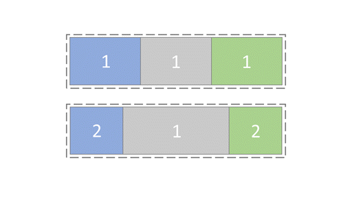
If you assign each container a value of 1, then the available space is equally shared between every container at run time. The containers stretch to fill the available space in the browser window.

Shrink Ratio
The Shrink Ratio property enables you to define the ratio between responsive containers when the available space becomes limited. By default, containers shrink in equal proportions as the available space gets smaller. Each container has a shrink ratio of 1, and the available space is shared equally between containers at run time.

When you assign the side containers a shrink ratio of 2, they shrink at twice the rate of the middle container in the mashup.