Responsive Mashups
The responsive mashup enables you to arrange items within a container using advanced layout settings. These settings are based on the Flexible Box Layout module (flexbox) for Cascading Styling Sheets (CSS).
Using Flexbox-based containers, you can perform the following:
• Align items vertically or horizontally in a container
• Stretch or wrap items in a container, depending on the available space
• Set fixed container height or width
• Define flexbox grow and shrink ratios when you have more than one container in a mashup
• Use custom CSS rules to position items
• Customize the look and feel of containers using the Style Properties panel
You can use containers as rows and columns to structure your mashup layouts. Items in a container expand or shrink, depending on the available space. When creating a mashup, you can use the Layout panel to control options such as orientation, alignment, stretching, and wrapping for items in a container. You can define specific layout rules for each container in your mashup.
Creating a Responsive Mashup
1. From Composer, click > . The New Mashup window opens.
2. Select Responsive, and then click OK.
3. Enter a name for the mashup, and then click Save.
Adding Containers to a Mashup
By default, blank responsive mashups have one container. To add more containers to a mashup, do the following:
1. Select a container on the mashup.
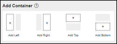
2. On the Layout panel, under the Add Container section, select an option to add a container to the left, right, top of, or below the selected container.

3. Repeat steps 1 and 2 to add containers to the mashup as required.
You can choose how styles are applied to new containers in the mashup under the Style Inheritance option:
◦ Default—Applies styles based on the selected mashup style theme.
◦ Merge—Applies the styling of the current container to the parent container in the new layout.
◦ Duplicate—Duplicates the style properties of the selected container.
4. Click Save.
Adding Items to a Container
After you create the mashup layout, you can start adding items to containers. Items are sorted in the order in which they are added. To add an item, drag the item from the Widgets panel onto any container in your mashup.
You can add responsive and non-responsive widgets to the same container. Responsive widgets fill all of the available space inside an empty container. When you add a non-responsive widget, the responsive widget is set to a default size. You can use the Layout panel to control the alignment of the items within the container. For more information about arranging items, see Arranging Items in a Responsive Container.
Using Static Positioning
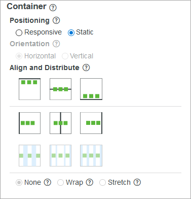
When positioning is set to Responsive, widgets are arranged according to the container layout rules. When positioning is set to Static, the responsive layout rules are disabled, and you can position widgets anywhere within the container. To position a widget, click and drag it manually, or use the available alignment commands for static layouts.

Customizing the Container Size
You can control the size of each container within a mashup using one of the following options:
• Responsive—Makes the container responsive.
• Fixed Size—Specifies a fixed size for the container.
• Size Range—Sets the container size according to a defined range of minimum and maximum values.