Menu Button Widget (Themed)
The Menu Button widget shows a button that opens a menu with a list of items that you can define using infotable data.. You can bind the selected item data or the clicked events of each menu item, depending on the menu configuration. Use this widget when the available space in a layout is limited and you want to hide options that are not used frequently. You can create multiple levels of navigation to group menu items under a common label.
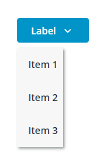
Standard Menu Button

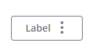
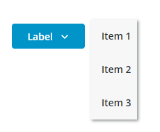
Menu Button with a label
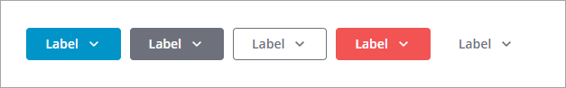
The following image shows the available variants for the menu button from left to right. You can use the ButtonType property to set the button variant to Primary, Secondary, Tertiary, Danger, or Transparent. By default, the button is displayed using a Tertiary style.
Anatomy
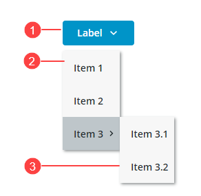
1. Menu button
2. Menu
3. Second level menu
Choosing Layout Direction
You can open the menu using a horizontal or a vertical direction using the MenuDirection property.
Vertical (Default)—Opens the menu under the button. Use this mode to reduce the amount of horizontal space that is required to display the button. For example, when the button is displayed in a toolbar.
Horizontal—Opens the menu to the side of the button. Use this mode when the button is displayed in a side panel.
Data Format
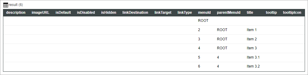
You can create infotable data for the widget using the MenuEntry Data Shape. For more information, see Using the MenuEntry Data Shape.
The following image shows an infotable result that displays a simple menu using the MenuEntry Data Shape.
 |
The first row of the infotable is used as a root and is not displayed as a menu item. You must define top-level menu items with a parentMenuId that matches the menuId of the root.
|
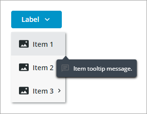
Adding Custom Tooltips to Menu Items
You can show tooltips for each menu item by adding the tooltip and tooltipIcon columns in the infotable data. The following image shows a custom tooltip for a menu item.
Configuring Menu Data Using an Infotable
1. In Composer, create a service that returns infotable data that is defined using the MenuEntry data shape. For more information, see Menu Bar Widget.
2. In Mashup Builder, add the menu service using the Data panel.
3. Bind the All Data property of the service infotable to the Data property of the Menu Button widget.
4. Click Save to save your changes to the mashup.
Alternatively, you can manually define the infotable data without using a service using the Infotable configuration dialog in Mashup Builder.
1. In Mashup Builder, select the Menu Button widget.
2. On the Properties panel, next to the Data property, click Add. A dialog opens where you can add rows to define infotable data for the widget.
3. Click Add, then define the row data for the menu item.
4. Click Add to add the row to the infotable.
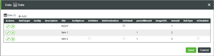
5. Click Save to save the infotable data.
The menu items that are defined in the infotable are displayed at runtime.
Configuring Menu Items using Widget Properties
By default, the widget is configured to use infotable data to define menu items. You can use the SelectedDataChanged event and the SelectedData property of the service to pass the selected item to another service. To configure menu items using widget properties instead, use the ItemConfigurationMode property. When you set this property to Widget Properties, a Clicked event and properties that enable you to configure the visibility and the disabled state for each menu item are added to the Properties panel. You can bind these properties to control the state of individual menu items dynamically based on specific events in the mashup. This allows you to customize menu interactions, making it easier to manage the visibility and functionality of each menu item.
1. In Mashup Builder, bind an infotable data source with data to define the menu ids and the labels.
2. Select the Menu Button widget, then on the Properties panel, set the ItemConfigurationMode to Widget Properties.
3. Configure or bind the following properties for each menu item:
◦ <Item_Name>_Clicked—An event that triggers when the menu item is clicked.
◦ <Item_Name>_Disabled—Disables the menu item.
◦ <Item_Name>_Visible—Hides the menu item.
4. Click Save.
Styling the Menu Button
You can style the Menu Button widget in the following ways:
• On a widget level using the available style properties on the Style Properties panel.
You can modify the button and the menu styles in any state, such as Disabled or Hover.
• On a style theme level under > .
For more information about customizing style themes, see Customizing Style Themes Using the Styles Tab.
Widget Properties
|
Property Name
|
Description
|
Base Type
|
Default Value
|
Bindable (<-, ->)
|
Localizable (Y/N)
|
|---|---|---|---|---|---|
|
Data
|
Bind an infotable to define the menu items . You must format the infotable using the MenuEntry data shape
|
INFOTABLE
|
Y
|
N
|
|
|
SelectedData
|
An infotable that contains the data for the last selected menu item.
|
INFOTABLE
|
Y
|
N
|
|
|
SelectedDataChanged
|
An event that triggers when a menu item is selected.
|
Event
|
Y
|
N
|
|
|
MenuOffset
|
The space between the button and the menu when the menu is open.
|
NUMBER
|
8
|
N
|
N
|
|
ButtonType
|
Set the button type for the menu button. Each type has different styling. Options: Primary, Secondary Tertiary, Danger, Transparent
|
STRING
|
Tertiary
|
Y
|
N
|
|
TooltipField
|
Displays a tooltip text when you hover over the menu button widget.
|
STRING
|
Y
|
Y
|
|
|
TooltipIcon
|
Sets an icon image for the tooltip of the menu button widget.
|
MEDIA
|
N
|
N
|
|
|
Disabled
|
Disables the menu button
|
BOOLEAN
|
False
|
Y
|
N
|
|
SVGIcon
|
Select an SVG icon to display within the menu button widget. To display a media entity, use the Icon property.
|
MEDIALINK
|
N
|
N
|
|
|
ButtonIcon
|
Select an icon image to display within the menu button widget. This property overrides the SVGIcon property.
|
MEDIA
|
N
|
N
|
|
|
ButtonIconPosition
|
Set the icon position to the left or to the right side of the button label. Options: Left, Right
|
STRING
|
Right
|
N
|
N
|
|
ButtonClicked
|
An event that triggers when the button is clicked and no menu items are defined for the widget.
|
Event
|
Y
|
N
|
|
|
ButtonMaxWidth
|
Set a maximum width for the button.
|
NUMBER
|
N
|
N
|
|
|
ButtonLabelAlignment
|
Aligns the button label to the left, right or center. Options: Left, Right, Center
|
STRING
|
Center
|
N
|
N
|
|
ButtonLabel
|
Specifies the text of the button label.
|
STRING
|
Y
|
Y
|
|
|
ButtonSize
|
Sets the size of the button. Options: Standard, Medium, Large, X-Large, Fill
|
STRING
|
Standard
|
N
|
N
|
|
DisplayMenuIcons
|
When false, icons for menu items are hidden.
|
BOOLEAN
|
False
|
N
|
N
|
|
AllowMissingIcons
|
When false and DisplayMenuIcons is true, a default icon is displayed next to menu items without a specified icon in the infotable data.
|
BOOLEAN
|
False
|
N
|
N
|
|
MenuMinWidth
|
Set the minimum width that menus and submenus can be reduced to, in pixels. When empty, the menu width is set to fit its widest item.
|
Number
|
N
|
N
|
|
|
MenuMaxWidth
|
Set the maximum width that menus and submenus can expand to, in pixels. When empty, the menu width is set to fit its widest item.
|
Number
|
N
|
N
|
|
|
MenuMaxItems
|
Setsthe maximum number of visible items in the menu and its submenus. When the data contains more items than the maximum, items are hidden under a submenu with a More label.
|
Number
|
5
|
Y
|
N
|
|
MenuDirection
|
Sets the direction that the menu opens relative to the button. Options: Vertical Horizontal
|
STRING
|
Vertical
|
Y
|
N
|
|
ItemConfigurationMode
|
Infotable Data mode – Configure the visibility and state of each menu item using infotable data. You can use the SelectedDataChanged event and the SelectedData property of the service to pass the selected item to another service.
Widget Properties mode – Configure the visibility and state of each menu item manually using widget properties or dynamically using bindings. You must bind the Clicked event of menu items to pass the SelectedData property to another service. Options: Infotable Data, Widget Properties
|
STRING
|
Infotable Data
|
Y
|
N
|
|
<Item_Name>_Clicked
|
An event that triggers when the menu item is clicked.
|
Event
|
Y
|
N
|
|
|
<Item_Name>_Disabled
|
Disables the menu item.
|
BOOLEAN
|
True
|
Y
|
N
|
|
<Item_Name>_Visible
|
Controls the visibility of the menu item.
|
BOOLEAN
|
True
|
Y
|
N
|