Menu Bar Widget (Themable)
 |
This widget is a web component that is available as a preview. It includes a subset of features from the current Menu widget. Additional features and migration support will be added in future releases.
|
Use the Menu Bar widget to create a navigation layout for solutions that contains multiple mashups or pages. The widget displays navigation links as a list of items that a user can choose from. You can configure each item on the widget to navigate users to a mashup, web page, or submenu. The widget is permanently displayed on the left side of the top-level container in a layout. You can use the widget to create menus with single level or multiple levels of navigation. You can define menu items by creating menu entities in Composer, or by writing data services that generate data-driven menus. This lets you build more complex mashups with different views across multiple pages.
Watch the following video on how to define the menu items and use the widget to replace a contained mashup. To open the video in a new tab, click the title on the player.
In addition to the Mashup Builder widget, the Menu Bar includes the following components:
• The MenuEntry Data Shape. This is used to define the infotable for the menu bar configuration in a data service.
• A Mashup and a Master layout template that includes pre-configured layout containers and a Menu Bar widget. Use this template to create a simple layout quickly.
Choosing a Menu Design: Accordion and Cascading Menus
You can configure the widget to control how multiple levels of navigation are displayed on the menu bar using the SubMenuType property. Submenus are displayed in one of two ways:
• Cascading menus(default)—Open to the right where each navigation level is displayed as a separate submenu.
• Nested accordion sections—Open vertically where each navigation level is indented to the right.
The following image shows the default cascading menu on the left and the nested accordion menu on the right.
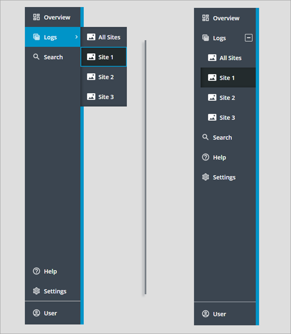
The compact view is disabled in these two Menu Bar widgets, and the same menu entities are selected for the primary and secondary navigation data properties. The cascading menu is divided into three sections. The top section is used to display the primary navigation items. The two sections at the bottom display the secondary navigation items and the footer. In the accordion menu, secondary navigation items that are displayed above the footer are combined with the primary items into one section.
|
|
The footer section is not affected by the menu bar type.
|
Menu Bar Anatomy
There are multiple ways to configure the Menu Bar widget. The following figure shows the menu in its default configuration as a cascading menu.
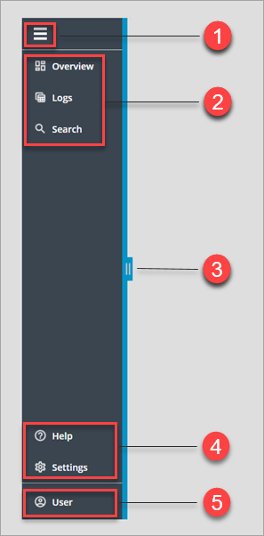
1. Expand and collapse toggle button (optional)
2. Primary navigation items
3. Drag handle used to increase or decrease the menu bar width (optional).
4. Secondary navigation items (optional)
5. Footer section (optional)
Items on the top level of the widget are listed vertically. The widget contains multiple sections in which you can display menu items, based on the current configuration.
Keyboard Navigation and Focus
You can use common keyboard shortcuts to navigate between items on the menu bar using the following keys.
|
Key
|
Description
|
|---|---|
|
TAB
SHIFT+TAB
|
Moves the focus box to the next section within the widget, such as the expand/collapse button, secondary and primary navigation items, and the footer. To focus the pervious section, press SHIFT+TAB.
|
|
ENTER
SPACE
|
Expands or collapses a parent item that contains a submenu.
Opens or closes a section.
|
|
UP/DOWN arrow
|
Focuses on the next or the previous menu item in the current section.
|
|
RIGHT/LEFT arrow
|
Focuses on the next or the previous submenu level in the current section.
|
|
HOME
|
Focuses on the first item in the current section.
|
|
END
|
Focuses on the last item in the current section.
|
Widget Properties
The following table lists the properties of the Menu Bar widget.
|
Property
|
Description
|
Base Type
|
Default Value
|
Binding
|
Localizable
|
|---|---|---|---|---|---|
|
AlwaysOpen
|
Hides the expand/collapse button used to toggle the menu between the expanded and the compact view modes. To disable the compact view mode, set this property to True.
|
BOOLEAN
|
False
|
None
|
N
|
|
DataSource
|
Specifies whether the menu bar items are defined using an infotable or a Menu entity. You can select one of the following options:
• Menu Entity—Select a Menu entity with the menu items to display. To select Menu entities, use the PrimaryNavMenu and SecondaryNavMenu properties.
• Infotable—Bind an infotable that contains the menu item definition from a data service. You must format the infotable using the MenuEntry Data Shape. To bind Menu data, use the PrimaryNavData and SecondaryNavData properties.
|
STRING
|
Infotable
|
In
|
N
|
|
DisableResizing
|
Removes the drag handle that lets users change the menu bar width at run time.
|
BOOLEAN
|
False
|
None
|
N
|
|
Disabled
|
Disables the widget on the mashup. Disabled widgets are visible, but are not interactive.
|
BOOLEAN
|
False
|
In
|
N
|
|
FooterIcon
|
The icon to display in the footer section. The footer icon is visible for all menu types, including the cascading menu and the accordion.
|
IMAGE
|
N/A
|
None
|
N
|
|
FooterLinkTargetWindow
|
Controls whether the footer link opens in the same window or in a new window. You can set this to Same Window or New Window.
|
STRING
|
Same Window
|
None
|
N
|
|
FooterText
|
Specifies the text to display in the footer section.
|
STRING
|
N/A
|
In
|
Yes
|
|
FooterURL
|
Sets the URL to navigate to when the footer link is clicked.
|
STRING
|
N/A
|
In
|
N
|
|
FooterLogo
|
The logo to display in the footer section when the widget is expanded.
|
IMAGE
|
N/A
|
None
|
N
|
|
HideAlteranteIcons
|
Hides alternative icons that are displayed automatically when custom icons are missing for menu items.
|
BOOLEAN
|
False
|
None
|
N
|
|
HideFooter
|
Hides the footer section on the menu bar.
|
BOOLEAN
|
False
|
In
|
N
|
|
MashupControl
|
Controls how the menu bar navigates between mashups at run time. You can select one of the following options:
• Control Current Mashup—Replaces the entire mashup.
• Bind To Mashup Parameters—Only the contained mashup is replaced. Adds a widget property named Mashup that you must bind to the Contained Mashup widget.
|
STRING
|
Control Current Mashup
|
None
|
N
|
|
Mashup
|
A text property that contains the name of the currently selected mashup on the menu bar. Use this property to specify which mashup to display in the Contained Mashup widget.
|
STRING
|
N/A
|
Out
|
N
|
|
MaxWidth
|
The maximum width of the menu bar. This property is applied when the menu bar is expanded.
|
NUMBER
|
N/A
|
In
|
N
|
|
MinWidth
|
The minimum width of the menu bar.
|
NUMBER
|
N/A
|
In
|
N
|
|
PrimaryNavData
|
Bind an infotable to define the items for the primary navigation section. You must format the infotable using the MenuEntry Data Shape.
|
INFOTABLE
|
N/A
|
In
|
N
|
|
PrimaryNavIcons
|
Displays icons for the primary navigation items on the menu bar. The icons are defined in the selected Menu entity or the bound infotable.
|
IMAGE
|
False
|
None
|
N
|
|
PrimaryNavMaxItems
|
Sets the maximum number of items that are displayed in the primary navigation section. Additional items in the Menu entity are displayed in an overflow menu.
|
NUMBER
|
5
|
In
|
N
|
|
SecondaryNavIcons
|
Displays icons for the secondary navigation items on the menu bar. The icons are defined in the selected Menu entity or the bound infotable.
|
IMAGE
|
False
|
None
|
N
|
|
SecondaryNavData
|
Bind an infotable the contains the item for the secondary navigation items. The infotable must be formatted using the MenuEntry Data Shape.
|
INFOTABLE
|
N/A
|
In
|
N
|
|
ShowDataLoading
|
Displays a spinning icon when data is loading.
|
BOOLEAN
|
True
|
None
|
N
|
|
StayOpenOnSelection
|
Keep accordion sections open when an item on the menu bar is selected.
|
BOOLEAN
|
False
|
None
|
N
|
|
SubMenuMaxWidth
|
The maximum width of cascading submenus.
|
NUMBER
|
N/A
|
None
|
N
|
|
SubMenuMinWidth
|
The minimum width of cascading submenus.
|
NUMBER
|
N/A
|
None
|
N
|
|
SubMenuType
|
Controls how menu items are displayed when the widget contains multiple levels of navigation.
• Cascading Menu
• Nested Accordion
|
STRING
|
Cascading Menu
|
In
|
N
|
|
TabSequence
|
The sequence number of widget when the TAB key is pressed.
|
NUMBER
|
N/A
|
None
|
N
|
|
Visible
|
Controls the visibility of the Menu Bar widget.
|
BOOLEAN
|
True
|
In
|
N
|