Progress
Definition and Usage
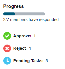
The Progress component is a widget that displays the status of progress graphically. The component displays the overall progress as a horizontal progress bar and the individual details about the progress below the bar.
The following is a sample image showing the Progress component:
You can configure the Progress component in the following ways:
• Define the title
• Configure the message below the progress bar
Task Progress is a predefined configuration available for the Progress component.
Binding Properties
Input | ||
|---|---|---|
Property Name | Description | Property Type |
Input | Used for identifying the data to be fetched from the backend system. Sample JSON: { "version":"1.0.0", "data":[ { "adapter":{ "thingName":"PTC.WCAdapter", "instanceName":"windchill" }, "itemListsData":[ { "objectType":"PTC.Workflow.WorkItem", "items":[ { "id":{ "value":"OR:wt.workflow.work.WorkItem:566231" } } ] } ] } ] } | JSONin CCO format |
Configuration Properties
The following tables show the JSON properties used to configure this component.
For more information on the structure of the configuration, see Component Configuration Structure.
For more information on sub-properties, see Sub-Properties and Container Keys.
Property Name | Description | Property Type | Default Value | Required or Optional | ||
|---|---|---|---|---|---|---|
title | String that appears as the title in the component. | N/A | Optional | |||
progressBarMessage | String that is shown below the progress bar. This is a message that indicates progress, as measured by activity. Place holders exposed in the progress bar message are%0 and %1. In the out-of-the-box component, these values are replaced by the pending and completed items, respectively. %total is also available as a place holder which is replaced by the total number of items. For example, if 5 items out of 7 total items have been completed and 2 items are still pending, the string "%1/%total items have been completed" appears in the user interface as "5/7 items have been completed". The string "'%0/%total items are pending" appears in the user interface as "2/7 items are pending". Note that the blue progress bar always reflects the percentage of completed tasks, regardless of the string. | N/A | Optional | |||
Sample Configuration
For sample configurations for the Progress component, see Task Progress.
Customization Services
In addition to configuration, each component supports extending its business logic to customize the component. The business logic of each component includes overridable services in a Thing Template that you can extend and override. The overridable services for this component are detailed in the following table.
For examples of returns and parameters for each service, see Examples of Input/Output for Customization Services.
Name | Description |
|---|---|
GetConfigurations | Returns the available configurations for the component implementation. Parameters: None Returns: JSON |
GetImplementationLabel | Returns either the localized name of the component or the token that can be used to obtain the localized name. This localized name is displayed in the Mashup Builder user interface. Parameters: None Returns: String |
CalculateProgress | Calculates and returns progress data. When creating a custom implementation, override this service with custom logic. For an example of custom logic that can be used for this service, see Task Progress. Parameters: input (Required)– JSON in CCO format that includes the input ID for the data to be fetched from the backend system and the adapter information for the backend system. configuration (Optional)– JSON with the final merged configuration obtained from the Tailoring Manager resource. Returns: JSON |
Implementation Definition
For the implementation definition for the Progress component, see Task Progress.