Item List
Definition and Usage
The Item List component is a contained mashup that lets you display a list of items from a data set in a grid view. It also allows the end user to search, sort, and filter the list, and perform actions on the entire list or specific list items.
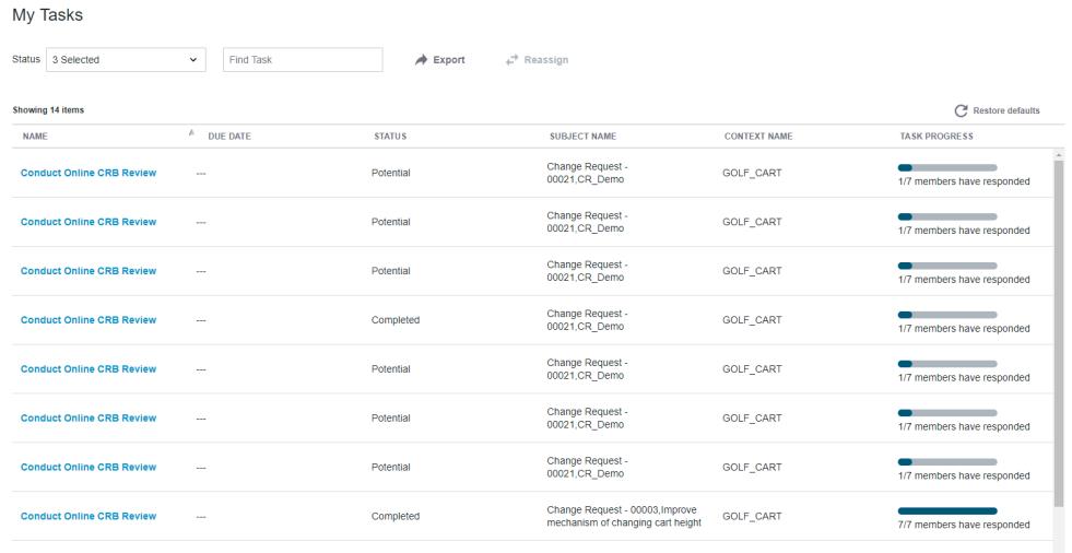
The following is a sample image showing the Item List component:
You can configure the Item List component in the following ways:
• Enable or disable searching and filtering
• Set the initial filtering and sorting options
• Set the maximum number of rows in the grid
• Define whether items can be selected from the list, and if so whether one or multiple items can be selected
• Configure the actions available in the embedded Action Bar
• Choose whether to show the Export action
The user can filter or search the Item List using the filter box or the search box. However, if the filter box and the search box are not enabled in the configuration, then filtering and searching are not available. You can click a column title to sort the list by that column. To reverse the sort order, click the column title again.
The Item List component contains an embedded Action Bar component. By configuring the Action Bar, you can enable additional capabilities, such as executing an action on one or more list items. See the Action Bar (BETA) for more information. By default, the Item List contains an Export action, which exports all items that match the filter criteria to a CSV file.
The Item List also includes a Restore defaults button. The Restore defaults button restores the default settings for filtering, searching, and grid level operations including sorting, swapping, and showing and hiding columns.
Activity, Affected Items, Attachments, and Tasks are the predefined configurations available for the Item List component.
Binding Properties
Input | ||
|---|---|---|
Property Name | Description | Property Type |
input | Used for identifying the data to be fetched from the backend system. When input is required, set the waitForInput configuration property to true. Sample JSON: { "version":"1.0.0", "data":[ { "adapter":{ "instanceName":"windchill", "thingName":"PTC.WCAdapter" }, "itemListsData":[ { "items":[ { "id":{ "value":"OR:wt.workflow.work.WorkItem:1432583" } } ], "objectType":"PTC.Workflow.WorkItem" } ] } ] } | JSON in CCO format |
tailoringName | Uniquely identifies an instance of the Item List component. This value is used internally for looking up tailoring information for that specific instance. Only use this binding property in when there is a dedicated tailoring page for your custom task. | |
Output | ||
|---|---|---|
Property Name | Description | Property Type |
totalItemsNumber | Number of list items that match search and filter criteria. | Integer |
selectedItems | Used for identifying the selected grid items and their attributes. This property can be bound to the input binding property of other components. Sample JSON: { "timeStamp":"2019-08-25 18:53:33.476", "data":[ { "itemListsData":[ { "items":[ { "workItem":{ "value":"OR:wt.workflow.work.WorkItem:143921" } }, { "workItem":{ "value":"OR:wt.workflow.work.WorkItem:143928" } } ], "objectType":"PTC.Workflow.WorkItem" } ], "adapter":{ "instanceName":"windchill", "thingName":"PTC.WCAdapter" } } ], "version":"1.0.0", "statusMessage":"OK", "status":"200" } | JSON in CCO format |
Configuration Properties
The following tables show the JSON fields used to configure this component.
For more information on the structure of the configuration, see Component Configuration Structure.
For more information on sub-properties, see Sub-Properties and Container Keys.
Property Name | Description | Property Type | Default Value | Required or Optional | |
|---|---|---|---|---|---|
actionBarConfiguration | Configuration of the embedded Action Bar. See the Action Bar (BETA) for more information. | N/A | Optional | ||
attributes | Attributes to display. These appear as column titles in the grid. | N/A | Required | ||
defaultSelectedFilterValue | The initial selected value or values to filter by. When blank, there is no default filtering. This property is a sub-property to filterFields and is only relevant when filterFields is included in the configuration. Its container key is itemListFilterFieldDefinition. | N/A | Optional | ||
defaultSortDirection | The direction of the default sorting. Options: asc, which indicates ascending order, anddsc, which indicates descending order. When blank, sort direction is ascending. This property is a sub-property to defaultSortField and is only relevant when defaultSortField is included in the configuration. Its container key is itemListDefaultSortFieldDefinition. | asc | Optional | ||
defaultSortField | The initial column to sort by. When blank, Item List is sorted by the first column. | N/A | Optional | ||
enableSearch | Whether to present the search field. Options: true, false. | true | Optional | ||
filterFields | The IDs in the backend system of the fields by which to filter the data. When blank, there is no option to filter the data. | N/A | Optional | ||
filterLabelOverride | A label for the filter which overrides the display value returned from the GetItems service. This property is a sub-property to filterFields and is only relevant when filterFields is included in the configuration. Its container key is itemListFilterFieldDefinition | N/A | Optional | ||
implementationConfigurations | Entry point for the application builder to pass in additional values needed for their implementation, to further customize the component. | N/A | Optional | ||
label | The title of the Item List. | [[PTC.ItemList]] | Optional | ||
maxNumberOfRowsInGrid | Maximum number of rows to display in the grid area. It’s recommended to input a value less than 10,000. | 500 | Optional | ||
searchHintText | The hint text shown in the search box. This property is a sub-property to enableSearch and is only relevant when enableSearch is set to true. Its container key is itemListSearchDefinition. | Find Item | Optional | ||
selectionType | Determines how many items in the grid can be selected at one time. Options: • none– grid items cannot be selected • single– one grid item can be selected at a time • multi– one or more grid items can be selected at a time | multi | Optional | ||
showExportAction | Enables or disables the Export action. Options: true, false. | true | Optional | ||
waitForInput | Whether to wait at runtime for a value to be passed to the Item List's input mashup parameter before triggering the retrieval of the items that populate the grid. Options: true, false. | false | Optional | ||
Sample Configuration
For sample configurations for the Item List component, see Activity, Affected Items, Attachments, and Tasks.
Customization Services
In addition to configuration, each component supports extending its business logic to customize the component. The business logic of each component includes overridable services in a Thing Template that you can extend and override. The overridable services for this component are detailed in the following table.
For examples of returns and parameters for each service, see Examples of Input/Output for Customization Services.
 | When returning a JSON object in CCO format from a Business Logic Implementation component to the Item List component, only include attributes of a single object type. Currently, the Item List doesn’t support including attributes of different object types. |
Name | Description |
|---|---|
GetConfigurations | Returns the available configurations for the component implementation. Parameters: None Returns: JSON |
GetImplementationLabel | Returns either the localized name of the component or the token that can be used to obtain the localized name. This localized name is displayed in the Mashup Builder user interface. Parameters: None Returns: String |
GetItems | Returns the list of items from the backend system. To create a custom implementation of Item List, override this service to retrieve the custom data. Parameters: input (Optional)– JSON in CCO format that includes the input ID for the data to be fetched from the backend system and the adapter information for the backend system. When using this parameter, make sure that the waitForInput configuration property is set to true. configuration (Required)– JSON with the final merged configuration obtained from the Tailoring Manager resource. Returns: JSON in CCO format |
InitializeFilters | Returns the filter type definition for each of the filter fields in the configuration. Parameters: input (Optional)– JSON in CCO format that includes the input ID for the data to be fetched from the backend system and the adapter information for the backend system. configuration (Required)–JSON with the final configuration obtained from the Tailoring Manager resource. Returns: JSON in CCO format |
DefHookImplementationConfigurationDefinitionGroup | Returns the implementation-specific definition with the custom configurations for the implementation. Parameters: None Returns: JSON:Array |
DefHookImplementationAttributesDefinition | Returns the implementation-specific definition for the selected attributes. Parameters: None Returns: JSON:Array |
DefHookMaxRowsProperties | Returns the properties for the maximum number of rows to display in the grid area. Parameters: None Returns: JSON |
Implementation Definition
For implementation definitions for the Item List component, see Activity, Affected Items, Attachments, and Tasks.