Action Bar (BETA)
Definition and Usage
The Action Bar component is a widget that displays a range of actions available to the user. The actions appear as a row of buttons and in an accompanying list box. The component configuration and the size of the user’s screen determine the number of actions that appear as buttons. Any actions that do not appear as buttons are visible in the list box.
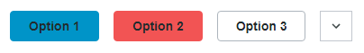
The following is a sample image showing the Action Bar component:
You can configure the Action Bar component in the following ways:
• Define the actions that are included in the Action Bar
• Set the maximum number of actions to show as buttons
• Set visibility options for the actions depending on their availability
• Define the order of the actions
• Define whether inputs are required for an action
• Select the desired style for the Action Bar
Actions are designed to activate either a service or a popup. The service or the popup mashup must be configured separately in ThingWorx. Any additional features, such as toast messages, must be configured in the appropriate service or mashup in ThingWorx.
An Action Bar can be included inside the Item List and Item Identity components.
There are no predefined configurations available for the Action Bar component.
Binding Properties
Input | ||
|---|---|---|
Property Name | Description | Property Type |
Disabled | Disables the widget in the mashup. | Boolean |
Input | Used for identifying the data to be fetched from the backend system. | JSON in CCO format |
ServiceActionId | When the action is clicked, this string is updated with the action ID of a service action. | String |
SubComponentConfiguration | Bind the configuration to this property if it changes in the runtime. | JSON |
Output | ||
|---|---|---|
Property Name | Description | Property Type |
EventTriggered | Event that is triggered when a service finishes running or a popup is displayed, if the action is configured with thefireEventOnFinish configuration property as true. | Event |
ServiceActionIdChanged | Event that is triggered when the value in ServiceActionId is changed, meaning that a service invoked by the Action Bar has finished running. | Event |
PopupClosed | Event that is triggered when a popup that was opened is closed. | Event |
Configuration Properties
The following tables show the JSON properties used to configure this component.
For more information on the structure of the configuration, see Component Configuration Structure.
For more information on subproperties, see Sub-Properties and Container Keys.
Property Name | Description | Property Type | Default Value | Required or Optional | ||
|---|---|---|---|---|---|---|
maxItemsToShow | The maximum number of action buttons that are shown. If there are more action buttons than the value specified, additional actions will be populated in the list box. | 2 | Required | |||
modelThingName | The name of a Thing that contains a service with the following signature: public JSONObject GetActions(@ThingworxServiceParameter(name = "ccoJson", baseType = "JSON") JSONObject ccoJson) This service takes input in CCO format containing a single item. It then returns a JSONObject containing an array that maps the ID of an available action to its label as received from the back-end. See example in Sample JSON Configuration below. | PTC.ActionBar Model.Thing | Required | |||
actions | The list of actions for which data needs to be fetched from the backend system. Container key is actionConfiguration. See sub-properties below: | N/A | Required | |||
overrideLabel | The value set here is shown as the action button’s label, overriding the value that comes from the backend system. To localize, put double brackets around the value. | N/A | Optional | |||
actionButtonVisibility | Determines under what conditions the action buttons are shown, and in what state. Options: AlwaysShown, DisableUnavailable, HideUnavailable. For AlwaysShown, button is always visible and enabled. For DisableUnavailable, button is always visible, but disabled when action is unavailable for given selection. For HideUnavailable, button is only visible when action is available for the given selection. Note: There are other configurations that affect whether a button is be enabled or disabled. | N/A | Required | |||
buttonStyle | Determines the visual style of the button. Options: primary, secondary, tertiary, danger, transparent. | N/A | Required | |||
overrideSetDisabled | If this field is set, then its value is the only factor in determining if a button should be enabled or disabled. Options: true, false. True ensures that the button is disabled, and false ensures that the button is enabled. | N/A | Optional | |||
activityType | Determines whether the action runs a service or displays a popup mashup. Options: popup, service. See the tables below for the required sub-properties for popup and for service. | N/A | Required | |||
fireEventOnFinish | If this field is set to true, when a service finishes running, the event EventTriggered is triggered, and when a popup is closed, the event PopupClosed is triggered. | N/A | Optional | |||
inputConstraints | Determines the input constraint for the action. Options: InputRequired, SingleInputOnly, and NoInputRequired. InputRequired: This action must receive input to operate. If the input is empty and doesn't contain any items, this action's button is disabled. SingleInputOnly: This action must receive a single input in order to operate. If the input is empty or contains more than a single item, this action's button is disabled. NoInputRequired: This action can operate without any input, or with input. | N/A | Optional | |||
iconWhenEnabled | If this field is specified, the action's button contains an icon to the left of the label when the action button is enabled. | |||||
entityName | The name of the media entity to use as an icon. | |||||
iconWhenDisabled | If this field is specified, the action's button contains an icon to the left of the label when the action button is disabled. | |||||
entityName | The name of the media entity to use as an icon. | |||||
mashupName | The name of the mashup that appears as a popup. This property is used only when activityType is set to popup. | N/A | Required | |||
redirectAfterPopupSuccess | Redirects to another mashup when the popup is closed after a successful operation. To inform the Action Bar whether the operation performed by the popup was completed successfully, set the session parameter named PTC.ActionBar.popupCloseParameters to indicate success or failure. For example, in the popup mashup there can be an expression that is executed after the operation performed by the popup finishes, and in that expression the session parameter is set. In the following example, the JSON attribute operationSuccessful is set to true since the operation was successful: sessionStorage.setItem("PTC.ActionBar.popupCloseParameters", JSON.stringify( { operationSuccessful: true } )); This property is used only when activityType is set to popup. | N/A | Optional | |||
popupWidth | Specifies the width of the popup that appears. This property is used only when activityType is set to popup. | 1024 | Optional | |||
popupHeight | Specifies the width of the popup that appears. This property is used only when activityType is set to popup. | 640 | Optional | |||
thingWithService | The name of the Thing that contains the service to run. This property is used only when activityType is set to service. | N/A | Required | |||
serviceName | The name of the service to run. This property is used only when activityType is set to service. | N/A | Required | |||
parameters | This optional field allows us to pass hard-coded parameters to the service. The parameters are defined in a JSONObject but must be formatted as a string of a JSON object, with escaped-quotations. Parameters should be input into the configuration file in the form "{\"myParamName\": \"hardcodedValue\"}" . See additional information below. This property is used only when activityType is set to service. | N/A | Optional | |||
Using parameters to Configure a Service Action:
This is the signature of an example service named MyService:
@ThingworxServiceDefinition(name = "MyService", category = "MyCategory")
public void MyService(
@ThingworxServiceParameter(name = "exampleInt", baseType = "INTEGER") Integer exampleInt,
@ThingworxServiceParameter(name = "ExampleString", baseType = "STRING") String exampleString,
@ThingworxServiceParameter(name = "ExampleBoolean", baseType = "BOOLEAN") Boolean exampleBoolean)
This is what the parameter values look like for MyService:
{
\"exampleInt\": 123,
\"exampleString\": \"Hello\",
\"exampleBoolean\": true
}
\"exampleInt\": 123,
\"exampleString\": \"Hello\",
\"exampleBoolean\": true
}
 | There are two parameters that your service gets automatically, if you define the service signature to receive them: serviceParam_InputCco and serviceParam_ActionId. The parameter serviceParam_InputCco is a JSONObject, and is the input that was provided to the Action Bar. The parameter serviceParam_ActionId is a string that contains the ID of the action that was clicked. If your service doesn't include these parameters in its signature, you cannot use them. If you would like to use them, define your service signature to use either or both of them, using the following: @ThingworxServiceDefinition(name = "MyService", category = "MyCategory") public void MyService( @ThingworxServiceParameter(name = "serviceParam_InputCco", baseType = "JSON") JSONObject serviceParam_InputCco, @ThingworxServiceParameter(name = "serviceParam_ActionId", baseType = "STRING") String serviceParam_ActionId) |
Sample Configuration
{
"maxItemsToShow":{
"value":3
},
"modelThingName":{
"entityName":"PTC.ActionBarModel.Thing"
},
"actions":{
"selectedValues":{
"data":[
{
"itemListsData":[
{
"items":[
{
"id":"Approve",
"additionalData":{
"actionConfiguration":{
"overrideLabel":{
"value":""
},
"actionButtonVisibility":{
"selectedKey":"HideUnavailable"
},
"buttonStyle":{
"selectedKey":"primary"
},
"activityType":{
"selectedKey":"popup"
},
"mashupName":{
"mashupName":"PTC.AccessApp.WindchillServices.RoutingOptionMashup"
},
"fireEventOnFinish":{
"value":false
},
"inputConstraints":{
"selectedKey":"SingleInputOnly"
}
}
},
"ordinal":1
},
{
"id":"Reject",
"additionalData":{
"actionConfiguration":{
"overrideLabel":{
"value":""
},
"actionButtonVisibility":{
"selectedKey":"HideUnavailable"
},
"buttonStyle":{
"selectedKey":"primary"
},
"activityType":{
"selectedKey":"popup"
},
"mashupName":{
"mashupName":"PTC.AccessApp.WindchillServices.RoutingOptionMashup"
},
"fireEventOnFinish":{
"value":false
},
"inputConstraints":{
"selectedKey":"SingleInputOnly"
}
}
},
"ordinal":2
},
{
"id":"Analyze",
"additionalData":{
"actionConfiguration":{
"overrideLabel":{
"value":""
},
"actionButtonVisibility":{
"selectedKey":"HideUnavailable"
},
"buttonStyle":{
"selectedKey":"primary"
},
"activityType":{
"selectedKey":"popup"
},
"mashupName":{
"mashupName":"PTC.AccessApp.WindchillServices.RoutingOptionMashup"
},
"fireEventOnFinish":{
"value":false
},
"inputConstraints":{
"selectedKey":"SingleInputOnly"
}
}
},
"ordinal":3
},
{
"id":"Reassign",
"additionalData":{
"actionConfiguration":{
"overrideLabel":{
"value":"Reassign"
},
"actionButtonVisibility":{
"selectedKey":"AlwaysShown"
},
"buttonStyle":{
"selectedKey":"primary"
},
"activityType":{
"selectedKey":"popup"
},
"mashupName":{
"mashupName":"PTC.AccessApp.WindchillServices.ReassignActionMashup"
},
"fireEventOnFinish":{
"value":false
},
"inputConstraints":{
"selectedKey":"InputRequired"
}
}
},
"ordinal":4
}
],
"objectType":"WT.WorkItem.Actions"
}
],
"adapter":{
"instanceName":"windchill",
"thingName":"PTC.WCAdapter"
}
}
]
}
}
}