Parts List Images
Servigistics InService enables you to view an image of the parts included in a parts list. You can also view an image of an individual part on the
part information page. The following image formats are supported:
• Non-interactive images
Servigistics InService supports the following regular image formats:
◦ GIF
◦ JPEG
◦ PNG
These types of images display in Servigistics InService without requiring a plugin.
• Interactive images
Interactive images provide a toolbar that enables you to interact with the image. You can select parts of the image, move the image, zoom in and out, and so forth. Servigistics InService supports the following interactive images:
◦ CGM
◦ IDRZ
◦ ISO
◦ PVZ
◦ SVG
Viewing interactive images other than SVG requires the Creo View browser plugin for browsers that support plugins. If you view a parts list image in one of these formats and do not have the required plugin installed, Servigistics InService displays a message asking whether to install or update the plugin.
For browsers that do not support plugins, PVZ interactive images display in the ThingView viewer. For other interactive images in this case, you have the option to download the image.
• Document format images
Servigistics InService supports the following images delivered in electronic document formats:
◦ DjVu
◦ PDF
For browsers that do not support the document format natively, you must install a plugin to view this type of image, before Servigistics InService can display images in this format. For example, you would install Adobe Reader to view PDF images.
Servigistics InService can also provide multiple images for a parts list. If more than one image is available for a parts list, you can open other images from the Sheet: drop-down list at the top right of the image area. The arrows in the viewer also enable you to move back and forth between the images. If a single image contains multiple images, you can select the image to view from the Figure: drop-down list. Note that the ThingView viewer does not support multiple images.
Working with Regular Images
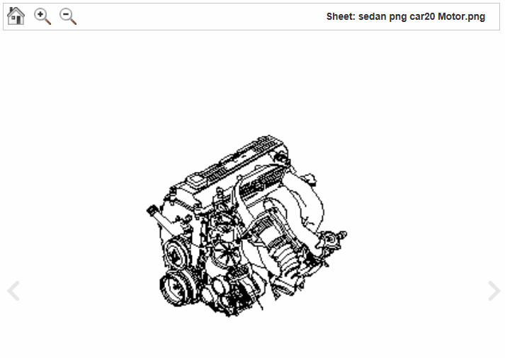
Servigistics InService displays regular images in the application’s image viewer:
The viewer provides a toolbar that enables you to make the image larger and smaller. The following toolbar buttons are available:
• Home
Returns the image to the default view.
• Zoom In
Makes the image larger.
• Zoom Out
Makes the image smaller.
Working with the Creo View Plugin
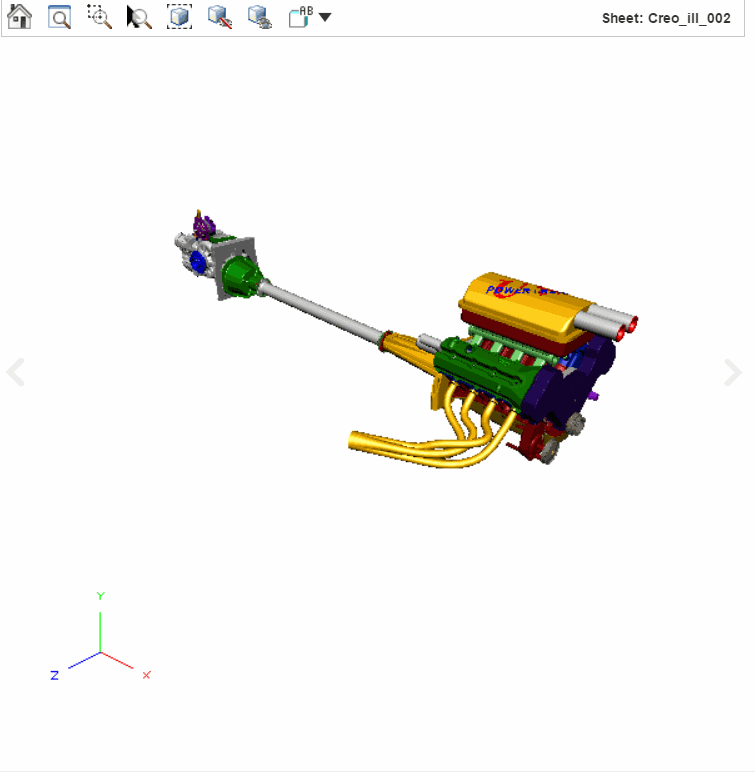
For browsers that support plugins, Servigistics InService displays interactive images in the Creo View plugin:
Any callouts in an interactive image are linked to the corresponding parts in the parts list. When you click on the image callout, the associated part is highlighted in the parts list. When you click on a callout in the parts list, the associated part is highlighted in the image.
You can use your pointer to interact with the image in the following ways:
Action | Result | Details |
Click. | Selects a component. | CTRL+click to select multiple parts. Click and drag to select all of the parts in an area. |
Right-click and drag. | Flies. | Drag down to fly out, and drag up to fly in. In fly mode, your perspective of the image changes instead of the image moving. You can fly towards or away from the image or slide your perspective from side to side. Fly mode is differential. This means that the faster you move the mouse, the faster the perspective changes. The perspective continues to change until you release the mouse button or return the mouse to its original position. |
Middle-click and drag. | Rotates the image. | In rotate mode, you can rotate the image using the mouse to see different aspects. |
Middle-click and drag. Release the mouse button, and then stop dragging. | The image continues to rotate | Click in the control to stop the rotation. |
SHIFT+middle-click and drag. | Pans. | In pan mode, you can move the image using the mouse. |
CTRL+middle-click and drag. | Zooms in or out. | Drag down to zoom in, and drag up to zoom out. |
Creo View also provides a toolbar that enables you to interact with the image. In some cases, the toolbar buttons might be opened from the
Tools
drop-down. The following buttons are available:
• Home
Returns the image to the default view.
• Zoom All
Adjusts the image to fit all parts in the view.
• Zoom Window
Zooms the view of the image to a selected area.
To use this button, click the button, move your pointer to the view, right-click and select the area in the image to which you want to zoom. When you release the button, the view zooms in to the selected area.
• Zoom In
Makes the image larger.
• Zoom Out
Makes the image smaller.
• Zoom Selected
Zooms the image in on selected part.
To use this button, first click a part in the image to select it. Click this button to zoom in on the selected part.
• Isolate
Show selected part only.
To use this button, select a part in the image. Click this button to only show the selected part.
• Hide Selected
Hide selected part
To use this button, select a part in the image. Click this button to hide the selected part.
• Unhide All
Show any hidden parts.
• Orientation
Changes the orientation of the view.
To use this button, click the button and select one of the orientation types from the drop-down list. The view changes to the selected orientation.
• Find a Part
Enables you to search for a part in the image.
If the image contains an animation, the following additional buttons are available:
• Rewind Animation
Returns the animation to the beginning.
• Stop Animation
Stops playing the animation.
• Play Animation
Starts playing the animation.
Working with the ThingView Viewer
For browsers that do not support plugins, Servigistics InService displays PVZ interactive images in the ThingView viewer:
You can use your pointer to interact with the image in the following ways:
Action | Result | Details |
Click. | Selects a component. | CTRL+click to select multiple parts. Click and drag to select all of the parts in an area. |
Right-click and drag. | Rotates the image. | In rotate mode, you can rotate the image using the mouse to see different aspects. |
Middle-click and drag. | Flies. | Drag down to fly out, and drag up to fly in. In fly mode, your perspective of the image changes instead of the image moving. You can fly towards or away from the image or slide your perspective from side to side. Fly mode is differential. This means that the faster you move the mouse, the faster the perspective changes. The perspective continues to change until you release the mouse button or return the mouse to its original position. |
SHIFT+right-click and drag. | Zooms in or out. | Drag down to zoom in, and drag up to zoom out. You can also zoom using the scroll feature on a pointing device. |
CTRL+right-click and drag. | Pans. | In pan mode, you can move the image using the mouse. |
The viewer also provides a toolbar that enables you to interact with the image. In some cases, the toolbar buttons might be opened from the
Tools
drop-down. The following buttons are available:
• Home
Returns the image to the default view.
• Zoom All
Adjusts the image to fit all parts in the view.
• Zoom Window
Zooms the view of the image to a selected area.
To use this button, click the button, move your pointer to the view, right-click and select the area in the image to which you want to zoom. When you release the button, the view zooms in to the selected area.
• Zoom Selected
Zooms the image in on selected part.
To use this button, first click a part in the image to select it. Click this button to zoom in on the selected part.
• Isolate
Show selected part only.
To use this button, select a part in the image. Click this button to only show the selected part.
• Hide Selected
Hide selected part
To use this button, select a part in the image. Click this button to hide the selected part.
• Unhide All
Show any hidden parts.
• Orientation
Changes the orientation of the view.
To use this button, click the button and select one of the orientation types from the drop-down list. The view changes to the selected orientation.


 drop-down. The following buttons are available:


 drop-down. The following buttons are available:


