Creating Charts
You can create Charts to visualize the data in list views. The following chart types are supported:
• Angular Gauge
• Area
• Bar
• Doughnut
• Line
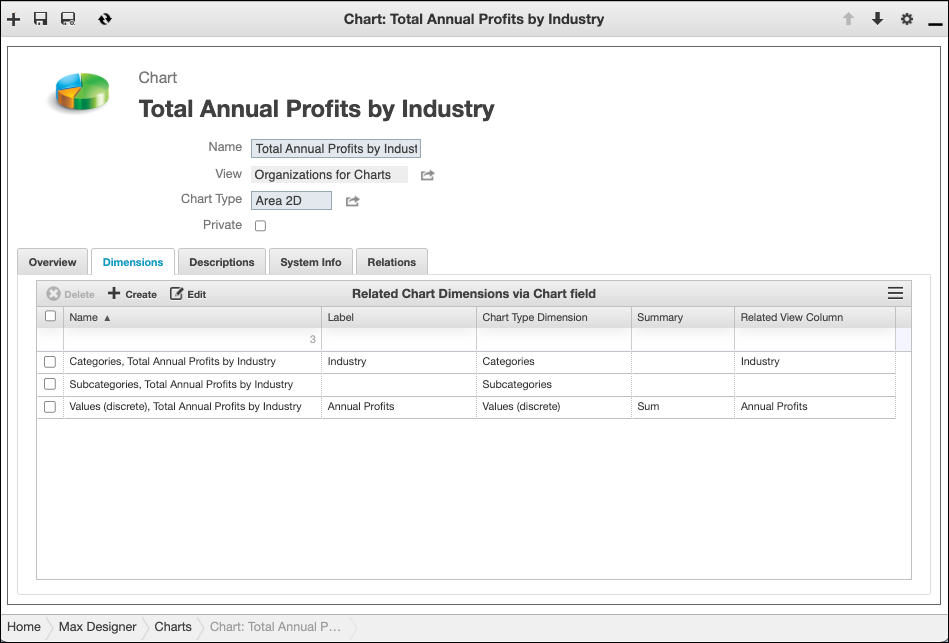
The available Chart types for list views are based on whether the Group By and Subgroup By values are configured in the View record related to the selected list view. These values correspond to the Category and Subcategory chart dimensions, which group values into chart series. The Value dimension defines which column in the list view to use to summarize, and the Summary field is used to specify how to summarize the values. For example, in the Total Annual Profits by Industry chart, the Related View Column in the associated View record that is related to the Value dimension is Annual Revenue, and the Summary value is Sum. On the rendered Chart, the value of each series is the sum of the Annual Revenue column in the related list view.
|
|
The Angular Gauge chart type has only the Value dimension.
|
To create a Chart:
1. In any list view in Max Designer or Max Admin, in the top right corner, click Options ( ) > .
) > .
) > .
|
|
• If multiple Charts exist for the selected list view, Chart Browser shows a list in the top pane, and you can click to view any item. If one Chart exists, it appears in the top pane. You can click Create (
 ) in the top left corner to open Chart Designer. The Chart Template in the bottom pane shows the Chart record for the Chart that appears in the top pane. ) in the top left corner to open Chart Designer. The Chart Template in the bottom pane shows the Chart record for the Chart that appears in the top pane.• If no Charts exist for the selected list view, Chart Designer is open in the top pane with a default template Chart shown. The Chart Template in the bottom pane shows a Chart record for the default template Chart.
• The number of available Chart templates is based on the number of View Columns that have configured Summary field values in the View record related to the selected list view . If no Summary values are configured, only the Record Count template is available. If one View Column has a configured Summary value, two templates are available. Each Chart template uses one configured Summary value to summarize values in chart series.
|
2. Do any of the following, and then click Save.
◦ In the Chart Designer pane, in the top right corner, click the chart type icons to change the chart type, or in the Chart Template pane, in the Chart Type field, select a different option.
◦ In the Chart Template pane, change colors, labels, margins, and other visual options as needed.
|
|
• The Max Fetch Size field in Chart records is used to configure the maximum number of records that can be used in Charts. The maximum configurable value is 15,000.
• All of your updates appear in the top pane in real time as you update Chart options.
|
3. When you are finished making changes, in Chart Designer, in the top right corner, click Close ( ), and then in Chart Browser, click Close again.
), and then in Chart Browser, click Close again.