Example: Using Polar Plots to Plot Data
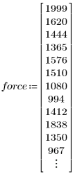
1. Define the following data sets:
 |
 |
2. Use an XY Plot to graph and visualize the data:
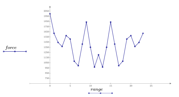
The plot shows symmetry around the 13th data point. |
3. Plot the same data using a polar plot:
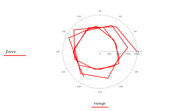
The symmetry is lost. You need to normalize the range so that the data is plotted over one cycle of the polar plot. |
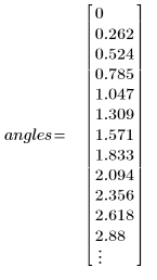
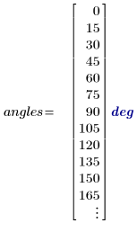
4. Convert the range (rng) to angles (angs) that are evenly spread over one cycle of the polar plot.

The angles are defined in radians. You can convert the radians to degrees by inserting the unit into the placeholder.
|
5. Plot the modified vectors:
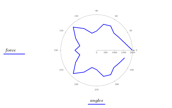
6. To connect the last data point to the first, use the stack function to add the first data point to the end of the two data sets:


7. Plot the modified vectors:
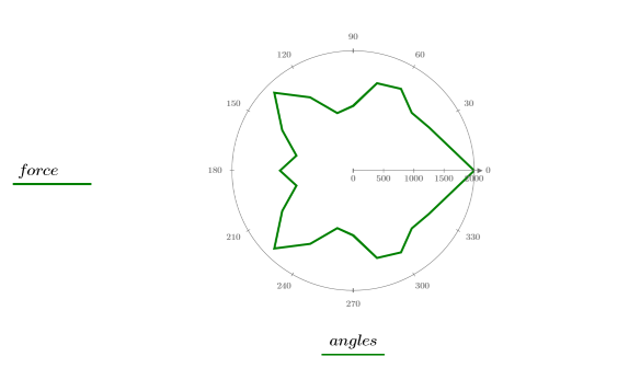
Now the data set is plotted over one cycle and all the points are connected. Note that in PTC Mathcad, the angles are displayed in a counter clockwise fashion.
