Customization Points
The default information page will just have a details tab and a ‘+’ new tab option. The details tab is set up to show just the
More Attributes panel. That attributes panel layout will come from the layout definition in the
Type and Attribute Management utility. For details on customizing attribute layouts see
Layouts Tab.
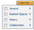
When you create a new tab only two options would be available in the Customize menu on that tab. “More Attributes” and “Visualization and Attributes”. (or if your object type does not have a visualization delegate registered you’d just get “More Attributes” and “Attributes”)
To customize what is displayed in the info page you’ll need to create a builder as defined above in the “Information Page Builder Designer” section of
Solution. Then, the instructions below describe how to customize various aspects of the Info Page by overriding the
buildInfoConfig() API in your custom builder.
Customization Options in Info Page Builder
You can control what elements appear on the information page in your builder class. For more information about the builder class, see the “Information Page Builder Designer” section in
Solution. The following options can be set on the
InfoConfig object:
|
Information Page Item
|
Method to invoke on Builder InfoConfig
|
Default Value
|
Description
|
|
Tab Level Set |
setTabSet()
|
"defaultInfoPageTabSet"
|
Name of the action model to be used for the top-level tabs.
See Configure the Table of Contents section for more information about configuring the default tables on a specific tab.
|
|
Tab set saving
|
setTabSetKey()
|
The hard type of the business object is used. For example “wt.part.WTPart”
|
This tabSetKey will be used for saving tab order, tab content and the last active tab. If no tabSetKey is specified by the builder the hard type of the business object will be used as the tabSetKey. For example, part info page will end up using a tab set key of "wt.part.WTPart".
Some info pages change this tabSetKey to share behavior across types. For example, the caddoc and saved caddoc info pages will both have tabSetKey of "wt.epm.EPMDocument". Other info pages change this tabSetKey to get different behavior for the same type. For example, the 'Clash Job Definition' info page will have a different tabSetKey so that tabs/tables added to that page are not added to the WTDocument info page.
Recommended tab set keys would be:
• wt.part.WTPart"
• WCTYPE|wt.part.WTPart|com.acme.SoftPart
Be careful with these keys from release to release. Since they are persisted to the database a migrator will be needed if the key needs to change.
|
|
Action menu |
setActionListName()
|
Defined in an actions model with the “menufor” attribute set
|
|
|
Table of Contents (TOC) menu |
|
|
Name of the action model to be used for the Customize Menu on a tab. This is the same action model that was used to render the third-level action bar in prior releases.
See Configure the Table of Contents section for more information about configuring the default tables on a specific tab
|
|
Add a status glyph |
addComponent()
|
|
Adds a status glyph to the top of the info page. See Adding a Status Glyph for more information about adding status glyphs in the builder. |
|
|
|
|
|
Workspace Toggle Button |
Not defined in the builder, see description for more details
|
|
Set of buttons that appear to the right of the Actions menu. This is configured in javascript and added to the infoModel JSON object via the info page ‘beforerender’ event. See Adding a Status Glyph for more information. |
Configure a Top-Level Tab Set
If you would like to specify a top-level tab set for your information page, create an action model and set the action model in the info page builder. For example, you could define the following action model for a tab set:
<model name=”partInfoPageTabSet” resource=”com.ptc.core.ui.navigationRB”>
<action name=”productStructureGWT” type=”psb”/>
<submodel name=”partInfoDefaultDetails” type=”object”/>
</model>
Then, you would specify the tab set on the builder as follows:
InfoComponentConfigFactory f =
(InfoComponentConfigFactory)getComponentConfigFactory();
InfoConfig result = f.newInfoConfig();
result.setTabSet(“partInfoPageTabSet”);
For more information on configuring the tabs, and how to specify the content (tables) for a particular tab, see Tab Customizations.section in this topic. For more details about defining tabs please refer to
Client Tabs.
Configure the Table of Contents
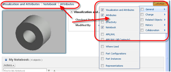
The table of contents (TOC) is comprised of two items, the menu and the links. They are shown below, circled in red.
TOC Menu
The TOC menu allows an end user to add or remove items from the tab. It will only appear on tabs that the user has access to modify. For more information about when tab contents can be modified, see
Client Tabs.
To specify the action model to use as the Table of Contents (TOC) menu, set the action model in your info page builder, like the following :
public InfoConfig buildInfoConfig(ComponentParams params) throws WTException {
InfoComponentConfigFactory factory = getComponentConfigFactory();
InfoConfig infoConfig = factory.newInfoConfig();
// sets the action model for the TOC menu on the Tabs of the info page
infoConfig.setNavBarName("third level nav package");
...
return infoConfig;
}
The action model for the TOC menu should contain the complete set of items that can be added to any of the top level tabs.
The TOC menu is a replacement of the Third Level navigation toolbar items found in prior releases:
TOC Links
The order of content items in a tab can be modified by dragging and dropping the links in the TOC if the user has the permission to modify the tab contents. See
Client Tabs for more information.
Adding a Status Glyph
You can add a status glyph to the information page for a particular business object type. See
Adding a Status Glyph for more information,
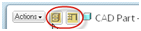
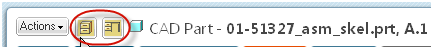
Workspace / Common Space Toggle Buttons
Currently, the CAD Document info pages show Workspace and Common Space toggle buttons between the Actions menu and the ‘Got to Latest’ link
If you would like to have the info page show the Workspace or Common space toggle buttons (or any other set of buttons) for a another object type, you’ll need to set the attribute “toggleButtonConfigs” on the infoModel object. The attribute “toggleButtonConfigs” takes an array of button configs.
Example JavaScript Button Definition:
// add the buttons to the information page via the ‘beforerender’ event
PTC.infoPage.on("beforerender", addToggleButtons);
// function that adds the buttons to the infoModel object
function addToggleButtons(infoModel) {
var cs_button = {
id: 'commonspace_button',
icon: 'com/ptc/windchill/uwgm/cadx/images/csUnHilite.gif',
handler: function() {
var params = {
typeIdForTypeLookup: 'com.ptc.carambola.customization.examples. infoPage.Carambola',
oid: extractParamValue(getWindow().location.href, 'oid')
};
PTC.infoPage.goTo('', params);
},
tooltip: 'toggle to commonspace'
};
var ws_button = {
id: 'workspace_button',
icon: 'com/ptc/windchill/uwgm/cadx/images/wsHilite.gif',
handler: function() {
var params = {
typeIdForTypeLookup: 'com.ptc.carambola.customization.examples. infoPage.Carambola',
oid: extractParamValue(getWindow().location.href, 'oid'),
csName: 'Carambola Example',
};
PTC.infoPage.goTo('', params);
},
tooltip: 'toggle to workspace'
};
infoModel.toggleButtonConfigs = [cs_button, ws_button];
}
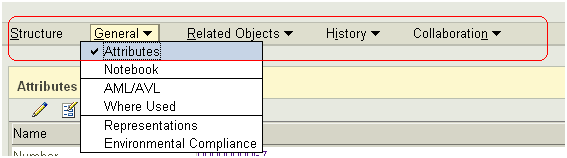
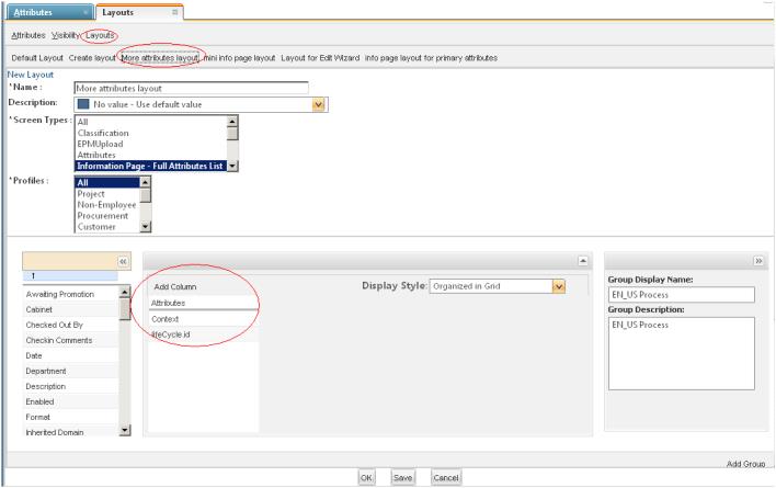
Configuration Options via the Type and Attribute Management Utility
The attribute layout for the Attributes panel as well as for the Visualization and Attributes component is controlled via the layout manager in the Type and Attribute Management utility.
The layout “More attributes layout” corresponds to the “Attributes” action on the information page. Likewise, the layout “info page layout for primary attributes” corresponds to the “Visualization and Attributes” action on the information page.
Attribute Customizations
Attributes v.s. Visualization and Attributes
There is a validator attached to the “Attributes” and “Visualization and Attributes” TOC options. That validator will hide one or the other based on the visualization delegate that is found for the object type. So even if both actions are specified in your TOC action model you would only see one in the UI:
<model name="defaultTOC">
<action name="primaryAttributes" type="object"/>
<action name="visualizationAndAttributes" type="object"/>
</model>
Having both actions in the TOC model allows visualization to be hidden/shown for a parent and sub types as needed at runtime.
You will not typically need to write a builder class for the Attributes panel, the Visualization and Attributes component, or the More Attributes panel. You configure the attributes panels using the Type and Attribute Management utility, as described in n . They are displayed by the PrimaryAttributeBuilder and VisualizationAttributesBuilder, and TypedAttributesPanelBuilder classes, respectively.
You can customize the visualization component of the Visualiation and Attributes panel by writing a custom visualization delegate. See the next section Configuring the Visualization Component for details of how to register a visualization delegate.
Configuring the Visualization Component
Out of the box there should be a visualization component shown for Representations, Representables, and Viewables. But there are a couple things that need to be configured correctly for it to show up. First, make sure you’ve defined your TOC in the info builder:
infoConfig.setNavBarName(“defaultTOC”)
Second, make sure you’ve included the “Visualization and Attributes” option in your TOC action model:
<model name="defaultTOC">
<action name="primaryAttributes" type="object"/>
<action name="visualizationAndAttributes" type="object"/>
</model>
You can make a custom visualization delegate if your object type doesn’t have visualization out of the box, or if you would like to define different visualization for your object type.
First define a custom visualization delegate with the desired html:
import com.ptc.core.components.rendering.guicomponents.VisualizationComponent;
import com.ptc.core.components.visualization.VisualizationDelegate;
public class CarambolaVisualizationDelegate extends AbstractVisualizationDelegate {
public VisualizationComponent getVisualizationComponent(Object datum, ServletRequest request) {
String html = "<div id=wvs_pview_div class=vizComponent><IMG src='netmarkets/ images/demodata/carambola.jpg'/></div>";
return new VisualizationComponent(html);
}
}
The html could include javascript if needed. See the VisualizationComponent javadoc for more details.
Second, register the custom visualization delegate with an typed services xconf entry:
<Service context="default" name="com.ptc.core.components.visualization. VisualizationDelegate">
<Option serviceClass="com.ptc.carambola.customization.examples.infoPage. CarambolaVisualizationDelegate"
requestor="com.ptc.carambola.customization.examples.infoPage. Carambola"
selector="visualization"
cardinality="singleton"/>
</Service>
Your html should appear in the visualization section. Note, currently the visualization html is put into a panel with a hard coded width and height of 298x202.
There are some cases where visualization is shown for a parent type but needs to be hidden for a sub type. For example, visualization is shown for EPMDocuments but is hidden Notes which are a subtype of EPMDocument. In this case the visualization component can be hidden for the sub type by registering the DefaultVisualizationDelegate for that sub type. This will hide the “visualizationAndAttributes” action from the TOC so you should make sure the TOC action model for the sub type includes the “primaryAttributes” action:
<model name="defaultTOC">
<action name="primaryAttributes" type="object"/>
<action name="visualizationAndAttributes" type="object"/>
</model>
To see some logging about which delegate is found and when actions are hidden/shown by that delegate you can enable a log4j logger named com.ptc.core.components.validators.VisualizationAndAttributesFilter.
Tab Customizations
Configure a Tab with a Default Set of Tables
You can specify a tab to have a set of tables shown by default. To do this, you will create an action model that contains the actions for the desired default tables. For example, the “Details” tab on the part information page may define the following default tables:
<model name="partInfoDefaultDetails" resourceBundle="com.ptc.core.ui.navigationRB">
<action name="visualizationAndAttributes" type="object"/>
<action name="whereUsed" type="object"/>
</model>
The tables won’t show up unless they are in the Table of Contents (TOC) action model. See the section Configure the Table of Contents in this topic for more details.
Please
Client Tabs or
Defining Menus for more information about defining the action model.
Hide/Show Tab Content with Validators
Validators can be used to hide/show tabs or to hide/show tables/panels within the tabs.
Each tab is an action or action model. Each table or panel is an action. See the validation documentation for details on how to hook up a validator to an action/action model.
Load a specific tab or a particular table on a tab
Sometimes it’s necessary to have a specific tab loaded or to bring a user to a particular table on a tab. Both of these scenarios can be achieved by adding request parameters to the information page URL.
Load a Specific Tab
To have a particular tab selected when the user navigates to the information page, set the following URL parameters (both need to be set):
URL Parameter | Description |
tabAction | Specifies the name of the ‘submodel’ or ‘action’ element in the tab set (action model) |
tabType | Specifies the object type of the ‘submodel’ or ‘action’. Submodel: If the tab is defined as a ‘submodel’ in the actionModels.xml file, set the value of this parameter to ‘object’. Actions: If the tab is defined as an ‘action’ in the actionModels.xml file, set the value of this parameter to the action’s type. For example, the value for the action below would be ‘part’: <objecttype name="part" class= "wt.part.WTPart">
<action name="createPart">
....
</action>
...
<objecttype> |
Load a Specific Table
To bring the user to a specific table (on a certain tab) when the user navigates to the information page, set the following URL parameters (both need to be set):
URL Parameters | Description |
tlnAction | Specifies the action name that corresponds to that item on the tab |
tlnType | Specifies the object type of the action. For example, the value for the action below would be ‘part’: <objecttype name="part" class= "wt.part.WTPart">
<action name="createPart">
....
</action>
...
<objecttype>
|
Supported Combinations of Tab and Table URL Parameters
Here are the supported combinations of the URL parameters listed in the previous sections.
| Tab Parameters on URL | Tab Parameters not on URL |
Table Parameters on URL | User is brought to the specified tab and the page is scrolled to the given table | 1. If the table is found on a tab (any tab), the user is brought to that tab and the page is scrolled to the specified table 2. If the table is not currently on a tab, a new tab is created and the table is added to that tab 3. If the table does not exist, an error message is displayed |
Table Parameters not on URL | User is brought to the specified tab | 1. User is brought back to the tab that they recently visited 2. Default to the left most tab if the user has not visited the information page within the current browser session. |
Configuring tabs through the Windchill UI
The following information gives a high-level overview of how user and administrator-created tabs can be configured. Please see
Client Tabs for more information.
Adding additional tabs for users
Tabs on the information page can be configured by site and organization administrators, per object type. Site administrators can create tabs that will be visible for all users, per object type. Organization adminsitrators can create tabs that will be visible for all members of that organization, per object type.
For example, a site administrator can add a tab called "Site Tab" by navigating to the information page of any part, and clicking the "+" tab to add a tab. The administrator may further customize the tab by adding content to the tab, via the customize link. Any user within this site will now see this "Site Tab" for every part information page, with the content defined by the administrator. Users will not be able to modify the tab or its contents, or close the tab
An organization administrator may configure tabs for all members of their organization in the same way.
Non-administrator users may also create and configure their own tabs, per object type. These tabs will not be available to other users.
Default Tab Set for End Users
The tabs that a user sees on an information page will be a combination of tabs defined by the action model for that information page, any tabs configured by the site administrator, any tabs defined by the organization administrator, and finally any tabs defined by the user. All tab sets will be specific to an object type
The algorithm for retrieving the tabs for a given information page for a user is as follows:
• Retrieve the tabs defined by the action model.
• Retrieve the tabs defined by the site administrator for the object type
• Retrieve the tabs defined by user’s organization administrator for the object type
• Retrieve the tabs defined by user for the object type.
Object Type Icon Customizations
The object type icon is controlled outside of the Information Page component. It is configurable. For information on configuring the icon see
Icon Delegates.
Item Identifications Customization
The item identification information is controlled outside of the Information Page component. It is configurable. Item Identification is controlled by the DisplayIdentification service and its delegates. To configure different identification information you can create your own DisplayIdentification delegate that implements the wt.identity.DisplayIdentification interface.
Information Page Stickiness Details
The information page stores its state both on the client (the user’s web browser) and on the server. It uses client-side stickiness to maintain the currently active tab and uses server-side stickiness to preserve the order of the top-level tabs. Tabs created dynamically on the information page (by clicking the “+” tab) are stored in the database (these may be defined for an entire site, an organization, or per user).
Client Side Stickiness
The currently active (i.e., selected) tab on the information page is stored on the client, using client-side stickiness, per object type (unless overridden, see section Overriding Stickiness Key in this topic). For example, if a user has “Tab A” selected on a document information page, then navigates to the folder browser, the next time the user goes back to any document information page, “Tab A” will be the initially active tab.
The active tab will typically be stored for the length of the browser session, or until the user clears their browser cache. When there is no active tab stored on the client for a given object type, the left-most tab on the information page will become the active tab.
Client-side stickiness uses the browser’s offline storage mechanism, and as such, behavior may vary across different browsers. For more information on client-side stickiness, see section Overriding Stickiness Key in this topic.
Server Side Stickiness
Much like the client side stickiness, server side stickiness is stored per business object type (unless overridden, see the see the “Overriding Stickiness Key” section). That is, the tab order on the information page tabs for Documents is stored in a different key than the tab order on the page for Parts. As tabs are re-ordered on each page, the ordering of the tabs is stored on the server via User Preferences. It will be stored in a separate key for each user. Since the keys are stored in user preferences on the server, the order of tabs on the page will be maintained across browser sessions. If a user changes the tab ordering on a Document information page, those changes will not affect the information for a Part. However, if a user changes the tab order for Document1, then navigates to the information page for Document2, the tab order will be the same as Document1. The server side stickiness can be reset (i.e. cleared) by the end user by navigating to http://<machine_name>/<Windchill> app/#ptc1/user/utilitiesList and clicking the link to reset the server side stickiness. For more information about server-side stickiness, see section Overriding Stickiness Key in this topic.
User Created Tabs
The contents of a user defined tab are stored per object type (unless overridden, see section Overriding Stickiness Key in this topic). Therefore, a new tab on a Document information page, “New Tab 1”, could contain different items than a tab on a Part information page named “New Tab 1”.
As items on a tab are added, removed, and re-ordered, the ordering of the items are stored on the server in the ClientTab database table. Each tab will be stored in a separate row for each user. Since tabs are stored in the database, the items contained on the tab will be maintained across browser sessions.
For more information about how user-created tabs are persisted, see
Client Tabs.
Overriding Stickiness Key
The stickiness key (or 'tabSetKey') will be used for saving tab order, tab content and the last active tab. If no tabSetKey is specified by the builder the hard type of the business object will be used as the tabSetKey. For example, part info page will end up using a tab set key of "wt.part.WTPart".
Some info pages change this tabSetKey to share behavior across types. For example, the caddoc and saved caddoc info pages will both have tabSetKey of "wt.epm.EPMDocument".
Other info pages change this tabSetKey to get different behavior for the same type. For example, the 'Clash Job Definition' info page will have a different tabSetKey so that tabs/tables added to that page are not added to the WTDocument info page.
Be careful with these keys from release to release. Since they are persisted to the database a migrator will be needed if the key needs to change.