Wayfinder
What Does This Widget Do?
The Wayfinder widget allows you to place Waypoints that help lead users towards a specific part of a model or place in their environment. Use a Wayfinder when you want to call attention or lead a user to a location on a model or place in their environment.
The Widget in Action
Here’s an example of what your widget might look like!
|
Minimum Steps Required for Use
|
|
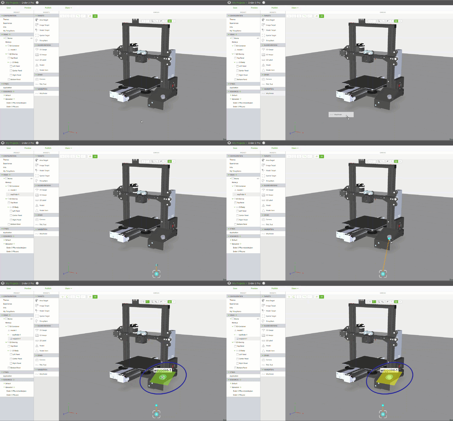
1. Drag and drop a Model widget onto the canvas.
2. In the Resource field, select an existing CAD file, add a new one, or enter the URL to the file you want to display.
3. Position the model on the canvas as desired.
4. Drag and drop a Wayfinder widget onto the canvas.
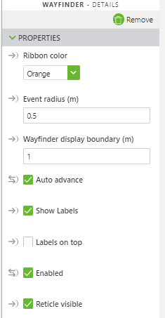
5. Make sure that the following properties are set for the Wayfinder widget:
◦ Event radius (m)—for this example, this property is set to 0.5
◦ Wayfinder display boundary (m)—for this example, this property is set to 1
◦ Auto advance—make sure this checkbox is selected
|
|
Enabling Auto advance will disable the use of the Departed event.
|
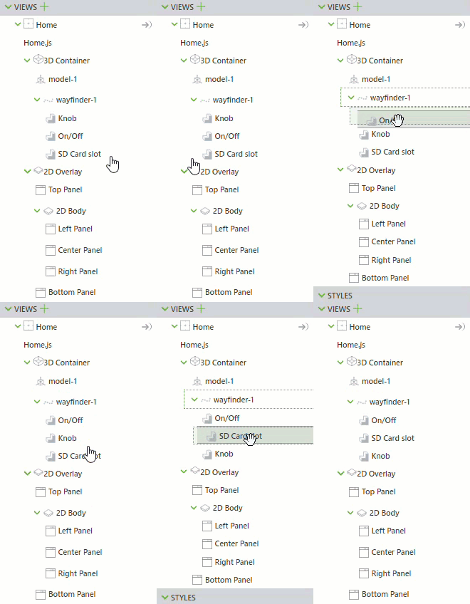
◦ Enabled—make sure this checkbox is selected 6. Drag the drop the add Waypoint icon (  ) to a location on the model. 7. Once you’ve placed the Waypoint, you can update the label by changing the Friendly Name. 8. Add any additional Waypoints. 9. Once you have all of your Waypoints on the model, you can then reorder them in you project tree if needed. The order that they appear in your project tree dictates the order in which the user will be led to the Waypoints. 10. Publish the experience, and then view it in Vuforia View. You’ll see the first waypoint appear. |
Are There Any Special Properties, Services, Events, or Actions?
Once Waypoints have been placed, you can select a Waypoint to view its own properties and events. For more information, see
Waypoints.
To view a list of common widget properties, services, and events, see
Common Widget Properties, Services, and Events.
The following tables list properties, services, and events that are specific to this widget.
|
Property Name
|
JavaScript Property
|
Description
|
|
Ribbon Color
|
ribbonColor
|
Select the color you want the ribbon of the Waypoint to be:
• Orange (Default)
• Red
• Green
• Blue
• Yellow
• Black
• White
• Magenta
• Turquoise
|
|
Select a color that contrasts well with your model or surroundings.
|
|
|
Event Radius (m)
|
eventRadius
|
By default, this property is set to 0.5.
When the user enters the event radius around the Waypoint, they have arrived/departed the Waypoint, and the Arrived or Departed event is triggered. This property can be overwritten by the Event Radius (m) of a specific Waypoint.
|
|
Wayfinder Display Boundary (m)
|
wayfinderDisplayBoundary
|
By default, this property is set to 2.
When any value above 0 is entered, the reticle and the ribbon will be hidden. To prevent this behavior set the Wayfinder Display Boundary (m) to 0. This property can be overwritten with the Wayfinder Display Boundary (m) property of a specific Waypoint.
|
|
Auto Advance
|
autoAdvance
|
This property is selected by default. If enabled, the Wayfinder will automatically advance navigation to the next Waypoint when a user enters the cutoff radius of a Waypoint.
|
|
Looping
|
looping
|
Returns user to the first Waypoint in the array once the last Waypoint is displayed.
|
|
Show Ribbon
|
showRibbon
|
This property is selected by default. If enabled, the Wayfinder ribbon will be shown at design and runtime.
|
|
Show Waypoints
|
showWaypoints
|
This property is selected by default. If enabled, Waypoints will be shown at design and runtime.
|
|
Show Labels
|
showLabels
|
This property is selected by default. If enabled, labels will be shown at design and runtime.
|
|
Labels on Top
|
labelsOnTop
|
This property is not selected by default. If enabled, labels will be shown on top of other objects and not occluded.
|
|
Enabled
|
|
This property turns the Wayfinder on or off at runtime. This includies visibility, event logging, event triggering, and services.
|
|
Show Reticle
|
showReticle
|
This property is not selected by default. If enabled, the reticle will be shown in the center of the screen during runtime.
|
|
Waypoints Data
|
waypointsData
|
Array of Waypoints that is zero-indexed.
|
|
Selected Waypoint Index
|
selectedWaypointIndex
|
Index of the currently selected Waypoint.
|
|
Selected Waypoint Data
|
selectedWaypointData
|
Object of the currently selected Waypoint.
|
|
Service Name
|
JavaScript Service
|
Description
|
|
Next
|
next
|
Navigation advances to the next Waypoint.
|
|
Previous
|
previous
|
Navigation goes back to the previous Waypoint.
|
|
Event Name
|
JavaScript Event
|
Description
|
|
Arrived
|
arrived
|
Triggered when a user reaches the cutoff radius of a Waypoint.
|
|
Departed
|
departed
|
Triggered when a user leaves the cutoff radius of a Waypoint.
|

 ) to a location on the model.


