 |
Available only in 3D Eyewear projects.
|
|
|
Available only in 3D Eyewear projects.
|
|
Property
|
JavaScript
|
Type
|
Description
|
|
Text
|
text
|
string
|
Text that appears next to the 3D Toggle Button.
|
|
Pressed
|
pressed
|
boolean
|
If selected, the toggle will be pressed by default in your experience.
|
|
Height
|
height
|
number
|
Height of the button in meters. The minimum value is 0.04 meters.
|
|
Width
|
width
|
number
|
Width of the button in meters. The minimum value is 0.04 meters.
|
|
Font Color
|
fontColor
|
color
|
Color of the font. Select a color from the color picker.
|
|
Button Color
|
color
|
color
|
Color of the button. Select a color from the color picker.
|
|
X Coordinate
|
x
|
number
|
Location of the model on the x-axis.
|
|
Y Coordinate
|
y
|
number
|
Location of the model on the y-axis.
|
|
Z Coordinate
|
z
|
number
|
Location of the model on the z-axis.
|
|
X Rotation
|
rx
|
number
|
Rotation of the model about the x-axis.
|
|
Y Rotation
|
ry
|
number
|
Rotation of the model about the y-axis.
|
|
Z Rotation
|
rz
|
number
|
Rotation of the model about the z-axis.
|
|
Disabled
|
disabled
|
boolean
|
When this checkbox is selected, the widget is not clickable.
|
|
Service
|
JavaScript
|
Description
|
|
Set
|
set
|
Puts the button into the pressed state. If the button is selected, the pressed event will fire.
|
|
Reset
|
reset
|
Puts the button into an unpressed state. If the button is selected, the unpressed event will fire.
|
|
Event
|
JavaScript
|
Description
|
|
Pressed
|
pressed
|
Triggered when the button is pressed. If the button is disabled, the event is not triggered.
|
|
Unpressed
|
unpressed
|
Triggered when the button is not pressed. If the button is disabled, the event is not triggered.
|
|
Instructions
|
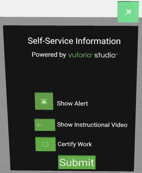
What It Looks Like
|
||||
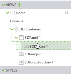
1. Drag and drop a 3D Panel widget onto the canvas.
2. Drag and drop a 3D Toggle Button widget onto the canvas. Move the widget to position where you want it.
3. Also for this example, we added a 3D Label next to the 3D Toggle Button that says Show Instructional Video.
4. Drag and drop a 3D Video widget onto the canvas.
5. Add the following code to Home.js:
$scope.showVideo = function(){
$scope.view.wdg['3DVideo-1']['visible'] = true; } $scope.hideVideo = function(){ $scope.view.wdg['3DVideo-1']['visible'] = false; } 6. Navigate back to the DETAILS pane of the 3D Toggle Button, an scroll down to EVENTS.
7. Click JS next to the Pressed event, and enter showVideo().
8. Click JS next to the Unpressed event, and enter hideVideo().
|
 Now, when you toggle the Show Instructional Video button, the 3D Video appears. 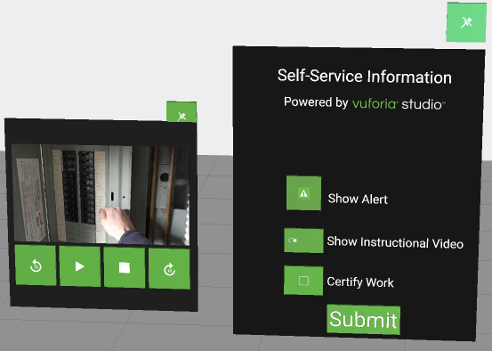 |