|
Property
|
JavaScript
|
Type
|
Description
|
|
Text
|
text
|
string
|
Text displayed on the widget.
|
|
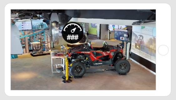
Resource
|
src
|
resource url
|
The path to the image being used for the 3D gauge. By default, this is set to vu_gauge1.svg.
To include a 3D Gauge, you can do one of the following: • Click  next to the field to add a new image file. next to the field to add a new image file.• Enter or copy and paste an image URL directly into the field. • Select an image from the drop-down menu. Supported file formats include: • .png • .jpg • .svg • .jpeg • .gif • .bmp |
|
Font
|
font
|
string
|
Font type. By default, this is set to Arial.
|
|
Font Size
|
fontsize
|
string
|
Size of the font specified in pixels. By default, this is set to 40px.
|
|
Text Attributes
|
textattrs
|
string
|
Attributes of the text including:
• Fill
• Text baseline
• Text alignment
|
|
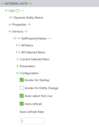
Enable State-Based Formatting
|
enableStateFormatting
|
boolean
|
Allows you to format the widget based on state definitions that have been defined in ThingWorx.
If the checkbox is selected the following properties appear:
• Dependent Field
• State Definition
For more information about style and state definitions in ThingWorx, see Style and State Definitions in the ThingWorx Help Center.
|
|
Dependent Field
|
stateFormatValue
|
string
|
This property is visible if the Enable State-Based Formatting checkbox is selected. For more information about style and state definitions in ThingWorx, see Style and State Definitions in the ThingWorx Help Center.
|
|
State Definition
|
stateFormat
|
boolean
|
This property is visible if the Enable State-Based Formatting checkbox is selected. For more information about style and state definitions in ThingWorx, see Style and State Definitions in the ThingWorx Help Center.
|
|
X coord of Text w/r/t Canvas
|
textx
|
number
|
Location of the text on the X-axis with respect to the canvas.
|
|
Y coord of Text w/r/t Canvas
|
texty
|
number
|
Location of the text on the Y-axis with respect to the canvas.
|
|
Scale
|
scale
|
string
|
Scale of the gauge
|
|
X Coordinate
|
x
|
number
|
Location of the gauge on the x-axis.
|
|
Y Coordinate
|
y
|
number
|
Location of the gauge on the y-axis.
|
|
Z Coordinate
|
z
|
number
|
Location of the gauge on the z-axis.
|
|
X Rotation
|
rx
|
number
|
Rotation of the gauge about the x-axis.
|
|
Y Rotation
|
ry
|
number
|
Rotation of the gauge about the y-axis.
|
|
Z Rotation
|
rz
|
number
|
Rotation of the gauge about the z-axis.
|
|
X coord of Image w/r/t Canvas
|
imagex
|
number
|
Location of the gauge on the X-axis with respect to the canvas.
|
|
Y coord of Image w/r/t Canvas
|
imagey
|
number
|
Location of the gauge on the Y-axis with respect to the canvas.
|
|
Canvas Growth Override
|
canvasgrowthoverride
|
string
|
Allows you to choose when the canvas size is overridden. Select one of the following options.
• Canvas grows with text size—the size of the canvas changes as the text gets bigger or smaller
• Canvas grows with image Size—the size of the canvas changes as the image gets bigger or smaller
• Canvas grows with image and text sizes (default)—the size of the canvas changes as the image or text gets bigger or smaller (larger value between the text and image will override the size of the canvas)
• No Override—the canvas will stay the size that was defined by the Canvas Height and Canvas Width properties.
|
|
Canvas Height
|
canvasheight
|
number
|
Height of the canvas.
|
|
Canvas Width
|
canvaswidth
|
number
|
Width of the canvas.
|
|
Billboard
|
billboard
|
boolean
|
Rotates a widget around its center so it is always facing the viewer. It is aligned with the screen.
|
|
Occluding
|
occlude
|
boolean
|
When this checkbox is selected, the geometry of a widget is invisible, but at the same time hides any other augmentations behind it in the 3D scene.
Therefore, the background or camera feed appears where the occluded widget should be. This can be used to emphasize some augmentations by hiding surrounding 3D geometry.
|
|
Always on top
|
decal
|
boolean
|
Overlays the widgets geometry on any other augmentations in the scene regardless of its depth in the 3D scene. If set to Yes, it is never hidden by other augmentations. Typically this can be used for labels or sensors that must always remain visible.
|
|
Opacity (1 Opaque - 0 Transparent)
|
opacity
|
number
|
A number between 0 and 1 that controls the level of transparency of the object. 0=completely transparent and 1=completely opaque.
|
|
Pivot
|
pivot
|
select
|
Determines the pivot point of the image:
• Top Left
• Top Center
• Top Right
• Middle Left
• Middle Center
• Middle Right
• Bottom Left
• Bottom Center
• Bottom Right
|
|
Height
|
height
|
number
|
Height of the gauge in meters.
|
|
Width
|
width
|
number
|
Width of the gauge in meters.
|