 |
Available only in 3D Eyewear projects.
|
|
|
Available only in 3D Eyewear projects.
|
|
|
We recommend using a 3D Press Button in place of the 3D Button, as the 3D Button widget will be deprecated in a future release. Here are a few things to keep in mind:
• The 3D Button widget will no longer available for new projects. This will not immediately affect existing projects that contain 3D Button widgets, and you will still be able to edit and re-publish projects that contain them.
• Then, at a later date (TBD), all existing 3D Buttons will be transitioned to 3D Press Buttons. More information on this transition will be forthcoming.
|
|
Property
|
JavaScript
|
Type
|
Description
|
|
Text
|
text
|
string
|
Text that appears on the as a label on the 3D button
|
|
Resource
|
src
|
resource url
|
Path to the resource being used for the 3D button. To include an image, you can do one of the following:
• Click next to the field to add a new image file.
• Enter or copy and paste an image URL directly into the field.
• Select an image from the drop-down menu.
Supported file formats include:
• .png
• .jpg
• .jpeg
• .gif
• .bmp
|
|
Height
|
height
|
number
|
Height of the 3D button in meters. The minimum value is 0.04 meters.
|
|
Width
|
width
|
number
|
Width of the 3D button in meters. The minimum value is 0.04 meters.
|
|
Font Color
|
fontColor
|
color
|
Color of the font. Select a color from the color picker.
|
|
X Coordinate
|
x
|
number
|
Location of the widget on the x-axis.
|
|
Y Coordinate
|
y
|
number
|
Location of the widget on the y-axis.
|
|
Z Coordinate
|
z
|
number
|
Location of the widget on the z-axis.
|
|
X Rotation
|
rx
|
number
|
Rotation of the widget about the x-axis.
|
|
Y Rotation
|
ry
|
number
|
Rotation of the widget about the y-axis.
|
|
Z Rotation
|
rz
|
number
|
Rotation of the widget about the z-axis.
|
|
Button Color
|
color
|
color
|
Color of the button. Select a color from the color picker.
|
|
Minimum Steps Required for Use
|
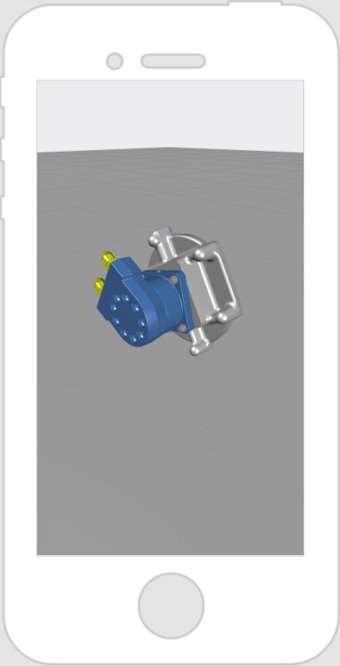
What It Looks Like
|
|
1. Drag and drop a 3D Button widget onto the canvas.
2. Enter the text you want displayed in the Text field or bind a data property to the Text field of the widget.
|
 |