Slider Widget
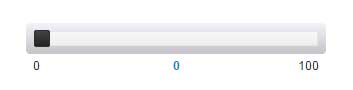
The slider allows for input of numerical values using a slider control. The value is not updated until the user changes the value on the slider, unless TrackingMode is set to true. When false, an event is fired and the value is changed when the user changes the position of the slider. It is possible to set a minimum and maximum value. The orientation of this slider is horizontal.
Properties
For information about common widget properties, see Widgets. Properties that are specific to the Slider widget are described in the table below.
|
Property Name
|
Description
|
Base Type
|
Default Value
|
Bindable? (Y/N)
|
Localizable? (Y/N)
|
|---|---|---|---|---|---|
|
CustomClass
|
User defined CSS class to apply to the top div of the widget. Multiple classes can be entered, separated by a space.
|
STRING
|
n/a
|
Y
|
N
|
|
Value
|
Value of the slider
|
NUMBER
|
0
|
Y
|
N
|
|
Minimum
|
Minimum acceptable value for the slider
|
NUMBER
|
0
|
Y
|
N
|
|
Maximum
|
Maximum acceptable value for the slider
|
NUMBER
|
100
|
Y
|
N
|
|
Step
|
Value for each step of the slider
|
NUMBER
|
1
|
Y
|
N
|
|
SliderHandle
|
Shape (square or circle) of the slider handle
|
STRING
|
Square
|
N
|
N
|
|
SliderBar
|
Thickness of the slider bar (thick or thin)
|
STRING
|
Thick
|
N
|
N
|
|
SteppingMode
|
When enabled, moves the slider by the Step amount when the slider bar is clicked.
|
BOOLEAN
|
false
|
N
|
N
|
|
TrackingMode
|
When enabled, the slider generates events as it changes value. Use with caution!
|
BOOLEAN
|
false
|
N
|
N
|
|
DisplayMinMaxLabels
|
When enabled, displays the minimum and maximum values of the slider.
|
BOOLEAN
|
true
|
N
|
N
|
|
DisplayValueLabel
|
When enabled, displays the value of the slider.
|
BOOLEAN
|
true
|
N
|
N
|
|
Disabled
|
If this property is selected, the slider widget is displayed in the mashup but the user cannot click it.
|
BOOLEAN
|
false
|
Y
|
N
|
Events
ValueChanged
When the user changes the value of the slider, this event is fired.