Widgets
ThingWorx widgets are the visual components of ThingWorx mashup pages. A widget can be an advanced data renderer, such as a chart, or more of a utility component, such as a button or a navigation link. Data rendering widgets have incoming data bindings. When a data service is executed, the data result set is bound to the widget for rendering. Other widgets, such as a button, may not have incoming data bindings, but may have an outgoing event binding. For example, you can bind the Clicked event of a Button widget to a data service. When you click the button, the data service is executed on the server.
Widget Categories for 8.4.X
The 78 widgets are classified into three major categories in the ThingWorx Platform.
• Standard: There are 64 widgets that are listed as Standard in the Mashup Builder. These are the existing widgets in the ThingWorx Platform.
• Beta: There are 13 new widgets that are listed as Beta. These are also available as web components that you can import from an SDK.
• Legacy: Only the Repeater widget is listed as Legacy. This widget will be deprecated in a future release.
There are other widgets that are available as extensions. Some of these extensions are listed in Extensions. There are some extensions available in the PTC Software Download page that you can import to ThingWorx and use. These imported extensions are listed in the Imported category in the Mashup Builder.
Widget Categories for 8.5.X and Later
The widgets are classified into five major categories in the platform. Click the arrow next to Category on Widgets panel in the ThingWorx composer Design page to select a widget category. A description of what is included in each category follows:
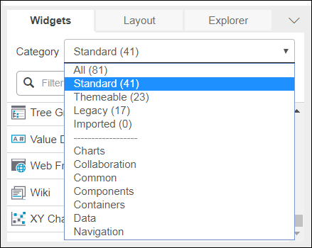
• All: All the widgets.
• Standard: Web component widgets and the existing widgets in the ThingWorx Platform that do not have a web component as a replacement.
 | Some widgets are referred to as web components because they are available in the ThingWorx Platform and can be imported from an SDK. |
• Themeable: Widgets to which you can apply style themes. These widgets are categorized as Beta in the earlier releases.
• Legacy: Widgets with replacements that are standard widgets. The legacy widgets will be deprecated in a future release.
• Imported: Widgets that are imported to the ThingWorx Platform are listed in this category. Some of these extensions are listed on Extensions. There are some extensions available in the PTC Software Download page that you can import to ThingWorx and use.
There are subcategories in the panel to help you to find widgets based on the function of widgets. The widgets that perform a similar function are listed together in each of these subcategories. For example, the Charts displays a list of all widgets that can render a chart. You can select the following subcategories to find the widget to use in the mashup; Charts, Collaboration, Common, Components, Containers, Data, and Navigation
Widget Placement
You can drag widget to a location on a mashup. For example, you can drag a widget to a mashup root, or to a container object such as a panel or a fieldset.
Widget Properties
All widgets have properties for configuring the specific widget instance on a page. Properties are edited in the widget properties pane of the Mashup Builder. Properties can be manually set or be bound to other data services or events in the mashup. If a property is bindable, next to the property name there will be an input facing arrow (the property value may be set from another source), and output facing arrow (the property value can be the source for another property or parameter's value), or both. The following properties are shared by every widget:
• Id—A unique identifier used internally by ThingWorx.
• Type—The widget type.
• DisplayName—A user defined friendly name to identify the widget.
• Description—User-defined description.
• Top—Top Y-Coordinate for the widget location.
• Left—Left X-Coordinate for the widget location.
• Width—Width in pixels.
• Height—Height in pixels.
• Z-index—Ordering for layered widgets. Typically, a lower Z-index moves the widget behind another widget with a higher Z-index.
• ShowDataLoading—Displays the data while it loads.
• Visible—Displays the widget when viewing the mashup.
When a property value is set manually, the property row background is highlighted. If the property has a binding, the relevant input arrow is filled in.
Widget Configuration
You can open the widget configuration dialog in one of the following ways:
• Hover over the drop-down arrow in the top-left corner of the widget container, and then choose Configure Bindings from the list.
• Select the widget, then click the  command in the Properties panel.
command in the Properties panel.The configuration dialog lists all the bindable properties of the widget. You can view or set the binding sources and targets for each property. This dialog functions as an alternative to the standard drag-and-drop method for binding. Some widgets, such as the Advanced Grid, have their own configuration dialogs where you can set options that are specific to the widget.
Localization for Applications
When you click  next to a text property, the text is no longer set to static and is instead based on localization tokens. Click the magic picker, so you can select an existing localization token or create a new one. When you are adding a new localization token, you add a namespaced token name, which will prevent conflicts with tokens from other sources and allow developers and translators to work with application-specific tokens only. For String Value field, you enter the default text value. After you define all tokens needed for the application, you can review them on the Localization Tokens page by filtering on the token name. You should add usage and context information for each token.
next to a text property, the text is no longer set to static and is instead based on localization tokens. Click the magic picker, so you can select an existing localization token or create a new one. When you are adding a new localization token, you add a namespaced token name, which will prevent conflicts with tokens from other sources and allow developers and translators to work with application-specific tokens only. For String Value field, you enter the default text value. After you define all tokens needed for the application, you can review them on the Localization Tokens page by filtering on the token name. You should add usage and context information for each token.For translations into other languages, confirm that the localization tables for those languages exists. You can use the Import/Export menu to export the entities to an XML file. You enter your name spaced localization token as the token prefix. In the XML output file, the translations for other languages should be added to the empty <Rows/> element. After the translations are ready and you confirmed that the localization table attributes name, description, languageCommon, and languageNative are correct, you can import them into ThingWorx and they are merged with the existing localization tables for the language.
Consider the following:
• If a new language is introduced, many widgets use tokens from the System localization table. These tokens need to be translated but there is no easy way to restrict the set of tokens to those used. Therefore, this is a manual filtering step. For existing languages, check if the System tokens have already been translated.
• When exporting and editing XML files, ensure that UTF-8 encoding is maintained. Encoding problems can appear as errors when a file is reimported or as localized strings with question marks or other unexpected characters in place of accented letters. ThingWorx should be set to use UTF-8 as the default file encoding. Specify the Java option -Dfile.encoding=UTF-8 on launch.
Widget Events
Many widgets have events in addition to properties. Events can be used to fire data services. If a widget has one or more events, they are available as in the Properties panel (with a lightning bolt icon) and via the click menu. From the click menu, you can drag a widget event to a data service.
Widget Styling
Style definitions are system-defined entities for controlling the look and rendering of a widget. Some widgets also support state definitions, so you can dynamically apply styles based on data values. See the individual widget sections for more details. For information about the properties panel for styling the widgets, refer to the Theming.