HTMLTextArea Widget
The HTMLTextArea Widget allows you to type in text, format it, and then write the formatted text out in well formed HTML. You can also use the widget to display well formed HTML output within your Mashup.
 |
Styles and common widget properties are not included in the table below.
|
|
Property Name
|
Description
|
Base Type
|
Default Value
|
Bindable? (Y/N)
|
Localizable? (Y/N)
|
|---|---|---|---|---|---|
|
CustomClass
|
User defined CSS class to apply to the top div of the widget. Multiple classes can be entered, separated by space.
|
STRING
|
n/a
|
Y
|
N
|
|
Text
|
The text that appears in the widget.
|
STRING
|
n/a
|
Y
|
N
|
|
ShowBorder
|
Display the Widget border.
|
BOOLEAN
|
False
|
N
|
N
|
|
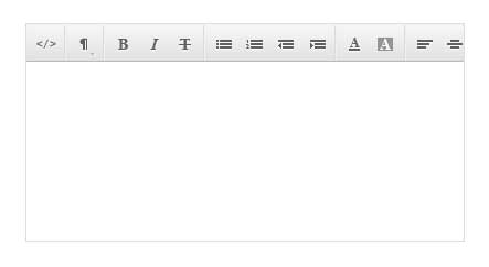
ShowToolbar
|
This property is enabled by default. It shows the toolbar in the editable widget at runtime.
|
BOOLEAN
|
True
|
Y
|
N
|
|
ReadOnly
|
Enables you to make the text area in the widget read only.
|
BOOLEAN
|
False
|
Y
|
N
|
|
LabelAlignment
|
Alignment of the label (Left, Right, or Center).
|
STRING
|
Left
|
N
|
N
|
|
ToolTipField
|
Optional field to include tooltips that display in runtime.
|
STRING
|
n/a
|
Y
|
Y
|
|
ShowDataLoading
|
Display data while it loads.
|
BOOLEAN
|
True
|
N
|
N
|
|
Visible
|
Widget is visible when viewing mashup.
|
BOOLEAN
|
True
|
Y
|
N
|
|
ResetToDefaultValue
|
Event. Allows a user to bind an Event that will return the HTMLTextArea to its default value.
|
n/a
|
n/a
|
Y
|
N
|