Gauge Widget
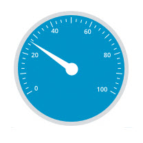
The Gauge Widget is a single needle gauge. You can define how many sections, or intervals the Gauge has, as well as different color schemes for each interval.
 |
Styles and common widget properties are not included in the table below.
|
|
Property Name
|
Description
|
Base Type
|
Default Value
|
Bindable? (Y/N)
|
Localizable? (Y/N)
|
|---|---|---|---|---|---|
|
CustomClass
|
User defined CSS class to apply to the top div of the widget. Multiple classes can be entered, separated by a space.
|
STRING
|
n/a
|
Y
|
N
|
|
Data
|
Data source (a single numeric value as opposed to a complete data set / InfoTable).
|
NUMBER
|
n/a
|
Y
|
N
|
|
MinValue
|
Minimum value for the gauge
|
NUMBER
|
0
|
Y
|
N
|
|
MaxValue
|
Maximum value for the gauge
|
NUMBER
|
100
|
Y
|
N
|
|
ValueFormatter
|
Styling rules for gauge needle and value display.
|
STATEFORMATTING
|
State Formatting
|
N
|
N
|
|
FormatNeedle
|
Applies State Formatting to the needle.
|
BOOLEAN
|
True
|
N
|
N
|
|
Intervals
|
Number of gauge intervals (affects ticks, labels, and indicator ring).
|
NUMBER
|
10
|
N
|
N
|
|
IntervalsPerLabel
|
Number of gauge intervals per label (affects the amount of labels).
|
NUMBER
|
2
|
N
|
N
|
|
LabelDisplayMode
|
Location to display the Label (inside, outside, or none).
|
BOOLEAN
|
Inside
|
N
|
N
|
|
ShowDataLoading
|
Displays the data while it is loading.
|
BOOLEAN
|
True
|
N
|
N
|
|
MinorTicks
|
Number of minor ticks between major ticks.
|
NUMBER
|
4
|
N
|
N
|
|
TickLength
|
Length of major tick.
|
NUMBER
|
8
|
N
|
N
|
|
MinorTickLength
|
Length of minor tick.
|
NUMBER
|
4
|
N
|
Y
|
|
ValueDisplayMode
|
Location to display the Value (top, bottom, inside, or none).
|
STRING
|
Bottom
|
N
|
N
|
|
LabelDigits
|
Number of digits used to display the label values.
|
NUMBER
|
3
|
N
|
N
|
|
LabelDecimals
|
Number of decimals used to display the label values.
|
NUMBER
|
0
|
N
|
N
|
|
ValueDigits
|
Number of Digits used to display the values.
|
NUMBER
|
3
|
N
|
N
|
|
ValueDecimals
|
Number of Decimals used to display the values.
|
NUMBER
|
0
|
N
|
N
|
|
LegendDisplayMode
|
Location to display the legend (Top, Bottom, or None).
|
STRING
|
Bottom
|
N
|
N
|
|
Legend
|
Text for the gauge legend.
|
STRING
|
n/a
|
Y
|
Y
|
|
ReferenceAngle
|
Angle that controls the gauge orientation (degrees).
|
NUMBER
|
225
|
N
|
N
|
|
Aperture
|
Angle that controls the gauge size (degrees).
|
NUMBER
|
270
|
N
|
N
|
|
NeedleDiameter
|
Diameter of the gauge needle (pixels).
|
NUMBER
|
10
|
N
|
N
|
|
CenterDiameter
|
Diameter of the gauge center (pixels).
|
NUMBER
|
20
|
N
|
N
|
|
GaugeBorder
|
Width/thickness of the gauge border (pixels).
|
NUMBER
|
20
|
N
|
N
|
|
RingWidth
|
Width/thickness of the gauge ring (pixels).
|
NUMBER
|
10
|
N
|
N
|
|
ToolTipField
|
Optional tooltip that is displayed when hovering over the widget in runtime.
|
STRING
|
n/a
|
Y
|
Y
|
|
ShowDataLoading
|
Shows data loading.
|
BOOLEAN
|
True
|
N
|
N
|
|
Visible
|
Sets the visibility of the widget at runtime.
|
BOOLEAN
|
True
|
Y
|
N
|