Date Time Picker Widget (Themable)
 |
This themable widget was listed as Beta in the ThingWorx 8.4.X release.
|
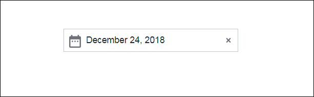
The Date Time Picker widget enables you to set a date and time in the mashup.
|
|
The Date Time Picker is available as a standard widget in the platform and as a web component that can be imported from an SDK.
|
The properties of the Date Time Picker widget are listed below.
|
Property Name
|
Description
|
Base Type
|
Default Value
|
Bindable? (Y/N)
|
Localizable? (Y/N)
|
|---|---|---|---|---|---|
|
Label
|
The text that is displayed in the label of the Date Time Picker widget.
|
STRING
|
n/a
|
Y
|
Y
|
|
Disabled
|
Use this property to disable the widget in the mashup. The widget is displayed in the mashup but you cannot click it.
|
BOOLEAN
|
False
|
Y
|
N
|
|
HintText
|
Displays placeholder text that explains what should be entered in the field.
|
STRING
|
Select Date & Time
|
Y
|
Y
|
|
DateOnly
|
Enables you to display only the date.
|
BOOLEAN
|
True
|
N
|
N
|
|
DisplaySeconds
|
Enables you to display the time with seconds.
|
BOOLEAN
|
False
|
N
|
N
|
|
DateDelimiter
|
Allows you to set one character to separate the day, month, and year. For example, a — (hyphen) or / (slash) as in 05/10/2020.
|
STRING
|
n/a
|
N
|
Y
|
|
MonthFormat
|
Enables you to display the month in either full, short , or numeric format.
|
STRING
|
Full
|
N
|
N
|
|
PrimaryActionPosition
|
Enables you to set the position of the primary action button to the Left or Right.
The primary action is the Done button in the button group.
|
STRING
|
Left
|
N
|
N
|
|
DateOrder
|
Enables you to set the format of the date display. The different formats are Auto, Day-Month-Year, Month-Day-Year and Year-Month-Day.
When the default Auto is selected, the system date appears in the widget. Also, the DateDelimiter and MonthFormat properties are disabled by the widget.
|
STRING
|
Auto
|
N
|
N
|
|
FormatToken
|
Localize the date and time format using dd-mm-yy pattern. This property overrides the DisplaySeconds, DateOnly, DateDelimiter, MonthFormat and DateOrder properties.
This syntax follows the ISO format.
|
STRING
|
n/a
|
N
|
Y
|
|
IntervalType
|
Enables you to set an interval type as Hours, Minutes, Seconds, or Days.
This property is available only when you select the InitializeWithCurrentDateTime property. For example, when you set an interval type from the dropdown list as Days and enter an integer value 1 in the Interval property field, the widget picks tomorrow’s date.
|
STRING
|
Hours
|
N
|
N
|
|
Interval
|
Enables you to set an initial interval.
This property is available only when you select the InitializeWithCurrentDateTime property.
|
NUMBER
|
n/a
|
N
|
N
|
|
CustomClass
|
Enables you to define the CSS to the top div of the widget. Multiple classes can be entered, separated by space.
|
STRING
|
n/a
|
Y
|
N
|
|
TabSequence
|
The sequence of the widgets in which they are highlighted when the user presses Tab key.
|
NUMBER
|
n/a
|
N
|
N
|
|
WeeklyCalendarStart
|
Enables you to set the weekly calendar to start on Sunday or Monday.
|
STRING
|
Monday
|
N
|
N
|
|
InitializeWithCurrentDateTime
|
Enables you to set the DateTime property with current date and time. If this property is not selected, you must enter the date and time.
|
BOOLEAN
|
True
|
N
|
N
|
|
LabelAlignment
|
Enables you to align the label to the left, right or center on the widget.
|
STRING
|
Left
|
N
|
N
|
|
DateTime
|
Source for date and time value of the date time picker.
|
DATETIME
|
n/a
|
Y
|
N
|
|
Changed
|
A bindable event that is triggered when the data for this widget is modified.
|
n/a
|
n/a
|
Y
|
N
|
|
ResetToDefaultValue
|
Resets the inputs for this widget to its default values.
|
n/a
|
n/a
|
Y
|
N
|
|
Width
|
The width of the widget.
|
NUMBER
|
n/a
|
N
|
N
|
|
Height
|
The height of the widget. The height is set to the maximum width of the label by default. It increases if the widget has multiline label. Enter a value in the property panel or resize the widget in the canvas to set a fixed height.
|
NUMBER
|
n/a
|
N
|
N
|