Collection Widget
The Collection Widget is an advanced widget that allows you to contain a series of repeated mashups within a collection. The Collection Widget uses an infotable service to dynamically define visual content. The Collection Widget is similar to the Repeater Widget, but contains more properties that provide more options and better performance.
 |
The Collection Widget is available in ThingWorx 8.2 and later. It is recommended that you use the Collection Widget instead of the Repeater Widget.
|
Key Features
• More than 60 properties that allow for detailed control over spacing, padding, headers, footers, sections, animations, and more
• Includes the ability to add dynamic data to every cell
• Performs better than the Repeater Widget. To improve memory use, the Collection widget caches a significant amount of information for the visualization. Browsing and scrolling during run time is quicker and smoother than the Repeater widget.
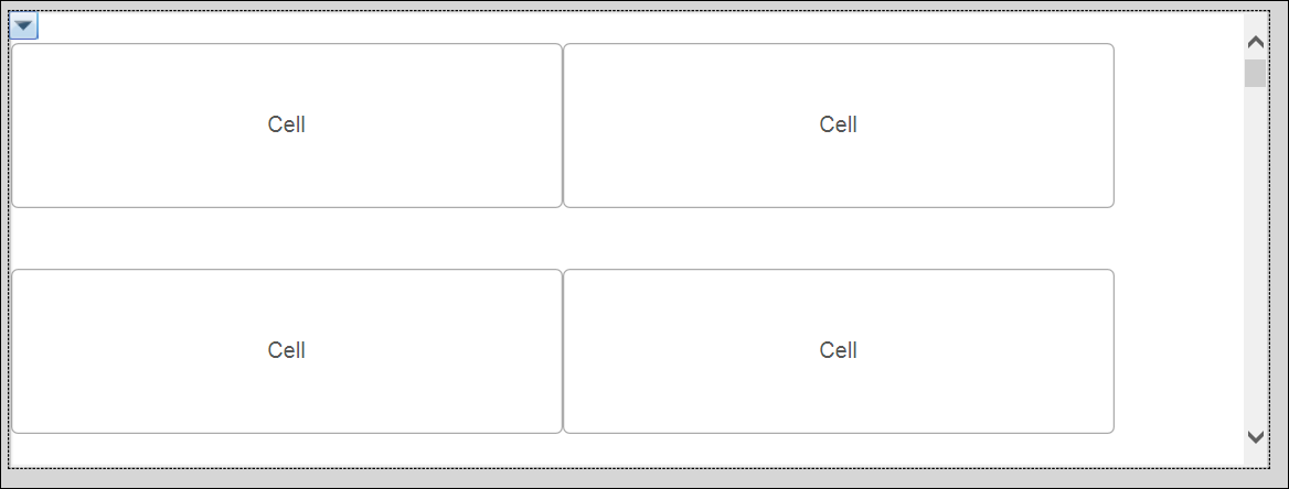
There are two views that can be used in the Collection Widget:
• Flow Layout: Responsive, horizontal wrap. This layout is most similar to the Repeater Widget.
• Table Layout: Vertically stacked, allows one mashup per row.
Usage Overview
MashupPropertyBinding is an important property in the Collection Widget. A JSON string must be given that associates the infotable field names with mashup parameters so that the data gets passed through. For example:
{"events":"eventsName","min_temp":"minTemp","max_temp":"maxTemp","precipitation":"precipitation","image":"image","wind":"wind","sourceType":"sourceType","date":"date","week":"week","id":"rowId"}
The optional MashupGlobalPropertyBinding provides a way to add custom properties you define to pass in variable data that should appear the same in every cell in the Collection, such as a product name. Consider using it for any data that would otherwise need to be part of the contained mashup or passed in redundantly through the service to every row via MashupPropertyBinding.
MashupGlobalPropertyBinding uses the same JSON format, but each entry must contain a unique property name (that you define) as a key, and a ThingWorx base type as its value (i.e. STRING, NUMBER, BOOLEAN). Every entry will provide a bindable custom property to the collection widget when you tab out of the MashupGlobalPropertyBinding field.
Populating the Widget with Data
There are multiple ways that you can configure the Collection Widget to get populated with Mashups in the widget at run time:
• You can define a mashup by setting the property to a mashup name.
• You can bind to the Mashup name property.
• You can use a service to provide a mashup name for each cell.
• You can define a Mashup to display when a cell is selected or is empty.
Known Browser Limitations
The Collection Widget performs and loads faster on Chrome and Firefox. It works well on Edge. Load times are longer and performance is slower on Internet Explorer 11.
Properties
For information about common widget properties, see Widgets. Properties that are specific to the Collection widget are described in the table below.
|
Property Name
|
Description
|
Base Type
|
Default Value
|
Bindable? (Y/N)
|
Localizable? (Y/N)
|
||
|---|---|---|---|---|---|---|---|
|
Data
|
Represents the data source for the widget.
|
INFOTABLE
|
n/a
|
Y
|
N
|
||
|
View
|
Layout types. Options are Flow and Table. Flow is responsive and table is grid-like, allowing one mashup per row.
|
STRING
|
Flow
|
Y
|
N
|
||
|
Mashup
|
The mashup to use for data items.
|
MASHUPNAME
|
n/a
|
Y
|
N
|
||
|
MashupHeight
|
The default cell height.
|
INTEGER
|
120
|
N
|
N
|
||
|
MashupWidth
|
The default cell width.
|
INTEGER
|
400
|
N
|
N
|
||
|
UIDField
|
Represents the unique identifier of a collection item. Should be NUMBER base type for best results with sorting. This can be any type of field that uniquely identifies an item. When using an existing service, if a field has the Is Primary Key aspect selected, it should be used for the UIDField. If a primary key is not defined, consider using a service to combine an existing infotable into a new one that includes a field with a GUID or NUMBER base type set as the primary key. This may also require adding a data shape that includes the GUID field.
|
INFOTABLE
|
n/a
|
N
|
N
|
||
|
SortField
|
When set or bound, this identifies the infotable field (as specified in the Data property) by which the section contents are sorted. The sorting is performed client-side and does not affect the source infotable or other widgets bound to the data set. This option is not required, but there is no guarantee that a service will return rows in a particular order every time. Consider setting this to the same field as the UIDField.
|
INFOTABLE
|
n/a
|
Y
|
N
|
||
|
SortAscending
|
Used with SortField. When enabled, the sort will be performed ascending, otherwise it will be descending.
|
BOOLEAN
|
n/a
|
Y
|
N
|
||
|
SectionField
|
Optional. Represents the section identifier by which to group the items. If set, the items will be grouped in sections. There is support for one section only. A section will group rows with a common value found in the SectionField. For example, it could be used to group rows that contain a week number field into week sections. Then the header and footer can be used to show where each week starts and ends.
|
INFOTABLE
|
n/a
|
N
|
N
|
||
|
SectionInsetLeft
|
If using sections, this is a way to indent or visually separate section contents to the left.
|
INTEGER
|
0
|
N
|
N
|
||
|
SectionInsetTop
|
If using sections, this is a way to indent or visually separate section contents to the top.
|
INTEGER
|
0
|
N
|
N
|
||
|
SectionInsetRight
|
If using sections, this is a way to indent or visually separate section contents to the right.
|
INTEGER
|
0
|
N
|
N
|
||
|
SectionInsetBottom
|
If using sections, this is a way to indent or visually separate section contents to the bottom.
|
INTEGER
|
0
|
N
|
N
|
||
|
LeftAlignFinalRow
|
If enabled, the final row in each section will be aligned to the left rather than the center.
|
BOOLEAN
|
n/a
|
N
|
N
|
||
|
FlowLayoutGravity
|
Controls how cells will flow in their row.
Options include: Edge, Spaced, Center, or Expand.
Edge: Cells will align to the nearest side that contain them, otherwise will maintain even spacing between themselves.
Spaced: Cells will maintain even spacing between themselves and the widget sides that contain them.
Center: Cells will center within available width while displaying as many cells in each row as will fit.
Expand: Cells will expand to fill available width, even beyond the MashupWidth property setting.
|
STRING
|
n/a
|
N
|
N
|
||
|
FlowLayoutAlignment
|
Must be used with Flow layout. Controls how cells will be aligned vertically in their row.
This property is useful for controlling vertical alignment when cell heights vary. This can be expected when getting cell heights from a service via the CellHeightField property, or when using the MashupNameField property and setting the UseMashupDimensions property to true.
Top: Align adjacent cells to row top.
Center: Align adjacent cells to row center.
Bottom: Align adjacent cells to row bottom.
Expand: Adjacent cells adjust height to match the tallest cell.
|
STRING
|
Center
|
N
|
N
|
||
|
FlowLayoutContentGravity
|
Must be used with the Flow layout. Controls how content is aligned vertically within the collection view when its size is smaller than the collection view.
The available options are Top, Center, and Bottom.
Top: Cells will fill space starting from the top.
Center: Cells will fill space starting from the vertical center.
Bottom: Cells will fill space starting from the bottom.
|
STRING
|
n/a
|
N
|
N
|
||
|
RowSpacing
|
Controls the spacing between headers, rows, and footers.
|
INTEGER
|
44
|
N
|
N
|
||
|
MinimumSpacing
|
Controls the minimum amount of horizontal spacing between cells/
|
||||||
|
TopPadding
|
Controls the padding of top margin and the first item.
|
INTEGER
|
22
|
N
|
N
|
||
|
BottomPadding
|
Controls the padding of the bottom margin and the last item.
|
INTEGER
|
22
|
N
|
N
|
||
|
MashupNameField
|
Provides a mashup name to use for data items. If set, this property supersedes the selections in Mashup and SelectedFieldMashup.
|
||||||
|
PinHeadersToTop
|
If enabled, the currently visible section header will be stuck to the top edge of the widget as you scroll through its contents.
|
BOOLEAN
|
n/a
|
N
|
N
|
||
|
PinFootersToBottom
|
If enabled, the currently visible section footer will be stuck to the bottom edge of the widget as you scroll through its contents.
|
BOOLEAN
|
n/a
|
N
|
N
|
||
|
MashupPropertyBinding
|
A JSON string that associates infotable field names with mashup parameters. Each key name should be an infotable field that is used to provide data to each contained mashup. Each value should be the name of a corresponding mashup parameter that is bound to a widget in the contained mashup in the Collection Widget.
For example:
{"events":"eventsName","min_temp":"minTemp","max_temp":"maxTemp","precipitation":"precipitation","image":"image","wind":"wind","sourceType":"sourceType","date":"date","week":"week","id":"rowId"}
|
STRING
|
n/a
|
N
|
N
|
||
|
MashupGlobalPropertyBinding
|
Optional. A JSON string used to create a bindable custom property. This property is useful for dynamically binding data that should be the same in every contained mashup, such as a product name, global status indicator, etc. Each key name can be any legal property name you want to add to the widget. Each value must be a data type which the property will be assigned when added .i.e. “STRING”, “NUMBER”, “BOOLEAN”. The property will be added to the widget as soon as you tab out of the MashupGlobalPropertyBinding property and it is validated. Scroll down in the properties window or type in its name in the property filter. This may be used to bind data to the custom property in order to pass it into a mashup parameter of the contained mashup in the widget.
|
STRING
|
n/a
|
N
|
N
|
||
|
CellWidthField
|
The field to define the default width for cells from a service. The values supersede CellWidth.
|
||||||
|
CellHeightField
|
The field to define the default height for cells from a service. The values supersede CellHeight.
|
||||||
|
CellMashupSelectedField
|
Optional. If specified, this represents the mashup parameter that will receive the selected state of the object it is bound to. This provides a way to identify an infotable field used to provide the selection state of each cell in the widget.
|
STRING
|
n/a
|
N
|
N
|
||
|
UseMashupDimensions
|
Optional. Must be used with the MashupNameField property and static cell mashups. Will match the cell size to the mashup it contains.
|
||||||
|
AllowSelection
|
If enabled, cells can be selected, otherwise cells will be unselectable by this collection widget.
|
BOOLEAN
|
n/a
|
N
|
N
|
||
|
MultiSelect
|
Enables multi selection. Multiple selections in the Collection widget do not require CTRL + click or SHIFT + click. Click to select as many cells as necessary and click cells to deselect. There is no support for range selection by mouse.
|
BOOLEAN
|
n/a
|
N
|
N
|
||
|
HasSelectedCells
|
Will be set to true whenever there is at least one selected cell in this Collection Widget.
|
BOOLEAN
|
false
|
Y
|
N
|
||
|
SelectedCellsCount
|
Contains the number of selected cells in the collection view.
|
INTEGER
|
0
|
Y
|
N
|
||
|
ScrollsToSelectedCell
|
Enables selection changes to cause the collection to scroll to the first selected cell.
|
BOOLEAN
|
n/a
|
N
|
N
|
||
|
AutoSelectFirstCell
|
When data is updated and no other cell is selected, the Collection Widget will automatically select the first available cell.
|
BOOLEAN
|
n/a
|
N
|
N
|
||
|
SelectedItems
|
Provides a binding to set the current selected cells from a service. The most recent selection in a multiple section will be updated in the collection.
|
INFOTABLE
|
n/a
|
Y
|
N
|
||
|
SelectedMashupName
|
Optional. Overrides the CellSelectedStyle if it is set. Defines a mashup that will replace the one defined in the Mashup or MashupFieldName properties when a cell is selected in run time. In most cases, the SelectedMashup should have the same dimensions as the default mashup. It may also have some, all, or more mashup parameters as the default mashup. A use case for this capability would be to provide a more detailed view of data when cell is selected or to reveal additional selection or filtering options on the data presented.
|
MASHUPNAME
|
n/a
|
N
|
N
|
||
|
HandleSelectionUpdates
|
If enabled, the collection will receive and transmit selection updates to its data service. This toggles the usual way that data widgets that share a common service in a mashup update each other’s selections. For example, when you click a grid row and a chart point is highlighted that is bound to the same service.
|
BOOLEAN
|
n/a
|
N
|
N
|
||
|
CellStyle
|
Controls the background of cells. Only the background color property of the style is used.
|
STYLE
|
n/a
|
N
|
N
|
||
|
CellSelectedStyle
|
Controls the background color of the selected cells. Only the background color property of the style is used.
|
STYLE
|
n/a
|
N
|
N
|
||
|
CellHoverStyle
|
Controls the background color of the cells when hovering. Only the background color property of the style is used.
|
STYLE
|
n/a
|
N
|
N
|
||
|
CellActiveStyle
|
Controls the background color of the cells when selected. Only the background color property of the style is used.
|
STYLE
|
n/a
|
N
|
N
|
||
|
RippleEffectStyle
|
This must be used with the UseRippleEffect property. Only the background color property of this style is used, which will be applied to the ripple animation effect.
|
STYLE
|
n/a
|
N
|
N
|
||
|
UseRippleEffect
|
If enabled, a ripple animation effect is used when clicking on cells. Using this option will cause the cells to have their overflow property set to hidden. The ripple effect is only visible in portions of the cell that do not contain a mashup with a background color (must be set to transparent).
|
BOOLEAN
|
n/a
|
N
|
N
|
||
|
CellBorderRadius
|
An optional border radius to apply to the cells. When this value is set to a non-empty string, for example 12px, the cells will have their overflow property set to hidden.
|
STRING
|
n/a
|
N
|
N
|
||
|
CellBoxShadow
|
When set to a non-empty string, this will be used as the box shadow for the cells. The shadow setting dimensions follow the CSS box-shadow specification and syntax:
box-shadow: none|h-offset v-offset blur spread color |inset|initial|inherit;
The shadow dimensions should be considered in relation to spacing properties to avoid shadows overlapping adjacent cells.
|
STRING
|
n/a
|
N
|
N
|
||
|
CellPointer
|
Optional. Explicitly sets the mouse pointer appearance when hovering over cells, instead of relying on the default browser cursor behavior.
|
STRING
|
Auto
|
N
|
N
|
||
|
CellMenuStates
|
Optional. Provides a menu accessible via right-clicking on cells. The menu selections are defined by the state definition selected in this property. You can use this to provide navigation to other mashups.
|
STATEDEFINITION
|
DefaultMenuStates
|
N
|
N
|
||
|
CellMenuStatesIconSize
|
This must be used with the CellMenuStates property. The menu icons will be set to this size. Maximum is 64.
|
INTEGER
|
n/a
|
N
|
N
|
||
|
CellMenuStatesIconGravity
|
Must be used with CellMenuStates property. Controls how the icon is anchored to the text in the menu entry. The options are left, above, right, and below
|
STRING
|
n/a
|
N
|
N
|
||
|
CellMenuStatesOrientation
|
Must be used with the CellMenuStates property. Controls how the menu entries are laid out. The options are horizontal or vertical.
|
STRING
|
n/a
|
N
|
N
|
||
|
ShowHeaders
|
If enabled and using sections, each section will have a header.
|
BOOLEAN
|
n/a
|
N
|
N
|
||
|
HeaderMashupName
|
The mashup to use for headers, must be used with the SectionField and ShowHeaders properties. The header mashup should be responsive to avoid issues with fitting in layouts without showing scrollbars.
|
MASHUPNAME
|
n/a
|
N
|
N
|
||
|
HeaderSectionParam
|
A mashup parameter, which must be set in the Header Mashup, to receive the value from the Collection widget section field defined in the SectionField property.
|
STRING
|
n/a
|
N
|
N
|
||
|
HeaderHeight
|
The height of the header mashup.
|
INTEGER
|
44
|
N
|
N
|
||
|
ShowFooters
|
If enabled and using sections, each section will have a footer.
|
BOOLEAN
|
n/a
|
N
|
N
|
||
|
FooterMashupName
|
The mashup to be used for footers. This must be used with SectionField and ShowFooters properties. The footer mashup should be responsive to avoid issues with fitting in layouts without showing scrollbars.
|
MASHUPNAME
|
n/a
|
N
|
N
|
||
|
FooterSectionParam
|
The mashup parameter that will receive the section identifier.
|
STRING
|
n/a
|
N
|
N
|
||
|
FooterHeight
|
The height of the footer mashup. This must be used with the SectionField and ShowFooters properties.
|
INTEGER
|
44
|
N
|
N
|
||
|
EmptyMashupName
|
If specified, this mashup will be displayed when the data set is empty. This can happen when using a Date Filter Widget with the service used to populate the Collection Widget. This can be used to display a Mashup that contains a "No Results" message.
|
MASHUPNAME
|
n/a
|
N
|
N
|
||
|
PlaysIntroAnimation
|
Enables a "slide-in" transition animation of the cells after data loads.
|
BOOLEAN
|
n/a
|
N
|
N
|
||
|
Deselect
|
The collection will deselect all rows from its data set when invoked.
|
n/a
|
Y
|
N
|
|||
|
SelectAll
|
The collection will select all rows in its data set when invoked.
|
n/a
|
Y
|
N
|
Events
CellMenuStates: The CellMenuStates property will add an event for each state in the StateDefinition added to the Collection Widget. The name of each event will correspond to the name of each state.
CellWasClicked: Triggered whenever any cell is clicked or tapped.
CellWasRightClicked: Triggered whenever any right click is clicked.
CellWasDoubleClicked: Triggered whenever any cell is double clicked or double tapped.
CellWasLongClicked: Triggered whenever any cell is long clicked or long tapped.
MashupPropertyBinding: The key in each entry in the MashupPropertyBinding property will generate an source binding property on Collection Widget. These can be used to bind cell-level data from Collection Widget to other widgets in a mashup when a cell is clicked.