Plot Types
As described in Weibull Plot Options, the availability of a plot type depends on the type of data set and its parameter values. The following table lists and describes all possible plot types.
|
Plot
|
Description
|
||
|---|---|---|---|
|
Life data set plots
Most of the plots described in this section are for parametric life data sets. For non-parametric life data sets, only two plot types are available: Reliability vs Time and Unreliability vs Time.
|
|||
|
Probability
|
Shows each point in the data set when plotted according to a selected distribution, parameter estimation method, the best fit line created by this method, and the resulting the parameters of the distribution. When confidence bounds for the parameters are specified, they are represented as lines on one or both sides of the best fit line. The probability plot reports the transformed cumulative percentage values of the data, as well as the theoretical values given by the parameters along the best fit line. The y-axis values for all distributions but exponential reflect unreliability at a given point in time. The y-axis values for the exponential distribution reflect reliability at a given point in time.
|
||
|
Reliability vs Time
|
Shows the reliability function, R(t). This plot reports the reliability of the product at a given point in time according to the distribution. It is the complement of the cumulative distribution function, F(t), displayed on the Unreliability vs. Time plot.
|
||
|
Unreliability vs Time
|
Shows the unreliability function, F(t) or Q(t). This plot reports the unreliability of the product at a given point in time according to the distribution.
|
||
|
PDF Plot
|
Shows the probability density function of the distribution, f(t). This function reports the chance of failure at any given time based on the parameters of the distribution. This plot is often called the bell curve because it resembles a bell.
|
||
|
Failure Rate vs Time
|
Shows the function known as the hazard rate, h(t). This function is also referred to as the instantaneous failure rate because it calculates the rate of failure for a product at a given point in time, provided it has survived up until this point. Because it is conditional upon survival up until the specified time, it is also known as the conditional failure rate.
|
||
|
Contour Plot
|
Shows the confidence bounds related to the maximum likelihood function. This plot is derived from the 3D contour plot. To display the 3D plot in two dimensions, a cross-section is taken of the “mound” at the level of confidence specified in the Weibull Parameters panes. This cross-section encompasses the parameter values that fall within the interval represented by the selected level of confidence.
|
||
|
3D Contour Plot
|
Shows the reported parameters on the X and Y axes for the selected distribution and the likelihood function in the Z direction. As likelihood increases, the reported parameters converge upon a single point at the top of the graph, resulting in a mound shape. This type of plot is also referred to as a surface plot. It is available only when Single is selected for Number of plots. If you have selected double confidence bounds for your analysis, this selection is ignored for contour plots. Contour plots support only a single-sided confidence bound.
|
||
|
Failure/Suspension Pie
|
Shows the percentages of failures versus suspensions as a pie chart.
|
||
|
Failure/Suspension Timeline
|
Shows the time to failure for each failure and suspension in the data set in a histogram.
|
||
|
Reliability growth data set plots
The plots described in this section are for reliability growth data sets.
|
|||
|
Cumulative Occurrence
|
Shows the total number of failures at a given time. The cumulative occurrence plot displays the actual observed number of failures versus time, t. This plot also displays the expected number of failures versus time in a regular scale.
|
||
|
Instantaneous Failure Rate
|
Shows the failure rate at a given time. It is the intensity of occurrence of the underlying non-homogeneous process. The instantaneous failure rate plot displays the estimated instantaneous failure rate versus time in a log-log scale. The estimated instantaneous failure rate can be found by taking the first derivative of the expected number of failures with respect to time, t. It is calculated using the following formula:  |
||
|
Cumulative Failure Rate
|
Shows the average failure rate up to a specified time. The observed cumulative failure rate can be found by dividing the total failures, N(t), by time, t. This plot displays the estimated cumulative failure rate versus time in a log-log scale. The estimated cumulative failure rate, C(t), is calculated using the following formula: 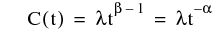 |
||
|
Instantaneous MTBF
|
For a reliability growth data set, shows MTBF (mean time between failures) values at a given time. It is estimated as the reciprocal of the estimated instantaneous failure rate in a log-log scale. It is calculated using the following formula:  |
||
|
Cumulative MTBF
|
Shows MTBF values over a specified time period. The observed cumulative MTBF can be found by dividing the time, t, by the total number of failures during that time, N(t). The cumulative MTBF plot displays the estimated cumulative MTBF versus time in a log-log scale. The estimated cumulative MTBF is calculated as the reciprocal of the estimated cumulative failure rate. The estimated cumulative MTBF, M(t), is calculated using the following formula: 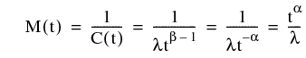 |
||
|
Cumulative Failures
|
Shows the expected number of failures versus time, t. This plot displays the expected number of failures versus time in a log-log scale. The expected number of failures is calculated using the following formula: 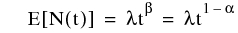 |
||