Object Property Commands
Commands for modifying certain properties of an object are found on the Object Properties toolbar. Although the buttons on this toolbar are primarily for editing objects containing text, you use the last two buttons to edit the fill color for boxes and the border colors for both lines and boxes.

If the Object Properties toolbar is not visible, you can quickly display it. In the toolbar area, right-click and select Object Properties. Repeating this step switches between showing and hiding the toolbar. The Object Properties toolbar is shown when a checkmark appears beside the entry for it on this shortcut menu.
The following table shows the buttons in the Object Properties toolbar as they appear when they are selected and also describes what each one does. The object selected determines which buttons are available. You view and modify all object properties in its Properties window. For more information, see Viewing and Modifying Properties for a Report Object.
Toolbar Button/Tooltip | Description | ||
|---|---|---|---|
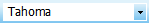 | Displays the font family for text. You use the drop-down control to select a different font family. | ||
 | Displays the font size for text. You use the drop-down control to select a different font size. | ||
 | Indicates whether the text is to appear in bold type. Clicking this button switches between bold and regular type. | ||
 | Indicates whether the text is to appear in italic type. Clicking this button switches between italic and regular type. | ||
 | Indicates the horizontal alignment for the text. Clicking this button aligns text to the left of the object’s text box. | ||
 | Indicates the horizontal alignment for the text. Clicking this button centers text to the object’s text box. | ||
 | Indicates the horizontal alignment for the text. Clicking this button aligns text to the right of the object’s text box. | ||
 | Indicates the vertical alignment for the text. Clicking this button aligns text to the top of the object’s text box. | ||
 | Indicates the vertical alignment for the text. Clicking this button aligns text to center of the object’s text box. | ||
 | Indicates the vertical alignment for the text. Clicking this button aligns text to the bottom of the object’s text box. | ||
 | Provides for selecting text color. Clicking this button opens the Text Color window.
| ||
 | Provides for selecting the background or fill color for the object. Clicking this button opens the Fill Color window. | ||
 | Provides for selecting the border color for the object. Clicking this button opens the Border Color window. This toolbar button does not provide for turning the border on or off for the object. This is done using Border properties under Border in the Properties window. | ||
 | Provides for selecting the background or fill color for the object. Clicking this button opens the Connector Color window. This button is available only when a Markov or RBD connector is active. |