|
Element
|
Description
|
|
Title Bar
|
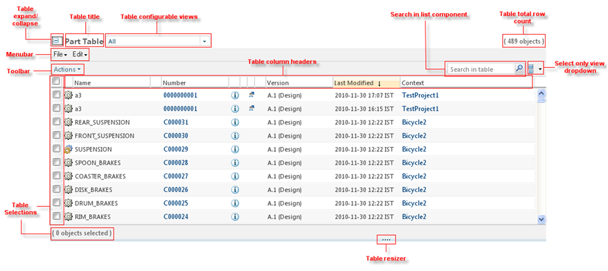
The title bar area tells users what information is displayed in the table. The table title bar is located at the top of the table and may contain: a table title, an object count, the Current View pulldown list, and several action icons - Help etc.
|
|
Menu Bar
|
Tables with many actions will display a menu bar. Each menu title provides a pulldown list of actions.
|
|
Shortcut Tool Bar
|
The shortcut tool bar displays a subset of actions from the menu bar. These are actions that are frequently used. The shortcut tool bar may be used without the menu bar when a table contains few actions.
|
|
Column Header/Sorting
|
Sorting allows the user to control the presentation of table data.
|
|
Selection
|
The checkbox column allows users to select and deselect objects within the table that they wish to perform an action upon. A user can also select the rows across the multiple pages and perform the desired actions on the same.
|
|
Status Glyph Columns
|
The status glyph column(s) convey status and messaging information about individual objects in the table.
|
|
Object Icon Column
|
The object icon column displays the appropriate icon for that object.
|
|
Action Column(s)
|
The action columns in the content area of a table contain the row-level actions for specific objects in a table.
|
|
Data Rows
|
The data rows of a table contain attributes for a given object in the table. This section covers table scroll bars.
|
|
Footer
|
The table footer is located at the bottom of the table. It provides visual closure to the table and contains the paging and View All functionality, if used.
|
