Configuring Search in List
By default the Search In List feature is enabled for the table. A user can enter text and hit Enter or Search In List icon to execute the search. After applying the search in list filter, the table will be displayed with the records matching with the text entered. Only the values in the visible columns will be searched. The Search in List filter will be sticky across component/page refreshes.
The Search in List table filter and View Selected Objects Only table filter interact as follows:
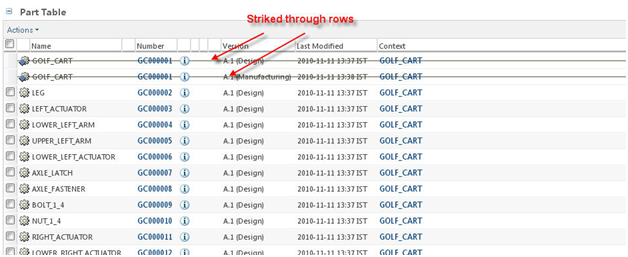
1. Selected and disabled rows stay checked/disabled when the Search in Table filter is applied. This is only allowed if the table in question is complete (the data source is no longer running) and it only has one page of data. For tables that are still populating or that have more than one page of data, the user is warned that selections will be lost when applying the search filter.
2. Only one filter is allowed to be applied to the table at a time. The user can apply either the Search in Table filter, OR the View Selected Objects Only filter. But not both at once. When the user chooses one filter when the other is on, they are prompted to that the original filter will be cleared as well.
Disabling Search In List feature
Search in list can be disabled from a table by setting “false” in setFindInTableEnabled.
TableConfig tableconfig = factory.newTableConfig('myTable');
tableConfig.setFindInTableEnabled(false);
Search In List modes
There are multiple modes available for Search in List. The Search in list mode can be set using setFindInTableMode() method.
The search in list modes available are:
1. FindInTableMode.CLIENT_AND_SERVER(default mode): Perform the search in table on the client or server data.
2. FindInTableMode.CLIENT_ONLY: Perform search in table on the client data only.
3. FindInTableMode.DISABLED: Search in list panel is not displayed.
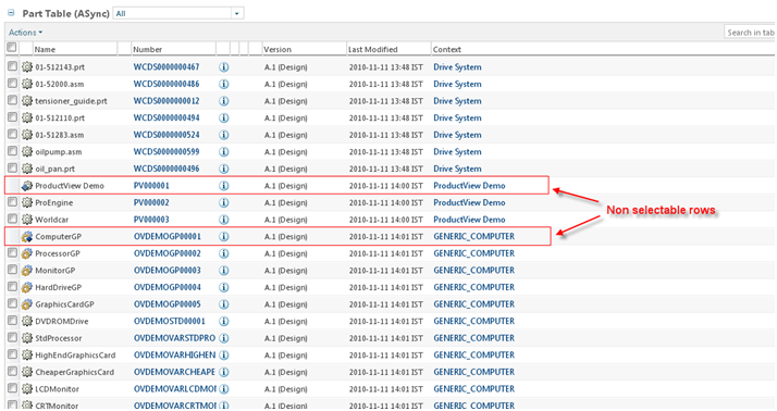
Configuring Non-Selectable Rows
Non selectable row based on an existing visible column
Non-selectable rows can be set depending upon a column that has a Boolean value.
An example:
TableConfig table = factory.newTableConfig ();
…
//a column that is suppose to hold a boolean
ColumnConfig col1= factory.newColumnConfig (“aBooleanColumn”, false);
…
table.setNonSelectableColumn (col1);
Configuring Non selectable rows based on a boolean attribute value available in the backing object
The data utility com.ptc.core.components.factory.dataUtilities.DefaultBooleanValueDataUtility is provided out of the box for configuring non selectable rows. This data utility is mapped to column id “com.ptc.core.components.descriptor.DescriptorConstants.ColumnIdentifiers.NON_SELECTABLE_COLUMN”. There are two ways to set this data utility for a column in a table:
• Use NON_SELECTABLE_COL as the column id
Create a column with an Id as “com.ptc.core.components.descriptor.DescriptorConstants.ColumnIdentifiers.NON_SELECTABLE_COLUMN”. Set the attribute as the need.
An example:
TableConfig table = factory.newTableConfig ();
ColumnConfig col = factory.newColumnConfig (NON_SELECTABLE_COLUMN, false);
col.setNeed (<Attribute>); // Specify the attribute which will decide the row is
selectable or not.
col.setDataStoreOnly (true); // this will make your Column hidden
table.addComponent (col);
table.setNonSelectableColumn (col);
• Setting datautility id to NON_SELECTABLE_COLUMN
Create a column with any Id, set the attribute as the need and set the Datautility Id as “com.ptc.core.components.descriptor.DescriptorConstants.ColumnIdentifiers.NON_SELECTABLE_COLUMN”.
An example:
TableConfig table = factory.newTableConfig ();
ColumnConfig col = factory.newColumnConfig(<columnId>, false);
col.setNeed (<Attribute>); // Specify the attribute which will decide the row is
selectable or not.
((JcaColumnConfig)col)setDataUtilityId (NON_SELECTABLE_COLUMN);
col.setDataStoreOnly (true); // this will make your Column hidden
table.addComponent (col);
table.setNonSelectableColumn (col);
Non selectable row based on a custom data utility
Create and register a custom data utility for the column to be used as a non-selectable column.
• Create a custom data utility
A custom data utility for controlling non selectable rows should extend “com.ptc.core.components.factory.dataUtilities.AbstractBooleanValueDataUtility”.
The method getBooleanAttributeValue() method can be overridden with custom logic:
An example:
package com.customPkg;
import com.ptc.core.components.factory.dataUtilities.
AbstractBooleanValueDataUtility;
public class TestCustomDataUtility extends AbstractNonSelectableRowDataUtility {
public boolean getBooleanAttributeValue (String component_id, Object datum,
ModelContext mc) throws
WTException {
/* this method will return true if the row is not selectable */
}
}
• Register the custom data utility:
Configure the newly created data utility against the column id:
<Service name="com.ptc.core.components.descriptor.DataUtility">
<Option serviceClass="com.customPkg.TestCustomDataUtility "
requestor="java.lang.Object" selector="col1” cardinality="duplicate"/>
</Service>
Non-selected rows are displayed as follows:
Configuring Data Store Only Column
Setting a column as data store only would make the column value available in data store, but the column will not be displayed in the table.
For example:
TableConfig table = new TableConfig('testTable');
ColumnConfig dataStoreOnlyColumn = factory.newColumnConfig
("dataStoreOnlyColumn", false);
dataStoreOnlyColumn.setDataStoreOnly(true);
table.addComponent(dataStoreOnlyColumn);
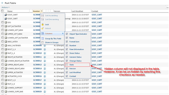
Configuring Column as a Hidden Column
A column can be set as hidden so that it is not displayed on the table. However, hidden column is available in the column list and thereby can be made un-hidden.
For example:
TableConfig table = new TableConfig("testTable");
ColumnConfig stateColumn = factory.newColumnConfig("state", true);
stateColumn.setHidden(true);
table.addComponent(stateColumn);
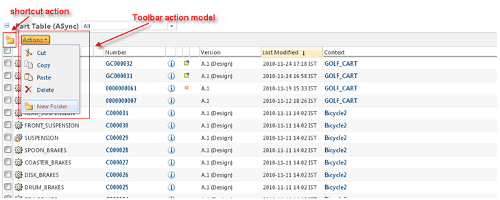
Adding a Toolbar
In order to add a toolbar, the key attribute must be set to “actionModel” and the value attribute must be set to the name of the action model that contains the toolbar actions.
For example:
TableConfig table = factory.newTableConfig();
table.setActionModel("customToolbar");
This example uses a toolbar named “customToolbar” that contains pre-existing folder actions.
If the table uses a new action model for the toolbar, it must be registered in the actionModels.xml file.
<model name="CustomToolbar">
<action name="list_cut" type="object"/>
<action name="list_copy" type="object"/>
<action name="fbpaste" type="object"/>
<action name="list_delete" type="object"/>
<action name="separator" type="separator"/>
<action name="create" type="folder" shortcut="true" />
</model>
Configuring above action will produce an toolbar action model displayed as:
The *actions.xml and *actionModels.xml files can be modularized with logical packaging. These files are located in <Windchill>/codebase/config/actions. There is also a custom-actions.xml and custom-actionModels.xml file available to register new actions and action models. The “customToolbar” action model is registered in the custom-actionModels.xml file.
If the user selects few records and does a right click on the selected records, table toolbar action model shall be displayed. But note, only the actions having attributes selectRequired=”true” and multiSelect=”true” shall be displayed.
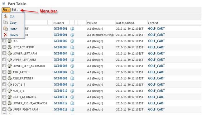
Configuring the Menubar
Menubar can be set for the table using setMenubarName() in table builder.
For example:
ComponentConfigFactory factory = getComponentConfigFactory();
TableConfig table = factory.newTableConfig();
table.setMenubarName("customMenubar");
This example uses an action model named “customMenubar”.
The action model must also be registered in the *action-models.xml file. Action models can be nested using the submodel tag.
<model name="customMenubar">
<submodel name="fileMenu"/>
<submodel name="editMenu"/>
</model>
<model name="fileMenu">
<action name="list_cut" type="object"/>
<action name="list_copy" type="object"/>
<action name="fbpaste" type="object"/>
<action name="list_delete" type="object"/>
</model><model name="editMenu">
<action name="create" type="folder"/>
</model>
In order to label each menu, the description must be set for the File and Edit submodels
The action properties must be included in either the action.properties file or in a resource bundle
The properties depicted below are the entries that get added to the action.properties file
The entries for the File and Edit actionModels would look like:
object.fileMenu.description.value=File
object.editMenu.description.value=Edit
Adding the menu bar will produce the following results:
Configuring Table — Enabling a Row Selection
Making the rows selectable can be done by using setSelectable() on table config. To make the table non-selectable the value must be set to “false”. By default, table is selectable.
For example:
For setting non-selectable table.
ComponentConfigFactory factory = getComponentConfigFactory();
TableConfig table = factory.newTableConfig();
table.setSelectable(false);
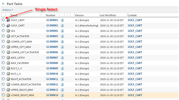
Configuring Single Select Table
We can have the single select facility to the table. This restricts the user to select only one record at a time from the table. This can be done by setting the singleSelect property on the table. A “true” value will present the table in a single select (radio buttons) mode whereas a “false” value presents it in a multi select (checkboxes) mode.
For example:
ComponentConfigFactory factory = getComponentConfigFactory();
TableConfig table = factory.newTableConfig();
Table.setSingleSelect(true);
Configuring non- Pre-Selection rows
Pre-Selection row depends on an existing visible column
Pre-selectable rows can be set depending upon a column that has a Boolean value. The column should return a GUIComponent that has comparable value “true”/”false”.
An example:
TableConfig table = factory.newTableConfig ();
…
//a column that is suppose to hold a boolean
ColumnConfig colX = factory.newColumnConfig(<columnId>, false);
table.setPreSelectableColumn(colX);
Configuring Pre selectable rows based on a boolean attribute value available in the backing object
The com.ptc.core.components.factory.dataUtilities. DefaultBooleanValueDataUtility is out of box datautility provided for this case. This will simply return the value of the given column. There are two ways to set this data utility for a column in a table:
Use PRE_SELECTABLE_COL as the column Id
Create a column with an Id as “com.ptc.core.components.descriptor.DescriptorConstants.ColumnIdentifiers.PRE_SELECTABLE_COLUMN” (against this the dataUtility has been registered) and set the attribute as the need.”.
An example:
TableConfig table = factory.newTableConfig ();
---------
ColumnConfig col = factory.newColumnConfig (PRE_SELECTABLE_COLUMN, false);
col.setNeed (<Attribute>); // Specify the attribute which will decide the row is pre-selectable or not.
col.setDataStoreOnly (true);// this will make your column available on store only
table.addComponent (col);
table.setPreSelectableColumn (col);
Pre selectable rows based on a custom data utility
Create and register a custom data utility for the column to be used as a pre-selectable column.
Create a custom data utility
Create your own DataUtility by extending “com.ptc.core.components.factory.dataUtilities.AbstractBooleanValueDataUtility”.
Override getBooleanAttributeValue () method.
An example:
package com.customPkg;
import com.ptc.core.components.factory.dataUtilities.
AbstractBooleanValueDataUtility;
public class TestCustomDataUtility extends
AbstractBooleanValueDataUtility {
public boolean getBooleanAttributeValue(String
component_id, Object datum,
ModelContext mc) throws
WTException {
/* this method will return true if the row is pre selectable */
}
}
Register the custom data utility
1. Configure the newly created data utility against the column id:
<Service name="com.ptc.core.components.descriptor.DataUtility">
<Option serviceClass="com.customPkg.TestCustomDataUtility "
requestor="java.lang.Object" selector="col1” cardinality="duplicate"/>
</Service>
TableConfig table = factory.newTableConfig ();
--------
ColumnConfig col = factory.newColumnConfig(<'''columnId'''>, false);
col.setNeed (<Attribute>); // Specify the attribute which will decide the
row is pre selectable or not.
col.setDataStoreOnly (true); // this will make your Column hidden
table.addComponent (col);
table.setPreSelectableColumn (col);
2. Configure the newly created data utility against the Selector id:
<Service name="com.ptc.core.components.descriptor.DataUtility">
<Option serviceClass="<DataUtility>" requestor="java.lang.Object"
selector="<selectorId>” cardinality="duplicate"/>
</Service>
TableConfig table = factory.newTableConfig ();
--------
ColumnConfig col = factory.newColumnConfig(<columnId>, false);
col.setNeed (<Attribute>); // Specify the attribute which will decide
the row is selectable or not.
((JcaColumnConfig)col) setDataUtilityId (<selectorId>);
col.setDataStoreOnly (true); // this will make your Column hidden
table.addComponent (col);
table.setPreSelectableColumn (col);
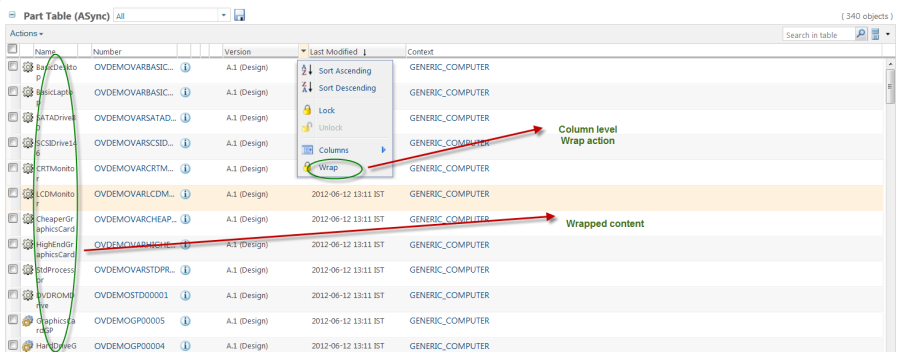
Configuring Column Wrap
We can mark a column to wrap its content by default. A column can be wrapped through client side column level action also. For example:
ColumnConfig descritionColumn = factory.newColumnConfig(NAME, true);
descritionColumn.setColumnWrapped(true);
| The screen shot above shows text wrapping enabled in the Name column and the Wrap Text option in the drop down menu in the Last Modified column. |
Additional attributes set via the setComponentProperty sub tag
getModel tag attributes
getModel Creates a component model based on the supplied component descriptor and query parameters. The resulting model is assigned to a scoped variable specified by the var attribute. Its tag class is com.ptc.core.components.tags.components.GetModelTag and the body content is “scriptless”
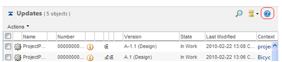
Configuring a Table — Adding a Help Icon
The help button will appear in the upper right corner of the table/tree if you set a help context in your builder:
// sets the help topic to use from the Windchill Help Center
tableConfig.setHelpContext("HelpTopicName");
If your table/tree is still defined in a jsp instead of with a builder, adding the help topic would be as follows:
<renderTable model="${tableModel}" helpContext=" HelpTopicName"/>
On click of the “?” button, a pop up window will open which will show the help topic for the table.
Specifying Datautility for Columns
Data utilities allow developers to post-process and/or augment the data returned by the low-level data acquisition API. The additional information can be returned by an additional query, a call to a service, or whatever else you can get at via Java code. To specify the data utility for a column can be done by using setDataUtilityId() in table config.
ComponentConfigFactory factory = getComponentConfigFactory();
TableConfig table = factory.newTableConfig();
ColumnConfig col = factory.newColumnConfig("iconType", true);
col.setDataUtilityId("typePicker.iconType");
table.addComponent(col);
To register the dataUtility, you need to put in *service.properties. An example entry is:
<Service name="com.ptc.core.components.descriptor.DataUtility">
<Option serviceClass="com.ptc.windchill.enterprise.picker.type.
dataUtilities.IconTypeDataUtility"
requestor="java.lang.Object"
selector="typePicker.iconType"
cardinality="duplicate"/>
</Service>
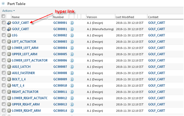
Configuring Table Columns as Hyperlinks
Adding hyperlink to the table data.
We can specify the link to the particular columns in the table. When the user clicks on that link, the new page (Infopage) will open up. This can be done by setting setInfoPageLink() to true in table builder.
For example:
ComponentConfigFactory factory = getComponentConfigFactory();
TableConfig table = factory.newTableConfig();
ColumnConfig col = factory.newColumnConfig("name", true);
col.setInfoPageLink(true);
table.addComponent(col);
This result in the name column displayed as hyperlink.
Configuring a Table — Creating a Customized View
If the table is to be configured to have customized views, table builder should implement interface ConfigurableTableBuilder. The interface, ConfigurableTableBuilder has only method:
ConfigurableTable buildConfigurableTable(String id) throws WTException;
The method should return an instance of a class implementing interface ConfigurableTable. Default JCA implementation is provided by class JCAConfigurableTable.
Table views intended for JCA are required to extend the com.ptc.core.htmlcomp.components.JCAConfigurableTable class.
As in 9.x versions, no mapping in service.properties.xconf to this class is required.
When implementing getOOTBTableViews and defining OOTB views, it is important to use the correct column ids. Column ids for common attributes are defined in com.ptc.core.components.descriptor.DescriptorConstants.ColumnIdentifiers. If the column is not found here, then it is best to use the available attribute report for the types contained in the table. Available Attributes report link is available under Customization tab inside “Tools” link.
If more than one table view was implemented, then the current view displayed would be either the first view on the list (alphabetically) or the table view set in the getOOTBActiveViewName method.
Selecting “Customize…” from the current view list launches a pop-up displaying the configurable table views. From there, additional table views can be added and removed using the toolbar actions.
For each view in that list, there is an action to set that view as “active”. By using this action, any view can be set as the default. An example:
public class MyTableBuilder extends AbstractConfigurableTableBuilder {
…
@Override
public ConfigurableTable buildConfigurableTable(String tableId)
throws WTException {
return new MyConfigurableTable();
}
/* an internal static class */
private static class MyConfigurableTable extends JCAConfigurableTable {
}
…
}
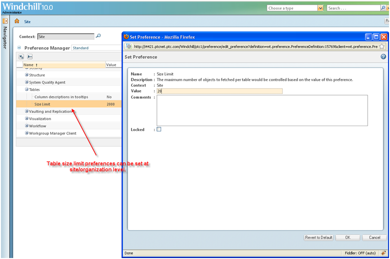
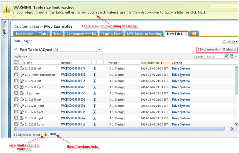
Setting Table Size Limits
The maximum number of rows that can be fetched in a table on a client can be set using the table size limit preference.
If the table has more data than the table size set in the preference, next/ previous links are displayed at the footer to navigate through the data:
Using Tables in Wizards
Saving Form Data
The table component can be used to edit data. Since the table is using a buffered view and not all objects are kept in the DOM at all times there can be some special handling needed to ensure the data is getting saved as desired.
The data for the table is all saved behind the scenes in the table’s datastore. When the user updates a field there is default handling in place that saves the updates to this store. In some cases this default handling may not work. Additionally when a wizard is submitted any hidden rows in a table are rendered to ensure that all data is available in the form as it has always been.
Wizard Table Limitations
Due to browser security restrictions, browser file input fields cannot be saved to the table’s datastore and re-rendered with a value. This means that any values entered into browser file input fields will be lost when doing operations that refresh the grid from the store (drag and drop, locking, scrolling in a buffered table, etc.). Because of these limitations, it is recommended that you do not place a file input field inside an editable table.
If you must include a file input field in your editable table, you should configure it to disable the grid features that cause the values to be lost. The following grid features will be disabled:
• Drag and drop of columns
• Column locking
• Row buffering for performance improvements of large tables
• Find in table
• View selected objects only
• Performance improvements for mass removal of rows in the table.
It will only disable grid features if the File Upload preference is set to use the default browser file input. To do this, add the following tag to your wizard JSP:
<jca:setTablePlugin ptype=”gridfileinputhandler”/>
The Attributes table in the Create Multiple Documents wizard, and the Attachments table in the Attachments wizard step found in many wizards (new Document, new Change Request, for example) have been configured to turn off grid features because they contain a file input field in an editable table.