Configuring a Type Picker
You want to create a Type Picker either for the display or for the assignment of type-able items.
Background
Type Picker Common Component is to be used either for display or for assignment of type-able items. For example in a search application to select the type of objects that you are interested to do a search on or in a create application to create an item of a specific type. It can be used to display the type in case of edit or view applications. The component can be used in the context/mode of CREATE, EDIT, SEARCH or VIEW.
Scope/Applicability/Assumptions
• If the Type Picker behavior is to be driven by site/organization preferences viz. display (list or tree), default type, filter criteria etc, its assumed that you will extract the relevant information and pass them to the component.
• The component will apply access control policies except for SEARCH mode.
• It is assumed that your <MyPage>.jsp file in which you are implementing this common component includes “/netmarkets/jsp/begin.jspf” or “/netmarkets/jsp/beginPopuf.jspf” file and “/netmarkets/jsp/end.jspf” files.
Intended Outcome
Depending upon the format, you will get either a dropdown or table or a tree:
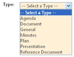
• Type Picker in DropDown Format
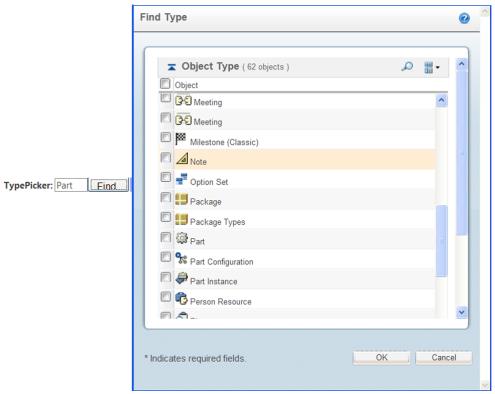
• Type Picker in Table Format
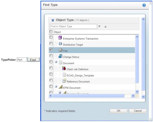
• Type Picker in Tree Format
Solution
Use Type Picker Common Component to display or for the assignment of type -able items.
Prerequisite knowledge
To understand this documentation, you need to have an understanding of the following:
• Basic development involving JSP, JavaScript and Custom taglibs
• The management of resource bundle files customizations
• Windchill xconfmanager concepts
• Windchill Type Identifiers
Solution Elements
Element | Type | Description |
picker.tld | tld | Tag Library Descriptor (TLD) file, which contains Type Picker Tag definition Run time Location: <Windchill>\codebase\WEB-INF\tlds\ |
typePickerResource.java | Java | You should use this file to localize the contents of the Type Picker pop up. |
<your_page>.jsp | jsp | Your TypePicker Common Component implementation containing jsp file. |
wt.properties | properties | You can define ‘wt.typepickerexclude’ property here Run time Location: <Windchill>\codebase\wt.properties |
The solution is also addressed to these variations:
1. You want to specify that a container will display a particular subset of all types in a Type hierarchy.
2. You want to specify filtering criteria on the types shown, including criteria on custom subclasses.
3. You want to specify the root/base types (OOTB or custom) to be used.
4. You want to include a type picker that will be launched as a dropdown or table/tree popup menu.
5. You want to specify whether or not non-instantiable types are to be presented for picking
Procedure – Configuring Type Picker Common Component
1. Include necessary artifacts.
You should include the necessary artifacts in your configuring jsp file e.g. “/netmarkets/jsp/begin.jspf” or “/netmarkets/jsp/beginPopuf.jspf” file and “/netmarkets/jsp/end.jspf” file. You also need to declare picker taglib directive. (uri=”http://www.ptc.com/windchill/taglib/picker”)
2. Configure Type Picker.
<%@ taglib uri="http://www.ptc.com/windchill/taglib/picker" prefix="p"%>
<%@ include file="/netmarkets/jsp/util/begin.jspf"%>
----
----
<!-- TYPE PICKER CONFIGURE START -->
< p:typePicker id="typePickerTest" label="Type : " mode="SEARCH" >
<p:pickerParam name="seedType" value="wt.epm.EPMDocument" />
<p:pickerParam name="type" value="BOTH" />
<pr:pickerParam name="displayHierarchy" value="false" />
<p:pickerParam name="showRoot" value="true" />
</p:typePicker>
<!-- TYPE PICKER CONFIGURE END -->
----
----
<%@ include file="/netmarkets/jsp/util/end.jspf"%>
Customization Points
typePicker tag attributes
Parameter | Default Value | Possible values | Req? | Description |
id | - | Any value | Yes | Used to distinguish between the multiple Type-Picker usages in a page. The id value should not contain "." (dot). |
label | - | Any value | No | Used as the Picker label |
mode | SEARCH | - | No | Defines in which mode the Type Picker is going to be used and it should be one of the value defined in com.ptc.core.ui.resources.ComponentMode |
field | - | - | No | Target Element is the one in which the selected elements attributes will be populated. It should be a subclass of com.ptc.core.components.rendering.AbstractGuiComponent Currently support TextBox and ComboBox |
renderContext | - | - | No | Object should be an instance of com.ptc.core.components.rendering.RenderingContext. If not supplied the component will create one for the user. |
objectType | typepicker | - | No | This is the object type in which the picker action is specified in *actions.xml . <Windchill>\codebase\config\actions\EnterpriseUI-actions.xml |
actionName | typePicker | - | No | This is the action name that is specified in *actions.xml for the picker action |
pickerParam tag attributes
Parameter | Default Value | Possible values | Req? | Description |
adminDomainRef | | - | No | String representation of the administrative domain reference (wt.admin.AdminDomainRef). Used to check access control rights. |
containerRef | | - | No | String representation of the container reference (wt.inf.container.WTContainerRef) and is used to populate types specified for this container. If adminDomainRef is provided, containerRef is calculated from that even if user has supplied it. If adminDomainRef is NOT provided, component uses the default AdminDomain for the supplied containerRef or if containerRef is not provided, component uses default WTContainer (Exchange container). |
lifeCycleState | | - | No | String representation of State (wt.lifecycle.State) and is used while checking access control rights. |
seedType | - | - | No | Accepts valid logical or external representation of Windchill Type Identifiers. Multiple values supported and it’s required for mode = CREATE/EDIT/VIEW |
filterType | - | - | No | Accepts valid logical or external representation of Windchill Type Identifiers. Multiple values supported. The type and its descendants are filtered out from the picker element |
defaultType | - | - | No | Accepts valid logical or external representation of Windchill Type Identifiers. For single select, it should be only one value. Multiple values are supported and it’s required for mode = EDIT/VIEW. It can support blank, "Select a Type" etc values also. |
appOption | - | - | No | Localized Display name and value separated by a "$" delimiter and multiple values are supported. |
format | dropdown | - | No | It should be one of the enum constant value defined in com.ptc.windchill.enterprise.picker.type.server.TypePickerFormat. The possible values are dropdown, table, tree |
select | single | - | No | Possible values are single and multi. |
type | BOTH | - | No | It should be one of the enum constant value defined in com.ptc.windchill.enterprise.picker.type.server.TypePickerTypes. Possible values are ROOT_TYPES (only seedTypes will be displayed), SOFT_TYPES (only SOFT Types will be displayed), BOTH (MODELED & SOFT Types will be displayed) |
displayHierarchy | false | false/true | No | Accepts String representation of Boolean value. This is valid only for dropdown format for which it presents picker elements in hierarchy. |
showInstantiable | false | false/true | No | Accepts String representation of Boolean value. If true - only instantiables will be displayed and for false both instantiables and non-instantiables will be displayed |
showRoot | true | false/true | No | Accepts String representation of Boolean value. If true shows the seedTypes as I level elements. |
componentId | Foundation.allSearch | - | No | componentId is defined as 'APP_ID+.+COMPONENT_NAME'. Valid APP_IDs are ProjectLink, Foundation, or PDMLink. This is used for mode = "SEARCH" to find the I level types from <Windchill>\codebase\com\ptc\windchill\enterprise\search\server\SearchableTypes.properties. Passing null will default to the Default |
pickerCallBack | typePickerPopulateTargetElement | - | No | A javaScript function that will be invoked to populate the selected element attributes in the target element. This is not applicable for dropdown. |
pickedDataFetcher | netmarkets/jsp/typepicker/typePicker_dataFetcher.jsp | - | No | A jsp file which is invoked in the AJAX call to fetch attributes of the picked elements. The file should be located in the <Windchill>/codebase and relative path is the value to be provided. It’s not applicable for dropdown. |
filterByInterface | - | Valid Windchill Interface | No | String representation of valid windchill Interface. Its Single valued parameter. For example, filterByInterface = “wt.index.Indexable” If filterByInterface param configured then only subtypes of seedType that implement the interface should be displayed in the type hierarchy. Here, Type picker will show only subtypes of seedType which implements Indexable interface. Seed type is always selectable even if non-instantiable when this parameter is configured. When fliterByInterface configured along with ShowInstantiable=true then only instantiable type which implements interface will be available in type picker. |
additionalTypes | - | Valid Windchill Abstract class | No | String representation of valid Windchill Abstract Classes. Its Multi valued parameter. For example, additionalTypes= “wt.meeting.Meeting, wt.org.WTPrincipal” All abstract classes specified by this parameter will be present in type picker as long as they are subclasses of the seedType and implement the interface specified by the filterByInterface parameter. This parameter is dependent on filterByParameter. Type picker framework respects this parameter only when filterByInterface is configured. |
showInternalNameAsTooltip | false | false/true | No | Accepts String representation of Boolean value. If true then shows tooltip as internal name of type, otherwise shows display name of type |
Configuring Type Picker that will be launched as a dropdown or table/tree popup menu
• Type Picker in “Drop Down” forma
< p:typePicker id="typePickerTest" label="Type : " mode="SEARCH" >
<p:pickerParam name="format" value="dropdown" />
</p:typePicker>
• Type Picker in “table” format
< p:typePicker id="typePickerTest" label="Type : " mode="SEARCH" >
<p:pickerParam name="format" value="table" />
</pr:typePicker>
• Type Picker in “tree” format
< p:typePicker id="typePickerTest" label="Type : " mode="SEARCH" >
<p:pickerParam name="format" value="tree" />
</p:typePicker>
Configuring Type Picker with your filter criteria
• Filtering via “filterType” parameter
< p:typePicker id="typePickerTest" label="Type : " mode="SEARCH" >
<p:pickerParam name="seedType" value="wt.doc.WTDocument" />
<p:pickerParam name="filterType" value="com.ptc.ReferenceDocument" />
</p:typePicker>
• Filtering via properties defined in wt.properties.
The properties are to be defined in <Windchill>/codebase/wt.properties.xconf and propagated to wt.properties file via xconfmanager.
Property | Description | Example |
wt.typepickerexcludedelimiter | wt.typepickerexcludedelimiter=<delimiter string> This defines the delimiter to be used for ‘wt.typepickerexclude’ property and the default value is ‘,’ | wt.typepickerexcludedelimiter=; |
wt.typepickerexclude/<mode>/<root type> | wt.typepickerexclude/<mode>/<root type>=<delimited list of external string representation of type identifier> • ‘mode’ should be one of the value defined in com.ptc.core.ui.resources.ComponentMode • If no ‘mode’ identifier is specified, then it’s assumed that the property is applicable to all mode. • Multiple values are to be separated by wt.typepickerexcludedelimiter property • Excludes the listed types and all their modeled and soft subtypes from the Type Picker if the root type matches the provided seedType. | wt.typepickerexclude/CREATE/wt.doc.WTDocument=WCTYPE|wt.doc.WTDocument|org.r_and_d.Agenda wt.typepickerexclude/wt.doc.WTDocument=WCTYPE|wt.doc.WTDocument|org.r_and_d. Meeting |
wt.typepickerexclude/<mode>/<container type> | wt.typepickerexclude/<mode>/<container type>=<delimited list of external string representation of type identifier> • ‘mode’ should be one of the value defined in com.ptc.core.ui.resources.ComponentMode • If no ‘mode’ identifier is specified, then it’s assumed that the property is applicable to all mode. • Multiple values are to be separated by wt.typepickerexcludedelimiter property • Excludes the listed types and all their modeled and soft subtypes from the Type Picker if the container type matches the provided containerRef. | wt.typepickerexclude/CREATE/wt.pdmlink.PDMLinkProduct =WCTYPE|wt.doc.WTDocument|org.r_and_d.Agenda wt.typepickerexclude/wt.pdmlink.PDMLinkProduct =WCTYPE|wt.doc.WTDocument|org.r_and_d.General |
The exclusion types extracted from the properties would be aggregated. The result of above illustrated examples would mean that ‘Agenda’, ‘Plan’ and ‘General’ and their sub types would be filtered out when the rootType is WTDocument and container being PDMLinkProduct and the operation is CREATE. For all other operations, only ‘Meeting’ and ‘General’ and their sub types would be filtered out.
Configuring Type Picker with your root/base types
< p:typePicker id="typePickerTest" label="Type : " mode="CREATE" >
<p:pickerParam name="seedType" value="wt.part.WTPart" />
</picker:typePicker>
Configuring Type Picker with or without non-instantiable
< p:typePicker id="typePickerTest" label="Type : " mode="SEARCH" >
<p:pickerParam name="seedType" value="wt.part.WTPart" />
<p:pickerParam name="showInstantiable" value="true" />
</p:typePicker>
Configuring Type Picker with your picker call back function
< p:typePicker id="typePickerTest" label="Type : " mode="SEARCH" >
<p:pickerParam name="seedType" value="wt.part.WTPart" />
<p:pickerParam name="pickerCallBack" value="myCallBack" />
</p:typePicker>
Points to be taken care while authoring your pickerCallBack
• This javaScript function will be invoked to populate the selected element attributes in the target element.
• User supplied function should be available in the page where Type Picker is inserted.
• pickerCallBack function signature is "call_back_function(JSON_Object, Picker_Id, Field_Id)"
e.g
function mycallBack(JSONObjects, pickerId, targetId) {
var elements = JSONObjects.pickedObjects;
var targetElement = document.getElementById(targetId);
//update Target Element
if ((targetElement.type == "text") || (targetElement.type ==
"hidden")) {
--------
}else {
--------
}
//update hidden field
var valueElement = document.getElementById(pickerId);
-----
return true;
}
Configuring Type Picker with your picker data fetcher
< picker:typePicker id="typePickerTest" label="Type : "
mode="SEARCH" >
<picker:pickerParam name="seedType"
value="wt.part.WTPart" />
<picker:pickerParam name="pickedDataFetcher"
value="myfolder/myDataFetcher.jsp" />
</picker:typePicker>
Points to be taken care while authoring your pickedDataFetcher
• The response of the pickedDataFetcher should contain <DIV> tag with id same as the Type-Picker id. The content inside the <DIV> tag is extracted and evaluated to create JSON objects. An example of a typical response will be
<DIV id=”Type_Picker_Id” >
{"pickedObjects":
[
{"type" : "Part" , "theType" : "wt.part.WTPart "},
{"type" : "Document" , "theType" : "wt.doc.WTDocument”}
]
}
</DIV>
Accessing the Selected/Populated Information from Type Picker
• If you supply GUIComponent (via field) and RenderingContext (via renderContext) for Target Element and
◦ If GUIComponent Id is not set; Type Picker CC will set it to Type Picker Id
◦ If RenderingContext’s ContextString not set, Type Picker won’t set it.
• You supply GUIComponent and NO RenderingContext for Target Element
◦ Type-Picker uses a default RenderingContext, who’s ContextString won’t be set.
• You supply NO GUIComponent and NO RenderingContext for Target Element
◦ Type-Picker creates appropriate GUIComponent and will set Type Picker’s Id to it.
DropDown format
• If you want to access the selected value in the page (after submitting the page), the
HTML_NAME_OF_TARGET_ELEMENT = RenderingContext.getContextString
()+"___"
+ GUIComponent.getId() + GuiComponentUtil.COMBO_BOX;
• If you want to access the selected value in the Command, you can get a hold of it through the NmCommandBean
HashMap comboBox_hmap = commandBean.getChangedComboBox();
Object comboBox = comboBox_hmap.get(GUIComponent_Id);
Table/Tree Popup Format
• If you want to access the target element (TextBox or ComboBox) in the page, the
◦ TEXTBOX
HTML_NAME_OF_TARGET_ELEMENT = RenderingContext.getContextString
()+"___"
+ GUIComponent.getId() + GuiComponentUtil.TEXT_BOX;
◦ COMBOBOX
HTML_NAME_OF_TARGET_ELEMENT = RenderingContext.getContextString
()+"___"
+ GUIComponent.getId() + GuiComponentUtil.COMBO_BOX;
• The selected values are stored in an “input” hidden element in the page, with the selections separated by a delimiter (“,”)
• If you want to access the selected value in the Command, you can get a hold of it through the NmCommandBean.
String selected_value = cb.getTextParameter(Type_Picker_Id);