Configuring a Participant Picker in AngularJS
Objective
Participant Picker gives you the ability to search for participants using various search criteria and to pick selected participants. This customization is intended to add the AngularJS participant picker to an AngularJS page.
Background
This AngularJS–based participant picker common component provides the ability to select from an expanded list of participants, including users, groups, organizations, roles, and actors. It provides a wide variety of search scope criteria with which you can narrow down the search, including the ability to configure LDAP as a selectable option.
|
|
This topic describes how to customize an AngularJS-based participant picker for use in a standalone, single-page application based on AngularJS, HTML, or Javascript. The AngularJS-based participant picker was introduced in Windchill 11.0. PTC recommends using it for standalone, single-page applications. To customize a participant picker to use in a JCA page, refer to the JCA-based participant picker topic Configuring a Participant Picker in JCA. |
Scope/Applicability/Assumptions
To use an AngularJS participant picker app in a Windchill Client Architecture table, you should define a Windchill Client Architecture action, and point the action to a JSP page that has a participant picker tag. Add the Windchill Client Architecture action you created to the desired Windchill Client Architecture table. When you click the action, it launches the Participant Picker Wizard. Select desired participant and click OK. The picker delivers the selected participant to the application it is supporting.
Intended Outcome
The selected participants are populated in an element such as a table, text field, or list.
Solution
Use the Participant Picker to search for participants and populate the results into a table, text field, or list or other element that you choose.
Prerequisite knowledge
To achieve this objective, you need to have an understanding of the following:
• How to add Windchill Client Architecture actions.
• How to author JavaScript picker Callback functions.
• How to configure a standalone application page in AngularJS 1.2. Refer to the
AngularJS Developer Guide for additional information.
Solution Elements
|
Element
|
Type
|
Description
|
|
auto-suggest
|
Boolean
|
Set this to “true” to have the picker work as an auto-suggest search.
|
|
auto-suggest-display-limit
|
Integer
|
The limit of results to return to auto-suggest. This value will override the typical value returned from the server but only if it is less than the max count set on the property com.ptc.netmarkets.userSearch.maxCount.
|
|
auto-suggest-placeholder
|
String
|
The text to display in the auto-suggest input field. By default the value is Enter participant name.
|
|
auto-suggest-user-search-field
|
String
|
Specifies which attribute to search on for user type in auto-suggest. It only works when user is the only defined participant type available in the picker. The options are name or userName. The default is name.
|
|
default-columns-display
|
Object
|
Specifies which columns should be used in the results table and if they are hidden by default. When a column is hidden, it is still available to display through the column toggle support of the results table. The configuration is assigned to a specific participant type.
|
|
default-directory-service
|
String
|
The directory service from the list of services that should be the default selection. If not provided, the default will be the value specified by the property wt.federation.org.defaultAdapter. If no value is specified in the property or it does not match a directory-service in the directory-services list, All is the default selection when there are multiple directory services.
|
|
default-participant-type
|
String
|
Specify which of the participant-types should be the default type selected. The default value, if there are multiple types, is All, signifying that all the types provided by participant-types will be used in the search.
|
|
display-directory-service
|
Boolean
|
Determines if the directory service selections should be displayed. The default value is “false”.
|
|
display-field
|
String
|
Specifies which attribute of the selected participant type should display after selection in auto-suggest. The default attribute is name.
|
|
directory-services
|
Array
|
The directory services to be used by the search. If none are specified, the system defaults will be used.
|
|
embedded
|
Boolean
|
Set this to “true” to embed the picker in the web page instead of it appearing as a popup window.
|
|
help-link
|
String
|
The value for the help topic to use for this use of the picker. If not provided, the default will be LclSrchParticipantPick.
|
|
internal-group-search
|
Boolean
|
Set to true to include internal groups in the search results. Default is “false”.
|
|
ldap-attributes
|
Object
|
A way to specify LDAP attributes for display in the results table and if they are hidden by default. The configuration is assigned to a specific participant type.
|
|
multi-select-mode
|
Boolean
|
Determines if the participant picker is multi-select or single-select. Default is “true”.
|
|
participant-picker
|
Directive
|
Directive needed to launch the participant picker. Can be used as an element or attribute.
|
|
participant-types
|
Array
|
The types of participants to be supported by this launch of the picker. Available values are: User, Group, Organization, Role. Default value is [User, Group, Organization]
|
|
window-title
|
String
|
The value of the title to use for the Participant Picker pop-up. If none is provided, Find Participants is the default value.
|
Procedure – Participant Picker with Search in Context
You want to narrow down the search to different contexts. You need to supply the tag elements contextMap and defaultContext to the Participant Picker tag. The contexts can be Organization, Site, Product, Project, and Library.
Procedure – Search for Participants in different LDAP
You want to search for Participants in a different LDAP. You need to supply the tag element directory-services.
Configure your Windchill to support multiple LDAP servers. Each LDAP server is identified by a name. The name of LDAP server has to be supplied as key, and a localized display label as value. When you supply the directory-services tag element and you also set display-directory-services to true, you see a drop-down in the Participant Picker with the label “Service”. The selected key is sent as service parameter to the Info*Engine tasks by the Participant Picker.
Procedure – Single Select Participant Picker
You want to select only one participant at a time. You need to supply this tag element as shown: multi-select-mode="false". This provides a single-select radio button list in the results table.
Procedure – Restrict to Single Participant Type Search
You want to restrict the type of Participants to be searched to one. You need to supply this tag element as shown: singleParticipantType="true".
Procedure – Add a Custom LDAP Attribute
You want to display a custom LDAP attribute in the Search results table. The following is sample code to add this function.
<form id="participantPickerForm">
<input id="participantPickerFindButton" type="submit" value="Find"
participant-picker window-title="'MySimpleTitle'" help-link="'app'"
picker-data="data1" ldap-attributes="{'users':[
{'name':'Phone Number', 'field':'telephoneNumber', 'hidden':false},
{'name':'Address', 'field':'postalAddress', 'hidden':false},
{'name':'Custom CN', 'field':'cn', 'hidden':true},
]}"
default-columns-display="{'users':[
{'name':'Organization', 'hidden': true},
{'name':'status', 'hidden': false}
]}"/>
</form>
Procedure – Embed an Auto Suggest Field in an AngularJS Window
You want to embed the participant picker as an auto complete field in an AngularJS window, instead of launching the Participant Picker app. You need to supply this tag element as shown: participant-picker auto-suggest="true".
Sample Code
Sample JSP that contains a Participant Picker tag
After making entry for action to launch the Participant Picker, write a JSP with the same name as in action tag (for example, participantPickerSample.jsp).
<base href="<%=pageContext.getServletContext().getContextPath()%>/">
<jca:enableCorePlatform theme="Windchill" version="2.0" applications="participantPicker"
fullPage="true" />
<link rel="stylesheet"
href="/Windchill/apps/participantPicker/resources/css/participantPicker.css">
<form id="participantPickerForm"> <input id="participantPickerInputField"
disabled="true" type="text" /> <input id="participantPickerFindButton"
type="submit" value="Find" participant-picker
participant-picker-callback="pickerCallback" multi-select-mode="false" /> </form>
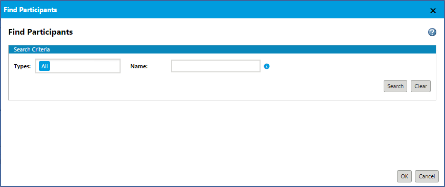
This renders a basic participant picker as shown here.
Examples of Usage in Windchill Code
• Calendar application: Windchill\codebase\src_web\apps\calendar\index.jsp
• Sample configurations of this picker are included in the >