Attribute Customization
You want to customize the display of an attribute of a Windchill object.
Background
Windchill attempts to provide consistent attribute behavior across all client applications. The Windchill Client Infrastructure provides support for rendering attributes of the standard Windchill supported data types (see Attribute Types section in this topic for more information). This infrastructure includes standard data acquisition, rendering and form processing mechanisms and, re-usable components for rendering the UI elements for attributes. These components honor the meta-data from attribute definition, the configurations defined for that attribute, and the persisted value(s) of the attribute, if any.
Windchill provides multiple configurations points for customizing an attribute’s display and behavior. The Type and Attribute Management utility is the recommended configuration tool. For certain cases, other configuration points may need to be used, such as:
• Java source files of modeled
Windchill classes. See “GeneratedProperty” in
Modeling Columns for more information.
The most common configurations include:
• Constraints
• Properties that can be set on attributes in the Type and Attribute Management utility
• Default values for attributes
Some of the other factors that implicitly affect the behavior of attributes include:
• Behavior built into the infrastructure to comply with Windchill UI standards
• DB configurations
The framework also provides extension points for customization via the ability to override the standard rendering and data acquisition behavior. See Data Utilities section in this topic for more information.
Scope of an attribute configuration
Windchill offers multiple configuration points for the same configuration as a mechanism to control the scope of the configuration. In general, there are 3 possible scopes for a configuration.
• Configurations that apply to all attributes of all object types on all screens. This is normally set in the Preference Management Utility.
• Configurations that apply to a single attribute of a single type on all screens. Attribute Definitions are set in the Type and Attribute Management Utility.
• Configurations that apply to a single attribute of a single type in a specific UI only. Attribute Layouts are set in the Type and Attribute Management Utility or when defining the component configuration using a java builder.
For certain configurations, more than one configuration point with the same scope is available in order to support backward compatibility.
The mechanism used to resolve the values of a configuration set using multiple configuration points varies with each configuration and is detailed in Customization of Common Windchill Business Attributes section in this topic.
For rules pertaining to overriding attribute constraints, please see administration of
Constraints in the
Type and Attribute Management utility.
Terminology
Definition of some commonly used terms
|
Term
|
Definition
|
|
Attribute Panel
|
The UI for displaying attributes as name-value pairs according to the Attribute Layout definition.
|
|
Client / Screen
|
The end user UI in which the attributes will be displayed. Example: Create Wizard Attributes Step.
|
|
Info Page Primary attributes
|
The attributes panel in the information page that is primarily used for displaying a small set of the attributes. This is normally displayed at the top of the info page.
|
|
Info Page Full attributes list
|
The attribute panel that is primarily used for displaying a larger set of attributes on an information page.
|
|
GUI component / UI component
|
The UI widget (or a composite of UI widgets) displayed on the screen for the user to enter a value for an attribute or to display the value of an attribute.
|
|
Attribute Properties
|
Properties that can be set on attributes either in the Type and Attribute Management utility or using other configuration points to customize the display and data acquisition for an attribute.
|
Windchill Attribute Customization Overview
There are three steps to getting an attribute rendered in the UI.
1. Placing the attribute in the UI
2. Configuring the UI widget for the attribute (optional)
3. Customizing the source of data (optional)
Out of these, steps 1 and 2 are the most commonly needed steps. This document primarily deals with these two areas.
Placing the attribute in the UI
The local attribute containers supported by Windchill include:
Attributes can also be displayed on the UI outside these containers.
Configuring the UI widget for the attribute
OOTB Windchill automatically determines the UI components to be used for a certain attribute based on the following:
• Windchill UI standards
• The data type of attribute
• The constraints and other configurations defined on the attribute
The Windchill configuration points allow you to alter some of the rendering properties of the widget
For some very limited cases, it is possible to specify an alternate widget using a configuration. For all other cases, mapping an alternate widget to an attribute would require writing a custom data utility. See Creating the Data Utility Class section in this topic for more information.
Customizing the source of data
The source of the data for a given attribute on a given UI can be altered by configuring some of the data acquisition properties, but this should be used only for some very special customization requirements.
Windchill Attribute Types
Windchill supports five types of attributes:
2. Global
Calculated Attributes and Alias Attributes
Alias attributes and some calculated attributes are derived from the values of other attributes. So these attributes should not be used on Create or Edit clients. If they are used in create or edit layouts, “(Unassignable)” will be displayed. They can be used on UIs that display persisted values of attributes.
Calculated attributes that are based on constant values may be displayed in create and edit clients.
For more information on defining these attributes, see
Creating a New Attribute.
Windchill Attribute Configurations
Attributes of Windchill objects are rendered in one of the two modes, commonly known as the input mode and the view mode. The input mode is used for allowing the user to set/edit the value of an attribute. The view mode is used for displaying the value of an attribute in an un-editable mode.
The following sections identify the default implementation of each of the pieces involved in displaying the input field and/or value field for each data type.
String
Default behavior and available configurations
|
Input
|
View
|
|
Rendered as: |
Rendered as: |
|
UI Configurations:
• Required Input
• Default Values
• Validating Input Values and Legal Value Lists
• Visibility and Modifiability
• Multiple Values (Global IBAs Only)
• Defining Custom Labels
• Controlling the Size of Input Fields for String Attributes
• Limiting the Length of Values Entered for a String Attribute
|
UI Configurations:
• Visibility (see Visibility and Modifiability section in this topic )
• Multiple Values (Global IBAs Only)
• Defining Custom Labels
• Create Hyperlinks (see Configuration Points section in this topic )
• Making a String Value All Upper Case or All Lower Case
|
|
Data Acquisitions Configurations:
• Configuring the source of data (see Customizing Data Acquisition section in this topic for more information)
• Configuring the data utility (see Data Utilities section in this topic for more information)
|
Data Acquisitions Configurations:
• Configuring the source of data (see Customizing Data Acquisition section in this topic for more information)
• Configuring the data utility (see Data Utilities section in this topic for more information)
|
Date and Time
Date & Time attributes are used to store a date only value (yyyy-mm-dd) or a date and time value (yyyy-mm-dd hh:mm).
Default behavior and available configurations
|
Input
|
View
|
|
Rendered as: |
Rendered as: |
|
UI Configurations:
• Required Input
• Default Values
• Validating Input Values and Legal Value Lists)
• Visibility and Modifiability
• Multiple Values (Global IBAs Only)
• Defining Custom Labels
• Date Input Field Type (see Configuration Points section in this topic for more information)
• Local Time Zone (see Configuration Points section in this topic for more information)
|
UI Configurations:
• Visibility (see Visibility and Modifiability)
• Multiple Values (Global IBAs Only))
• Defining Custom Labels
• Date Display Format (see Configuration Points section in this topic for more information)
• Local Time Zone (see Configuration Points)
|
|
Data Acquisitions Configurations:
• Configuring the source of data (see Customizing Data Acquisition section in this topic for more information)
• Configuring the data utility (see Data Utilities section in this topic for more information)
|
Data Acquisitions Configurations:
• Configuring the source of data (see Customizing Data Acquisition section in this topic for more information)
• Configuring the data utility (see Data Utilities section in this topic for more information)
|
Integer Numbers
Default behavior and available configurations
|
Input
|
View
|
|
Rendered as: |
Rendered as: |
|
Configurations:
• Required Input
• Default Values
• Validating Input Values and Legal Value Lists
• Visibility and Modifiability
• Multiple Values (Global IBAs Only)
• Defining Custom Labels
|
Configurations:
• Visibility (see “Visibility and Modifiability” section in this topic for more information)
• Multiple Values (Global IBAs Only)
• Defining Custom Labels
• Percent (see “Configuration Points” section in this topic for more information)
• Currency (see “Configuration Points” section in this topic for more information)
|
|
Data Acquisitions Configurations:
• Configuring the source of data (see “Customizing Data Acquisition for more information” section in this topic for more information)
• Configuring the data utility (see “Data Utilities for more information” section in this topic for more information)
|
Data Acquisitions Configurations:
• Configuring the source of data (see “Customizing Data Acquisition for more information” section in this topic for more information)
• Configuring the data utility (see “Data Utilities for more information” section in this topic for more information)
|
Real Numbers
A Real Number is stored as a decimal representation (e.g. 1.23).
Default behavior and available configurations
|
Input
|
View
|
|
Rendered as: |
Rendered as: |
|
Configurations:
• Required Input
• Default Values
• Validating Input Values and Legal Value Lists
• Visibility and Modifiability
• Multiple Values (Global IBAs Only)
• Defining Custom Labels
|
Configurations:
• Visibility (see “Visibility and Modifiability” section in this topic for more information)
• Multiple Values (Global IBAs Only)
• Defining Custom Labels
• Percent (see “Configuration Points” section in this topic for more information)
• Currency (see “Configuration Points” section in this topic for more information)
|
|
Data Acquisitions Configurations:
• Configuring the source of data (see “Customizing Data Acquisition” section in this topic for more information)
• Configuring the data utility (see “Data Utilities” section in this topic for more information)
|
Data Acquisitions Configurations:
• Configuring the source of data (See “Customizing Data Acquisition” section in this topic for more information)
• Configuring the data utility (see “Data Utilities” section in this topic for more information)
|
Real Numbers with Units
Default behavior and available configurations
|
Input
|
View
|
|
Rendered as: |
Rendered as: |
|
Configurations:
• Required Input
• Default Values
• Validating Input Values and Legal Value Lists
• Visibility and Modifiability
• Multiple Values (Global IBAs Only)
• Defining Custom Labels
• Measurement System (see “Configuration Points” section in this topic for more information)
|
Configurations:
• Visibility (see “Visibility and Modifiability” section in this topic for more information)
• Multiple Values (Global IBAs Only)
• Defining Custom Labels
• Percent (see “Configuration Points” section in this topic for more information)
• Currency (see “Configuration Points” section in this topic for more information)
• Measurement System (see “Configuration Points” section in this topic for more information)
|
|
Data Acquisitions Configurations:
• Configuring the source of data (see “Customizing Data Acquisition” in this topic for more information)
• Configuring the data utility (see Data Utilities” in this topic for more information)
|
Data Acquisitions Configurations:
• Configuring the source of data (see Customizing Data Acquisition in this topic for more information)
• Configuring the data utility (see Data Utilities in this topic for more information)
|
Boolean
Default behavior and available configurations
|
Input
|
View
|
|
Rendered as: |
Rendered as: |
|
Configurations:
• Required Input
• Default Values
• Visibility and Modifiability
• Defining Custom Labels
|
Configurations:
• Visibility (see “Visibility and Modifiability” section in this topic for more information)
• Defining Custom Labels
|
|
Data Acquisitions Configurations:
• Configuring the source of data (see “Customizing Data Acquisition” section in this topic for more information)
• Configuring the data utility (see “Data Utilities” section in this topic for more information)
|
Data Acquisitions Configurations:
• Configuring the source of data (see “Customizing Data Acquisition” section in this topic for more information)
• Configuring the data utility (see “Data Utilities” section in this topic for more information)
|
Use the “Include Blank Option” to control whether the Undefined option is shown. For more information see Configuration Points.
Hyperlink (a.k.a. URL in the Manage Reusable Attributes utility)
Hyperlink attributes are used to create a link to a system outside of Windchill. The value of this attribute should be a fully qualified URL.
Example:
Invalid value: ptc.com
Default behavior and available configurations
|
Input
|
View
|
|
Rendered as: |
Rendered as: |
|
Configurations:
• Required Input
• Default Values
• Validating Input Values and Legal Value Lists
• Visibility and Modifiability
• Multiple Values (Global IBAs Only)
• Defining Custom Labels
|
Configurations:
• Visibility (see “Visibility and Modifiability” section in this topic for more information)
• Multiple Values (Global IBAs Only)
• Defining Custom Labels
|
|
Data Acquisitions Configurations:
• Configuring the source of data (see “Customizing Data Acquisition” section in this topic for more information)
• Configuring the data utility (see “Data Utilities” section in this topic for more information)
|
Data Acquisitions Configurations:
• Configuring the source of data (see “Customizing Data Acquisition” section in this topic for more information)
• Configuring the data utility (see “Data Utilities” section in this topic for more information)
|
Object Reference Attributes
Limited client infrastructure support is available for Object Reference attributes. Display of object reference type attributes is supported out-of-the-box. Support for input/editing of object reference type attributes is limited to very specific attributes and specific usages only, and is not generally meant for reuse or customization.
Common Attribute Customization Procedures
The following attribute customizations are available:
• Required Input
• Default Values
• Visibility and Modifiability
• Validating Input Values and Legal Value Lists
• Limiting the Length of Values Entered for a String Attribute
• Controlling the Size of Input Fields for String Attributes
• Multiple Values (Global IBAs Only)
• Making a String Value All Upper Case or All Lower Case
• Automatically Creating Hyperlinks
• Defining Custom Labels
• Customizing Data Acquisition
• Providing Alternate UI Behavior
Required Input
You want to make it compulsory that a value is provided for an attribute.
Solution Elements
|
Element
|
Description
|
|
Required Constraint
|
This configuration will be applied to an attribute on all the UIs in which the attribute is displayed. This rule is enforced both in the UI and during persistence in the DB. For exceptions see the javadoc for com.ptc.windchill.annotations.metadata.PropertyConstraints.
The constraint can be set using one the following configuration points:
For modeled attributes:
• Required Constraint in the Type and Attribute Management utility (see Constraints Tab for more information)
For global attributes & local attributes:
• Required Constraint in the Type and Attribute Management utility (see Constraints Tab for more information)
|
|
Input required Property
|
The property Input Required can be set on a modeled, global or local attribute.
Scope: This configuration is applied to this attribute only on the specific attribute panel for which the property is set. This setting is purely a UI only rule and is not enforced during persistence in the DB.
The Input Required property cannot be used to disable mandatory input on an attribute that already has a Required constraint.
|
Intended Outcome
When the attribute is displayed as a Name-Value pair like in an Attribute Panel, the attribute will be marked with an ‘*’ in front of the label.
A validation message will be thrown when the data is submitted or when the user navigates to another screen. This message is not customizable.
Solution
The configurations required to achieve the different kinds of behavior are listed below:
If you want to….. | Configuration |
Make input required on all UIs in which the attribute is displayed for entry/editing | Use the Required Constraint |
Make input required when the attribute does not have a UI for entering the value, like import of data, programmatic creation of objects objects/attributes | Use the Required Constraint |
Make input required for the attribute only on a specific UI | Use the Input Required property |
Make input required for the attribute only in the UI; do not enforce this outside the UI, like when a value is provided programmatically | Use the Input Required property |
| In tables that allow input of data, the “*” will not be added to the column headers. This is because if a table displays more than one object type, for any given column, some types might have the attribute configured as required and others may not. |
Default Values
You want to specify a default values for attributes.
Solution Elements
Element | Description |
initialValue | A property used to specify default value(s) for an attribute. Applies to modeled attributes only. See the javadoc for com.ptc.windchill.annotations.metadata.GeneratedProperty and Modeling Business Objects for more information. |
Default Value | A configuration in the Type and Attribute Management utility. |
Object Initialization Rule | |
Default Value Display Mode | A property used to configure how default values will be displayed in the UI. See “Default Value Display Mode” in Configuration Points for more information. |
Intended Outcome
Default values are presented in the UI in one of these three modes and/or, default values are persisted automatically:
• Default value button
• Pre-populate the field with the default value
• Do not display default value
Solution
You want to specify a default values for attributes.
The configurations required to achieve the different kinds of behavior are listed below:
If you want to….. | Configuration |
Provide default value(s) for use in create UI only. You do not want this value to be automatically persisted when a value is not provided in the UI. | For a modeled attribute, use the initial value property For global and local attributes, provide the default value in the Type and Attribute Management utility. |
Provide default value(s)s for use in the Create UI and persistence You want this value to be automatically persisted for that attribute when a value is not provided until the point of persistence. | Specify the default values using an Object Initialization Rule. |
Provide default values for attributes that are not displayed in the Create UI and use this value for persistence This applies when you want to create an object programmatically (without a UI) or, when some attributes of an object are not added to the Create UI of an attribute. | Object Initialization Rule cannot be applied on attributes that have initial value configured in the object model. |
| Specify the default values using an Object Initialization Rule. |
Specify how default values should be presented in the UI | Use the Default Value Display Mode property. |
Limitations
• The default value specified in an Object Initialization Rule will not be reflected in the Type and Attribute Management utility.
• The value set on an attribute during persistence is the value displayed for that attribute in the UI. So when a default value is specified in the Modeled class or the Type and Attribute Management utility, this value will be used only for displaying in the UI. The default value will not be automatically set on an attribute during persistence unless the default value was displayed in the UI as the value of the attribute using one of the methods used for displaying the default value. Only the default values specified using an Object Initialization Rule will be automatically saved with the default value.
Visibility and Modifiability
You want to control the visibility and the modifiability of an attribute.
Solution Elements
Element | Description |
Immutable constraint | |
Changeable constraint | A property constraint. Applies to modeled attributes only. See the javadoc for com.ptc.windchill.annotations.metadata.PropertyConstraints and Modeling Business Objects for more information. |
Visibility setting in the Type and Attribute Management utility | A configuration in the Type and Attribute Management utility. See Visibility Tab for more information. |
Role-based Attribute Visibility | A configuration in the Profiles Management tool. See Managing Profiles for more information. |
Attribute validator | Java classes that can be used to perform attribute validation and filtering. See UI Validation for more information |
Intended Outcome
Attributes are displayed as follows in view mode for the various configurations:
| Outside a table | In a table |
Hidden attribute | The attribute (both label & value) is not displayed. | Column header will be displayed. For those row objects for which the attribute is hidden, the UI displays “(Secured Information)” |
Value hidden | | |
Read-Only | When the attribute does not have a value Created By: (Unassignable) |
When the attribute has a value | When the attribute does not have a value: When the attribute has a value: |
Read-Write | When the attribute does not have a value yet When the attribute has value | When the attribute does not have a value yet: When the attribute has value: |
Solution
The configurations required to achieve the different kinds of behavior are listed below:
If you want to….. | Configuration |
Always hide an attribute from a specific UI, for all profiles | Simply exclude it from the UI (i.e. do not add it to an attribute panel or a table configuration). |
Hide an attribute from a specific UI, for all profiles, based on specific business logic | Use the validation service. |
Hide an attribute from all UIs, for specific profiles only | Use Role-based Attribute Visibility. |
Always make an attribute not modifiable in any of the UIs it is displayed on | Use the Immutable constraint / changeable constraint. Limitation: If the attribute is immutable on create or edit, do not add it to an area of the UI where fields that will be updated are placed. |
Control the modifiability (hide value, make value editable or read-only) of an attribute in a specific UI, for all profiles | Use the visibility settings in the Type and Attribute Management utility to control the modifiability of an attribute in the end user UI. See visibility settings in the Type Manager for more information. Limitations: This feature is limited to Create and Edit UIs only. Also, at this point, the visibility & modifiability settings are honored only for those attributes that have local attribute behavior (All local attributes, global attributes and some modeled attributes). Modeled attributes with special OOTB behavior like Name, Number and Principal may not reflect this configuration. |
Control the modifiability (hide value, make value editable or read-only) of an attribute in all UIs, for specific profiles only | Use Role-based Attribute Visibility. |
Resolution of Multiple Configurations
When a global attribute has visibility configured both in the Profiles Management tool and in the Type and Attribute Management utility, it is resolved as follows:
The most restrictive setting of the Type and Attribute Management utility configuration and the result from the Profiles Management tool will be the final visibility setting of the attribute.
Example: Visibility settings for the attribute ‘Color’
in the Profiles Management tool: | Value Hidden |
in the Type and Attribute Management utility, for Create Screen: | Read-only |
Resulting visibility setting applied in the Create UI: | Value-Hidden (this is the most restrictive of the two settings) |
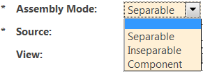
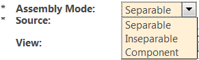
Validating Input Values, Legal Value Lists and Cascading Attributes
You want to restrict the values allowed for an attribute.
Solution Elements
Element | Description |
Legal value list Constraint | |
Enumerated list Constraint | |
EnumeratedType in Modeled class definitions | |
Cascading Attributes | |
Valid Range Constraint | |
upperLimit, lowerLimit Constraints | A constraint defined when defining the modeled class. See Modeling Business Objects for more information on PropertyConstraints. Same functionality as the range constraint when used with Numeric attributes. |
Wildcard Constraint | |
Regular expression constraint | |
String format constraint | |
No Duplicate Values constraint | |
Selection List Style | A property to specify how the legal values should be displayed in the UI. See “Select List Style” in “Configuration Points” section in this topic for more information. |
Include Blank Option | A property to specify whether to include a blank option in the legal value list . See “Include Blank Option” in “Configuration Points” section in this topic for more information. |
Intended Outcome
You are able to do one or more of the following:
• Restrict the input by specifying a set of valid values that the user needs to pick from.
Example:
◦ When Include Blank Option is set to true
◦ When Include Blank Option is set to false
• Allow the value of one attribute to define the value of another attribute, where both attributes have sets of valid values defined.
• Restrict user input to be within a certain range and display a validation message when the value is outside the range(s).
• Ensure that the user input for a String attribute conforms to a given pattern of characters. Display a validation message when the value entered does not conform to the pattern specified in the constraint.
• Require that user input values be unique.
Solution
The combinations of the solution elements required to achieve the different kinds of behavior are listed below:
If you want to….. | Configuration |
Display a Dropdown list (also configurable as a group of radio buttons) with the set of legal values for the attribute; do not allow the user to type in a value. | For global and local attributes, use: • Legal value list for non-localized lists • Enumerated list for localized lists. For modeled attributes, use: • EnumeratedType in Modeled class definitions. • To define a legal value list on an existing modeled attribute without having the need to recompile, use the Legal Value list constraint (localized list) or the Enumerated list constraint(non-localized list) in the Type and Attribute Management utility. |
Allow the user to type in a value, but restrict the value to be within a given range. | For modeled attributes, use upper limit, lower limit constraints. For local and global attributes, use the Range constraint. |
Allow the user to type in a value, but define more than one range for validating the value. | Significant figures constraint This is applicable only to Real Numbers and Real Numbers with Units. |
Allow the value of one attribute to define the value of another attribute. | |
You want to limit the value entered by the user to conform to a given pattern. | Use the wildcard constraint, the regular expression constraint or the string format constraint |
You want to require the set of values entered for a single business object to be unique. | Use the No Duplicate Values constraint. |
Specify how the legal values should be displayed in the UI | Use the property Selection List Style. |
Provide a blank option to clear the current value of the attribute, when using legal value lists. | Use the property Include Blank Option. |
Combining legal value lists, valid range constraint significant and figures constraint
It is possible to have more than one of these configurations defined for an attribute. The following table shows the effect of combining these configurations:
Constraints specified in Type and Attribute Management utility for an attribute | UI behavior |
Legal value list(s) + Enumerated list(s) + Enumerated type | The list displayed will be an intersection of all the constraints i.e. the list will have entries that are common to all the defined lists. Example: Given the following constraints: 1. Enumeration: COLOR_RED = Red COLOR_BLUE = Blue COLOR_GREEN=Green 2. Non-localized legal value list: COLOR_RED COLOR_BLUE 3. Non-localized legal value list: Red Blue If the user were to apply 1 and 2, the resulting legal values should be: COLOR_RED = Red COLOR_BLUE = Blue If the user were to apply 1 and 3, the result would be an empty set (no legal values). When all the legal value lists specified for an attribute are combined, the resulting list will be an intersection of all the lists (i.e. only those entries that are common to all the lists will be added to the resulting list). So it is possible to end up with an empty legal values list when multiple legal value lists have been defined. When the legal value list is empty, the end-user UI displays an input field. |
Legal value list + Range constraint | Drop down populated with only those values in the legal value list that satisfy the range constraint. (configurable as a group of radio buttons). No tool-tip message. |
Legal value list + Significant figures constraint | Drop down populated with only those values in the legal value list that satisfy the range derived from the significant figures constraint. (configurable as a group of radio buttons). No tool-tip message. |
Range constraint + Significant figures constraint | Input field with tool-tip indicating the valid range(s). Validation message will indicate the valid range(s). The valid range(s) will be the range(s) derived from the intersection of these 2 constraints. |
Legal value list + Range constraint + Significant figures constraint | Drop down populated with only those values in the discrete set that satisfy both the range(s) of the “Range constraint” and the range(s) of the “Significant figures” constraint. No tool-tip message. |
Limiting the Length of Values Entered for a String Attribute
You want to limit the length of the value entered for a string attribute.
Solution Elements
Element | Description |
upperLimit, lowerLimit Constraints | A constraint defined when defining the modeled class. See the information on PropertyConstraint in Modeling Business Objects for more information. |
String length Constraint | |
Character Entry Limit | The property Character Entry Limit can be set on a modeled, global or local attribute. See “Configuration Points” section in this topic for more information. |
Intended Outcome
You are able to restrict the length of string attributes in the UI and/or during persistence and provide feedback to the user when the limit is exceeded.
Solution
The combinations of the solution elements required to achieve the different kinds of behavior are listed below:
If you want to….. | Configuration |
Restrict input to a certain number of characters on all the UIs in which the attribute will be displayed for editing. Also apply this restriction during persistence. This applies when you want to create an object programmatically (without a UI) or, when some attributes of an object are not added to the Create UI of an attribute. | For modeled attributes, use upper limit, lower limit constraints. For global and local attributes, use the String length constraint. The string length constraint can be used on modeled attributes also to make configurations without requiring Java code compilation. Limitation: The length of the Name attribute conforms to Windchill UI standards and so cannot be overridden using this constraint. |
Restrict input to a certain number of characters on a specific UI only. Also, do not apply this restriction during persistence. | Use the property Character Entry Limit. Note: This limit has to be less than the maximum string length. |
Byte length
The validation in the end-user UI also takes into consideration the number of bytes needed to store the characters entered, to account for variable width encoding and multi-byte databases.
Merging multiple constraint definitions
When the upperLimit, lowerLimit constraints are specified in the modeled class and one or more String length constraints are specified for the same attribute in the Type and Attribute Management utility, all these constraints are compiled together to provide a range that is common to all of them.
So the minimum number of characters that can be entered will be the maximum of all the lower limit values. The maximum number of characters that can be entered will be the minimum of all the lower limit values.
Example:
Annotated Constraint: Lower limit = 30 Upper limit = 50
Type and Attribute Management utility String Length constraint 1: 20 – 40
Type and Attribute Management utility String Length constraint 2: 35 - 45
Result of combining all these constraints: 35 - 40
Controlling the Size of Input Fields for String Attributes
You want to customize the physical width and/or height of the input fields for string attributes.
Solution Elements
Element | Description |
String Length Threshold For Multiple Line Input | Provided as a property or a preference. See String Length Threshold For Multiple Line Input in Configuration Points section in this topic for more information. |
Input Field Type | Provided as a property. See Input Field Type in Configuration Points section in this topic for more information. |
Text Input Rows | Provided as a property. See Text Input Rows in Configuration Points section in this topic for more information. |
Text Input Columns | Provided as a property. See Text Input Columns in Configuration Points section in this topic for more information. |
Intended Outcome
You are able customize the physical width and/or height of the input fields for some string attributes.
Limitations
• The width and height are not configurable for certain special attributes like Name and Number.
• If a string input attribute is set to span columns in a layout, the input field width will expand to fit the combined width of the columns spanned. This will occur even if the string input length is smaller than the spanned width.
• Column span is not supported in the Structure Browser in this release.
Solution
The combinations of the solution elements required to achieve the different kinds of behavior are listed below:
If you want to….. | Configuration |
Customize the height of all input fields automatically based on the string length constraint | Use String Length Threshold For Multiple Line Input |
Override the automatic behavior provided by the String Length Threshold For Multiple Line Input for a specific attribute only | Use Input Field Type |
Always display a certain type of field(either single line or multi line) for a specific attribute | Use Input Field Type |
Specify the actual number of rows visible without scrolling, in a multi-line text input field. | Use Text Input Rows. |
Customize the width of the input field | Use Text Input Columns. Note: For most fields, the width of the field defaults to that specified by Windchill UI standards and the attribute’s String Length Constraint. |
| |
Multiple Values (Global Attributes Only)
You want to allow an attribute to be assigned more than one value.
Solution Elements
Element | Description |
Single Value Constraint | |
Delimiter for multi-valued attributes. | A preference. See “Delimiter for multi-valued attributes” in “Configuration Points” section in this topic for more information. |
No Duplicate Values | A constraint that requires the set of values for a multi-valued attribute to be distinct. Duplicate values are not allowed. |
Intended Outcome
You are able to
• enter multiple values for an attribute
• edit the values stored for an attribute
• add / remove values when editing the attribute
• require each entered value to be unique
• customize the separator used when displaying multiple values in the UI in the ‘view’ mode
Solution
To configure a global attribute to have multiple values, remove its Single Value constraint. See
Attribute Constraint Rules for more information.
To require each value to be unique, add the No Duplicate Values constraint. Otherwise duplicate values are allowed.
When multiple values assigned to a global attributes are displayed in the UI in the ‘view’ mode, they are separated by commas. To customize the separator, use the preference “Delimiter for multi-valued attributes” . See “Delimiter for multi-valued attributes” in “Configuration Points” section in this topic for more information.
Limitation: Support for multiple values for Alias attributes and Calculated attributes is not available at this time.
Making a String Value All Upper Case or All Lower Case
You want to automatically make a string value all upper-case or all lower-case without imposing this requirement on the user or any system that provides the value.
Solution Elements
Element | Description |
Lower case constraint | |
Upper case constraint | |
Intended Outcome
• You are able to enter the value of a string in any case (upper, lower or mixed-case) in the Create or Edit UIs and have it automatically stored and displayed as either all upper-case or all lower-case.
• You are able to programmatically(using java code, import operations etc) set the value of a string attribute in any case (upper, lower or mixed-case) in the Create or Edit UIs and have it automatically stored and displayed as either all upper-case or all lower-case.
Solution
`
To configure a string attribute’s value to be automatically converted to all lower-case, use the Lower case constraint.
To configure a string attribute’s value to be automatically converted to all upper-case, use the Lower case constraint.
Automatically Creating Hyperlinks
You want to control the automatic conversion of hyperlink text embedded in a string value to HTML hyperlinks.
Solution Elements
Element | Description |
Create Hyperlinks preference | This preference is available in the Attribute Handling category. See “Create Hyperlinks” in “Configuration Points” section in this topic for more information. |
Create Hyperlinks property | Available in the Type and Attribute Management utility Attribute Definition. See “Create Hyperlinks” in “Configuration Points” section in this topic for more information. |
Intended Outcome
• You are able set up a string attribute for the automatic conversion of hyperlink text embedded in a string value to HTML hyperlinks.
• You are able to prevent the automatic conversion of hyperlink text embedded in a string value to HTML hyperlinks.
Solution
To configure this setting for all attributes, use the Create Hyperlinks preference. This preference is available under the Attribute Handling category.
To configure this setting for a specific attribute, use the Create Hyperlinks property that can be set on the attribute definition in the Type and Attribute Management utility.
| The value of the property overrides the value of the preference. |
Defining Custom Labels
You want to customize the label displayed for an attribute.
Solution Elements
Element | Description |
Label property | A property defined in the Type and Attribute Management utility. See “Label” in “Configuration Points” section in this topic for more information. |
Display Name property | A property defined in the Type and Attribute Management utility Attribute Definition. See the Type and Attribute Management utility help topic Attribute Information Page for more information. |
rbInfo files | • componentRB.rbInfo • tableRB.rbInfo • com.ptc.core.htmlcomp.jstable.jstableResource • com.ptc.core.ui.tableRB • wt.enterprise.enterpriseResource (this is also used as the default) • wt.identity.identityResource • wt.templateutil.table.tableResource • com.ptc.windchill.cadx.ws.wsResource |
Intended Outcome
Solution
The combinations of the solution elements required to achieve the different kinds of behavior are listed below:
If you want to….. | Configuration |
Use a custom label on one specific attribute panel only | Use the Label property |
Use a custom column header for an attribute on a specific table only | If the table is defined using a Java builder class, set the custom label using the setLabel() method when defining the com.ptc.mvc.components.ComponentConfig for the column representing the attribute. See the JavaDoc for more information. |
Use the same custom label in all the attribute panels in which this attribute will be displayed | For attributes of TypeManaged objects, use the Display Name property. |
Use the same custom column header for an attribute, on all tables in which this attribute will be displayed. | If the attribute has an entry on one of the following rbInfo files, modify the rbInfo file entry com.ptc.core.htmlcomp.jstable.jstableResource com.ptc.core.ui.tableRB wt.enterprise.enterpriseResource (this is also used as the default) wt.identity.identityResource wt.templateutil.table.tableResource com.ptc.windchill.cadx.ws.wsResource For all other attributes, set the Display Name property of the attribute to the custom label using the Type and Attribute Management utilities Attribute Information Page. For all other attributes, set the Display Name property of the attribute to the custom label using the Type and Attribute Management utilities attribute information page |
Determine the source of the label of an attribute | Enable the logger com.ptc.core.components.labels |
Customizing Data Acquisition
You want to customize the source of the data of an attribute.
Solution Elements
Element | Description |
Data Utility ID | A property defined in the Type and Attribute Management utility or component builder. See “Data Utility Id” in Configuration Points section in this topic for more information. |
Need property | A property defined in the Type and Attribute Management utility. See “ Need“ in Configuration Points section in this topic for more information. |
Target Object property | A property defined in the Type and Attribute Management utility. See “Target object” in Configuration Points section in this topic for more information. |
Intended Outcome
The data for an attribute can be fetched from attributes other than the default.
Solution
The combinations of the solution elements required to achieve the different kinds of behavior are listed below:
If you want to…. | Configuration |
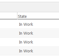
Specify the source of data for a composite attribute or a reference attribute | Example The value of the state attribute actually comes from State.state. The attribute that is defined on the type is State. When defining the component configuration, to indicate that the source of data for this attribute is State.state, set the value of the Need property of the State attribute to State.state. |
Specify a different source of data for a specific to the UI only | When defining the component configuration, set the value of the Need property of the attribute. |
Use data from multiple attributes and assemble them using custom logic, to form the value to be displayed in the UI. | Wherever possible, define a calculated attribute. If the required calculation is outside the scope of the current support provided for calculated attributes, use a custom data utility. When defining the component configuration, set the value of the Need property of the attribute to the list of attributes that need to be fetched for calculating the value. Example: attributeConfig.setNeed("name, number, creator"); |
Providing Alternate UI Behavior
You have a need to customize the rendering of a local attribute like Name that already has a data utility mapped to it, only for a specific case. Since the attribute id is already mapped to a data utility, adding another mapping using the same attribute id will not work as expected. See Data Utilities for additional information.
Solution Elements
Element | Description |
Data Utility ID | A property defined in the Type and Attribute Management utility or component builder. See “Data Utility Id” in Configuration Points section in this topic for more information. |
Need property | A property defined in the Type and Attribute Management utility. See “Need” in Configuration Points section in this topic for more information. |
Target Object property | A property defined in the Type and Attribute Management utility. See “Target object” in Configuration Points section in this topic for more information. |
Intended Outcome
The data for an attribute can be fetched from attributes other than the default.
Solution
The combinations of the solution elements required to achieve the different kinds of behavior are listed below:
If you want to….. | Configuration |
Use a custom data utility to render an attribute for the scope of a specific UI only and that attribute already has a data utility mapped to it and, the UI is one of the following: • an Attribute panel defined using the Type and Attribute Management utility or a builder class • an Table defined using the Type and Attribute Management utility or a builder class | Example: To render Number using a custom data utility called MyNumberDataUtility 1. Define your custom data utility (MyNumberDataUtility) 2. In an xconf file, map the custom data utility to a custom attribute id(myNumber). For more information see “Map the Data Utility to the Attribute ID” section in this topic . 3. Set the Data Utility Id property of that attribute to myNumber |
Use an existing data utility to render an attribute in all the UIs in which the attribute is rendered | In an xconf file, map the custom data utility to a custom attribute id(myNumber) |
In a specific UI only, render an attribute using an existing data utility; the existing DU might be already mapped to one or more attributes | To render myNumber using using a custom data utility called MyNumberDataUtility 1. Define your custom data utility (MyNumberDataUtility) 2. In an xconf file, map the custom data utility to a custom attribute id(myNumber) 3. Set the Data Utility Id property of that attribute to myNumber |
Rendering the same attribute for multiple objects within the same table | The column ids must be unique, so you need to use Target Object and Data Utility Id properties to accomplish this. For example, a table could have 3 columns that all render the Name attribute, but from 3 different objects: 1. Add all the three attributes to the attribute panel or table definition 2. For the attributes that belong on objects that are not the backing object, set the value of the property Data Utility Id to “name” and the Target Object to the attribute that represents the object Example: To display the name attributes of the roleAObject and roleBObject the same way the name attribute of the backing object is displayed, for each of those attributes, set the properties as follows: • For roleAName ◦ Data Utility Id = name ◦ Target Object = roleAObject • For roleBName ◦ Data Utility Id = name ◦ Target Object = roleBObject |
Specifying different renderers for the same attribute id for different object types | Example: You need to render the render the state attribute of a Document differently than the state attribute of a Part. Type-based lookup of data utilities is currently not supported by the infrastructure. If this type of behavior is needed, and if your UI displays objects of the same type, then use the Data Utility Id property to accomplish this. On a UI that displays objects of multiple types, like the Folders page, you may use a custom data utility and do the type-based checking within that custom data utility. |
Customization of Common Windchill Business Attributes
Some Windchill attributes need to adhere to specific Windchill standards and rules. This behavior is provided OOTB. Some of this behavior is customizable. This section lists some of these standard Windchill attributes and their configuration points.
Number
Render Number as a link to the object’s information page
Use case: I want to render the Number attribute as a hyperlink to the object’s information page.
This behavior can be enabled/disabled by using the “Is Info Page Link“ property. See Configuration Points section in this topic for more information.
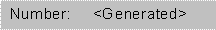
Making the value of Number server-generated/ server pre-generated/ immutable
The out of the box behavior of Number can be customized using
Object Initialization Rules.
The combinations of Object Initialization Rules required to achieve the different kinds of behavior for Number are listed below:
If you want to….. | You will need to configure your OIRs like this… | The UI the Create Wizard will look like this… |
Always use the server generated value and, do not allow the user to enter a value. | <Value algorithm="com.ptc.core.rule.server.impl.GetImmutableConstraint"/><Value algorithm="com.ptc.core.rule.server.impl.GetServerAssignedConstraint"/> | |
Always use the pre- generated value configured in the Object Initialization Rules and, display this value in the UI and, do not allow the user to modify this value. | <Value algorithm="com.ptc.core.rule.server.impl.GetImmutableConstraint"/><Value algorithm="com.ptc.core.rule.server.impl.GetServerPreGeneratedValue"/> | Pre-generated value with no override |
Use the pre- generated value defined in the Object Initialization Rules and, display this value in the UI and, want to allow the user to modify this value. | <Value algorithm="com.ptc.core.rule.server.impl.GetServerPreGeneratedValue"/> | Pre-generated value with override. |
Always require the user to provide the value | If there are no other OIR constraints defined for Number, this needs an empty constraints list to work as expected. <AttrConstraint id="number" algorithm="com.ptc.core.rule.server.impl.GatherAttributeConstraints"/> | |
Allow the user to enter a value and, if a value is not provided by the user, auto-generate a value on the server. | <Value algorithm="com.ptc.core.rule.server.impl.GetServerAssignedConstraint"/> | |
| If the above configurations do not yield the results listed above, check the following values of these other configurations which also affect the editability of Number in a Create or Edit UI: • The Type and Attribute Management utility Visibility settings. See Visibility Tab for more information. • The Type and Attribute Management utility Visibility settings. See the “Visibility Tab” online help topic for more information. |
Name
Render Name as a link to the object’s information page
This behavior can be enabled/disabled by using the “Is Info Page Link” property. See Configuration Points section in this topic for more information.
Making the value of Name server-generated/ server pre-generated/ immutable
The same customization method used for Number can be used for Name to make it server-generated or server pre-generated or immutable. Object Initialization Rules required to achieve the different kinds of behavior for Name as the same as those of Number listed in the “Making the value of Number server-generated/ server pre-generated/ immutable “ section in “Number” section in this topic.
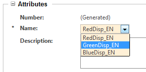
Built-in support for Enumeration Constraints on the Name attribute
Starting in Windchill release 10.1 the Name attribute of the Document, Part, and EPM Document types now has built-in support for Enumeration Constraints (static and dynamic). Remember that Enumeration entries have both an internal value and display values for each entry. The display values may be localized in multiple languages.
This new support allows customers to easily restrict the allowable values for the Name attribute, and also allows users to see localized values for the saved/persisted name, depending on their current locale.
If you have activated this feature and also configured an enumeration constraint on the Name attribute of any of these types (actually the constraint must be applied to the ___Master of these types), then in Create or Edit wizards the Name attribute will appear as a ComboBox with the (potentially localized) entries that were specified in the enumeration. In display-only tables & Info pages, the Name attribute will appear with the “Display” value of the saved enumeration entry.
Example of an enumeration constraint applied to the “name” attribute (note the “_EN” suffix was manually added to the display values for testing)
To activate support for Enumeration Constraints on the Name attribute, the following property must be added to site.xconf, and then “xconfmanager –Fp” must be run from a windchill shell (and then Windchill must be restarted): <Property name="com.ptc.EnableEnumeratedName" overridable="true" targetFile="codebase/wt.properties" value="true"/>
After this has been done, then launch the Type and Attribute Management utility (from the “Utilities” page), select one of these types from the tree: Document Master, Part Master, or EPM Document Master , and then select the “name” attribute, enter “Edit” mode, add a new Enumeration Constraint (static or dynamic), and then edit the enumeration (for static, add entries; for dynamic, set the provider & init string), and then save the changes. (See the Type and Attribute Management documentation for more info.)
Note that if the “com.ptc.EnableEnumeratedName” property is set, when the Name attribute is saved (from a Create wizard), the internal value of the enumeration entry is saved to the database, NOT the display value of the entry. When the name attribute is displayed in “view” mode (like in a table or Info Page), the (localized) display name will be referenced from the enumeration and displayed in the UI. This allows different users that are using different locales to see different localized values for the name attribute.
However, it also means that if the “com.ptc.EnableEnumeratedName” property is set to false (or removed) OR if the enumeration constraint is disabled or deleted, then the INTERNAL value will be displayed in view mode. Please keep this aspect of the feature in mind.
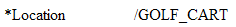
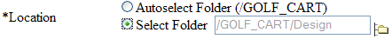
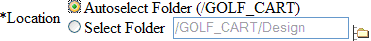
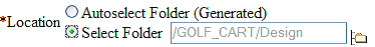
Location
The UI behavior of the Location attribute can be customized using Object Initialization Rules (see
About Object Initialization Rules for more information). The combinations of Object Initialization Rules required to achieve the different kinds of behavior for Location are listed below:
If you want to….. | You will need to configure your OIRs like this… | The UI the Create Wizard will look like this… |
Always use the ‘server assigned’ folder and, do not want to allow the user to specify a folder. | <Value algorithm="com.ptc.core.rule.server.impl.GetImmutableConstraint"/><Value algorithm="com.ptc.core.rule.server.impl.GetServerAssignedConstraint"/> | |
Always use the pre-generated folder defined using Object Initialization Rules and, display this value in the UI and, do not want to allow the user to modify this value. | <Value algorithm="com.ptc.core.rule.server.impl.GetImmutableConstraint"/><Value algorithm="com.ptc.core.rule.server.impl.GetServerPreGeneratedValue"/> | |
Allow the user to select a folder manually, and to display the launch context folder as the default value. | If there are no other OIR constraints defined for Location, this needs an empty constraints list to work as expected. <AttrConstraint id="folder.id" algorithm="com.ptc.core.rule.server.impl.GatherAttributeConstraints"/> | The field is populated with the folder from the launch context. |
Provide the following options to the user • Use the pre-generated folder defined using Object Initialization Rules or, • Select a folder manually; display the launch context folder as the default value for this. • Pre-select the launch context folder as the default option. | <Value algorithm="com.ptc.core.rule.server.impl.GetServerPreGeneratedValue"/> | The value of Autoselect Folder is the pre-generated value defined using Object Initialization rules. |
Provide the following options to the user • Use the pre-generated folder defined in Object Initialization Rules or, • Select a folder manually. display the launch context folder as the default value for this • Pre-select the pre-generated folder as the default option. | <Value algorithm="com.ptc.core.rule.server.impl.GetServerPreGeneratedValue"/><Value algorithm="com.ptc.core.rule.server.impl.GetRendererConstraint"><Arg>SelectGeneratedFolderByDefault</Arg></Value> | The value of Autoselect Folder is the pre-generated value defined in Object Initialization rules. |
Provide the following options to the user • Use the ‘server assigned’ folder or, • Select a folder manually; display the launch context folder as the default value for this • Pre-select the launch context folder as the default option. | <Value algorithm="com.ptc.core.rule.server.impl.GetServerAssignedConstraint"/> | |
Provide the following options to the user • Use the ‘server assigned’ folder or, • Select a folder manually; display the launch context folder as the default value for this. • Pre-select the server-assigned folder as the default option. | <Value algorithm="com.ptc.core.rule.server.impl.GetServerAssignedConstraint"/><Value algorithm="com.ptc.core.rule.server.impl.GetRendererConstraint"><Arg>SelectGeneratedFolderByDefault</Arg></Value> | |
Principal Attributes
1. Render Principal as a link to the Principal’s information page
This behavior can be enabled/disabled by using the “Is Info Page Link”property (see Configuration Points section in this topic for more information).
Revision
The Revision attribute can be configured to distinguish between the checked-out original and the working copy. This can be done by setting the “Distinguish WIP Versions” property (see Configuration Points in this topic for more information).
Lifecycle State
The Lifecycle State attribute can be configured to render all the lifecycle states instead of just the current state. This can be configured by setting the “Is Render All States” property (see Configuration Points in this topic for more information).
| This configuration is applied only when the attribute is displayed on a table or on a component whose com.ptc.core.ui.resources.ComponentType is SIMPLE. |
UI behavior
• When Is Render All States is set to true:
• When Is Render All States is set to false:
Data Utilities
Data utilities are java classes that can be used for customizations that cannot be accomplished using the available configuration points.
A data utility is used to get the data and meta-data of an attribute and create the UI component which will be used to render the attribute in the UI. If the data returned by a core API is not sufficient for creating the UI component, data utilities can be used to augment this data with additional information. The additional information can be fetched by an additional query, a call to a service, or whatever else you can get at via Java code.
The OOTB implementations of data utilities provide the behavior defined for Windchill OOTB applications in accordance with Windchill UI standards.
You can configure a data utility for any attribute id.
Creating a Data Utility
Creating a new data utility consists of the following steps:
• Create the data utility (Java) class
• Map the data utility class to the attribute id in an XCONF file
Creating the Data Utility Class
Create your data utility by implementing the com.ptc.core.components.descriptor.DataUtility interface.
Since data utilities are looked up using application context, your implementation class must be public and must have a public no-arg constructor.
It is highly recommended that when you implement a new data utility, you extend the AbstractDataUtility base class.
If you have a need to augment the attribute value or change how the attribute is rendered, you should consider extending the existing data utility, if applicable. Use the Available Attributes Report or JcaDebug to find the data utility currently mapped to an attribute. See
Available Attributes Report and
Using jcaDebug for more information.
1. Implement the getDataValue() method of the DataUtility interface:
The getDataValue() method gets the content that should be placed in the UI for a given attribute.
Example:
Suppose you want to append the value of a specific string attribute with some extra text. This can be done as follows:
Object getDataValue(String component_id, Object datum, ModelContext mc)
throws WTException {
…..
…..
String rawVal = myObject.get(component_id);
String displayVal = rawVal + “My extra text”;
TextDisplayComponent gui = new TextDisplayComponent(…);
gui.setValue(displayVal);
…
…
return gui;
}
| Avoid making database calls in getDataValue(), because when dealing with tables, the method is called once for every cell in the column. If they must be done, try to do work in setModelData() which is called once per column and cache the results so the database does not have to be called more often than necessary. |
2. Implement the setModelData() method of the DataUtility interface:
In the interests of performance, we want to process all the objects to be displayed in a single call to setModelData() and to perform the required database queries for all the objects at once, rather than making a separate query for each object.
When multiple objects needs to be fetched, as in the case of a table where multiple row objects needs to be fetched, the setModelData()method allows the data utility to prefetch data for all the row objects that will be rendered. The method is called before getDataValue() is called for any row/cell, and is supplied a list of all the objects that will be processed.
You can take advantage of this call to do some multi-object queries and save the results for later use in the getDataValue()method. If this method is implemented, then you must configure the data utility to be stateful.
Map the Data Utility to the Attribute ID
Add an application context entry to an xconf file like the following:
<Service name="com.ptc.core.components.descriptor.DataUtility">
<Option serviceClass="com.ptc.core.components.factory.
dataUtilities.ProjectDataUtility"
requestor="java.lang.Object"
selector="projectHealthStatus"
cardinality="singleton"/>
</Service>
<Service name="com.ptc.core.components.descriptor.DataUtility">
<Option serviceClass="com.ptc.core.components.factory.dataUtilities.
FolderedDataUtility"
requestor="java.lang.Object"
selector="location"
cardinality="duplicate"/>
</Service>
A note on cardinality:
Your safest bet is to use a "duplicate" cardinality. This will create a new instance of the data utility each time one is requested.
Data utility configuration entries can be added to any xconf file that ends up being read in by application context (any "service.properties"-type file). The general convention is to use a file named someprefix.dataUtilities.properties.xconf.
When setModelData() is called, the data utility is given a set of objects for which the JCA infrastructure will later request a suitable value to display in the table for each of the objects; the data utility has the opportunity to determine these values and cache them for later retrieval. The JCA infrastructure will later call the getDataValue() method to obtain the specific table cell value for a given object, which the data utility may retrieve from its previously computed cache.
How to Find an Attribute ID
When creating an attribute configuration in your java code you must specify the id of the attribute.
For Typed and TypeManaged objects, the id should be the Internal Name shown for the attribute in the Type and Attribute Management utility. For other objects, names can be found in the following sources. When using these reports you must type in a fully qualified type name, including the full package – for example, “wt.part.WTPart.”
Logical Attributes Report
This can be viewed by navigating to Customization -> Tools -> Logical Attributes Report.
For TypeManaged classes, this report includes:
1. Alias attributes defined in LogicalAttributes.xml file(s) (Note: This is no longer a recommended practice. Use the Type and Attribute Management utility to define alias attributes instead..)
2. Hard (annotated) attributes, unless overridden by the above.
3. Attributes defined in the Type and Attribute Management utility, unless overridden by an alias attribute..
For non-TypeManaged classes, this report includes:
1. Alias attributes defined in LogicalAttributes.xml file(s)
2. Hard (annotated attributes), unless overridden by an alias attribute.
Use the Logical Form of the name from this file as the attribute id in AttributeConfigs and describeProperty tags. Note that not all attributes listed can be used in the UI. A data utility that has the ability to create a gui component for the attribute must be available before it can be displayed.
Available Attributes Report
This can be viewed by navigating to Customization -> Tools -> Available Attributes Report.
This report lists the attributes that can be included in table views. Any attribute in this list could be included in an attribute panel using the name in the JCA ID column.
Property Report
This can be viewed by navigating to Customization -> Tools -> Property Report.
This is a composite report that includes the hard attributes of a type, the logical attributes listed in the Logical Attribute Report, and the table view attributes listed in the Available Attributes Report. You can click on each attribute to display additional information about it, including the data utility registered for it, if any. Note that the DefaultDataUtility will handle many attributes for which there is not a specific data utility listed.
Not all the attributes in this report are viewable in an attribute panel. In particular, Calculated attributes cannot typically be used in the UI.
Configuration Points
Considerations
• Type and Attribute Management utility Attribute Definition : Set using the
Attribute Information Page. The configuration applies to a specific attributes, in all clients.
• Type and Attribute Management utility Attribute Panel Layout Definition : Set using the
Editing Group Attribute Properties window of the attribute in the
Type and Attribute Management utility. Can be used only for attribute panels since the scope is limited to the specific panel.
Can also be set using the ComponentConfig builder, which is used for customizing attributes on attribute panels or tables. The configuration applies to a specific attribute in a specific UI only.
Property Name | Applicable attribute data types | Description | Preference (The configuration applies to all attributes, in all clients) | Type and Attribute Management utility Attribute Definition | Type and Attribute Management utility Attribute Panel Layout Definition |
Default Value Display Mode | All data types | Configures how to populate the default value, if any, in the input field for the attribute. Defaults to “Pre-populate”. Possible values: • None – the default value will not be used to populate the input field • Pre-Populate – the default value, if one is set, will be set in the input field • Button – A button will be displayed after the input field, the user can click the button to add the default value to the input field. | Available as a Site level preference in the Attribute Handling category. | If not specified, the value of the preference “Default Value Display Mode” will be used. | If not specified, the value of this property from the Attribute Definition will be used, if one has been specified. Otherwise, the value of the preference will be used. OR setDefaultValueDisplayMode() |
Selection List UI Style | All attributes that have a Legal Value List constraint or an Enumerated Value List constraint defined. | Specifies whether the legal values (selection list) for the attribute should be displayed as a drop-down list or as a set of radio-buttons, when the attribute is presented for data entry. Defaults to “Drop Down List”. Possible values: • Drop Down List – the values will be rendered in a drop down list, where the user can select one option • Radio Buttons – the values will be rendered as a set of radio buttons, where the user can select one option | Available as a Site level preference. Note: Applies to all attributes, except Boolean attributes. AT this level, the style for Boolean attributes is controlled by the preference Boolean Style. | If not specified, the value of the preference “Selection List Style” will be used. | If not specified, the value of this property from the Attribute Definition will be used, if one has been specified. Otherwise, the value of the preference will be used. OR setSelectionListStyle() |
Boolean Style | Boolean | Controls how Boolean attributes are displayed for input, either as radio buttons or as a dropdown list. Defaults to “Radio Buttons”. Possible values: • Drop Down List – the values will be rendered in a drop down list, where the user can select one option • Radio Buttons – the values will be rendered as a set of radio buttons, where the user can select one option | Available as a Site level preference. | Use the property “Selection List Style” to override the value of this preference for a specific attribute. If not specified, the value of the preference “Boolean Style” will be used. | If not specified, the value of the property “Selection List Style” from the Attribute Definition will be used, if one has been specified. Otherwise, the value of the preference will be used. OR setSelectionListStyle() |
String Length Threshhold For Multiline Input | String | Specifies the threshold for rendering a multi-line input field for a String attribute. The value can be any positive number. If the maximum length of the attribute in characters exceeds this value, a multiline input field will be displayed for data entry. Defaults to 60. | Available as a Site level preference. | If not specified, the value of the preference “String Length Threshold for Multiline Input” will be used. | If not specified, the value of this property from the Attribute Definition will be used, if one has been specified. Otherwise, the value of the preference will be used. setStringLengthThreshholdForMultilineInput() |
Input Field Type | String | Specifies whether the input field for the attribute should be single-line or multi-line. This directive will override that of the stringLengthThresholdForMultilineInput. Possible values: • Single Line – a textbox will be rendered for this attribute • Multiple Lines – a text area will be rendered for this attribute | Not available at this level | If not specified, this property is not assigned a default value. | If not specified, the value of this property from the Attribute Definition will be used, if one has been specified. OR setInputFieldType() |
Date Input Field Type | Date | Specifies whether the input field for a Timestamp attribute is of type date-only or date & time, so that the UI components can be created accordingly. The default is “Date Only”. Possible values: • Date Only – Allow the user to only set the date portion. • Date and Time – Allow the user to set both the date and time portion. | Not available at this level. | If not specified, the default will be used. | If not specified, the value of this property from the Attribute Definition will be used, if that has been specified. Otherwise the default will be used. OR setDateInputFieldType() |
Date Display Format | Date | A date format string (i.e. yyyy-mm-dd) to use when displaying the value of this attribute in View mode. This does not affect the format used to set the value in input mode. Please refer to the Java class java.text.SimpleDateFormat for the full set of valid characters. If not set, one of the following formats will be used from the rbInfo file componentRB: • STANDARD_DATE_DISPLAY_FORMAT – if the value of the property “Date Input Field Type” is set to “Date Only”, this format will be used. • STANDARD_DATE_TIME_ZONE_DISPLAY_FORMAT – if the value of the property “Date Input Field Type” is not set or is set to “Date and Time”, this format will be used. | Not available at this level. | If not specified, the default will be used. | If not specified, the value of this property from the Attribute Definition will be used, if that has been specified. Otherwise the default will be used. OR setDateDisplayFormat() |
Local Time Zone | Date | Specifies the time zone to use for Date attributes that display both the Date and Time portions (i.e. yyyy-MM-dd hh:mm zzz). This is only used in view mode; it is not used for input mode. | Available as a User level preference | Not available at this level. | Not available at this level. |
Measurement system | Real Number with Units | Specifies the measurement system to use for Real Numbers with Units. | Available as a User level preference | Not available at this level. | Not available at this level. |
Create Hyperlinks (in 9.x this was called Ignore URL values in strings) | String | Specifies whether URL style text embedded in the value of a String attribute should be displayed as a hyperlink in the view mode (example: http://www.ptc.com). Defaults to ‘true’. | Available as a Site level preference | Note: When upgrading from 9.x to 10.0, if this property were customized using the file AllClient.xml, manual migration is needed. If not specified, the value of the preference “Create Hyperlinks” will be used. | Not available at this level. |
Percent | Numeric | Specifies if a numeric value is to be displayed as a percentage or not. This property is only used in view mode. When specified, the notation used will be locale-specific. Defaults to false. | Not available at this level. | If not specified, the default will be used. | If not specified, the value of this property from the Attribute Definition will be used, if that has been specified. Otherwise the default will be used. OR setPercent() |
Currency | Numeric | Specifies if a numeric value is to be displayed as currency value or not. This property is only used in view mode. When specified, the notation used will be locale-specific. Defaults to false. | Not available at this level. | If not specified, the default will be used. | If not specified, the value of this property from the Attribute Definition will be used, if that has been specified. Otherwise the default will be used. OR setCurrency() |
Input Required | All | Used to mark attributes as ‘Required fields’ even though they may not have a ‘Required’ constraint. This property is used purely for the UI rendering. Unlike the “Required constraint”, this will not trigger any server-side validation. Note: If an attribute that has a ‘Required constraint’ is marked as “not required” using this property, a server-side exception will be thrown, unless the server-side code takes care of setting the value for the attribute by some other means. The most common usage of this property is to force the user to provide a value for an attribute that does not have a “required constraint” defined on it. | Not available at this level. | Not available | If not specified, the default will be used. OR setInputRequired() |
Is Info Page Link | ‘Name’, ‘Number’ and Principal attributes only | Specifies if the attribute is to be displayed as a hyperlink to the Information Page. In the case of Principal attributes, this will be displayed as a link to the principal’s info page. When not specified, the following defaults are used: • ‘true’ for Number and Container name • ‘false’ for all other attributes | Not available at this level. | Not available at this level. | If not specified, the default will be used. OR setInfoPageLink() |
Delimiter for multivalued attributes | | Specifies the character(s) to use as a separator when displaying the values of an attribute that contain multiple values. This applies only to Global Attributes since they are the only type of attributes that can have multiple values assigned to an attribute. Defaults to a comma followed by a space. | Available as a Site level preference | Not available at this level. | Not available |
Text Input Columns | | An integer value that specifies the width to render the Text Area in create or edit mode. This only applies to String attributes and is only used when the property “Input Field Type” is set to “Multiple Lines” | Not available at this level. | Not available at this level. | If not specified, the width defaults to the value specified by Windchill UI standards and the attribute’s String Length Constraint. |
Text Input Rows | | An integer value that specifies the height to render the Text Area in create or edit mode. This only applies to String attributes and is only used when a multi-line input field is required based on the properties String Length Threshhold For Multiline Input and Input Field Type. | Not available at this level. | Not available at this level. | If not specified, the number of rows is based on the String Length Constraint and the width of the column. The max number of rows is limited to 3. A scroll bar is added when the input exceeds 3 rows. OR setTextInputRows() |
Include Blank Option | | Specifies whether a blank option should be added as the first entry of a dropdown list that displays the legal value list of an attribute. When the legal values are displayed as a set of radio-buttons, a button with the label “Undefined” will be added as the first button in the list. Default to true. | Not available at this level. | Not available at this level. | If not specified, the value defaults to true. OR setIncludeBlankOption() |
isRenderAllStates | Lifecycle state attributes only | Specifies whether to render all the lifecycle states instead of just the current state. NOTE: This attribute is applicable to components with component type of SIMPLE or TABLE only. Default to false. | Not available at this level. | Not available at this level. | If not specified, the value defaults to false. OR setRenderAllStates() |
Distinguish WIP Versions | Revision attribute only | Specifies whether to distinguish between the checked-out original and the working copy. | Not available at this level. | Not available at this level. | If not specified, the value defaults to false. OR setDistinguishWIPVersions() |
Character Entry Limit | | Species the maximum number of characters that can be entered in the UI for a String attribute. | Not available at this level. | Not available at this level. | setCharacterEntryLimit() |
Data Utility ID | | The id to use for data utility lookup. When unspecified, the descriptor id is used for the lookup. | Not available at this level. | Not available at this level. | setDataUtilityId() |
Need | | The logical name of an object attribute needed to create the display value for a column cell. Used by data utilities for retrieving the cell value when the property/column id is not an attribute name defined by introspection or logical attributes. Use a comma-separated list if multiple attributes are needed. | Not available at this level. | Not available at this level. | setNeed() |
Target Object | | The target object to use for this column when it is processed by the Windchill Client Architecture infrastructure. By configuring the targetObject property, the developer tells the infrastructure to use an alternate row object that is derived from the backing row object returned by the underlying api. | Not available at this level. | Not available at this level. | ComponentConfig.setTargetObject() |
Label | | Used to set the label of an attribute | Not available at this level. | Use the display name on the attribute definition. | setLabel() |
Mode | | The mode in which the attribute will be displayed. There are 3 modes available: Create, Edit and View | Not available at this level. | Not available at this level. | setMode() |
Limitations
Defining Discrete Set using OIRs / Providing Input Components for Reference Attributes
OOTB, discrete sets are defined for TeamTemplate and Lifecycle Template attributes in the OIRs rather than in the Type Manager. This is because these attributes are reference attributes.
At present we do not have infrastructure support for displaying reference attributes in the input mode. We will need to map each of the reference attributes to a picker if this needs to be enabled. If there is a request from a customer for this support, we could try of the OIR approach used for TeamTemplate and Lifecycle Template attributes will work for that case.
Checklist for Things to Add when Writing Attribute Customization
• Configuration points
• Effect of multiple configurations – what takes precedence, how they are resolved
◦ Hierarchical
◦ Duplicate (when they are at the same level and scope)
• UI behavior
• Validation
◦ In the UI
◦ At the server
Calculated Attributes with Formula to Gather Multiple Values may not work without a DataUtility
Because some attributes are generated via a dataUtility, their value may not be available to be added automatically to a calculated attribute where the formula calls out the value to be used. In this case, the new attribute would also need a dataUtility where the value can be put together properly
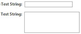
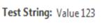
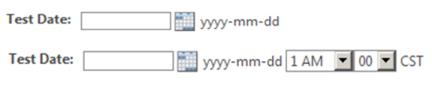
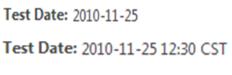
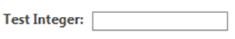
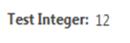
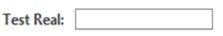
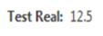
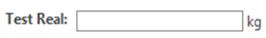
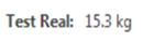
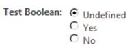
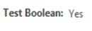
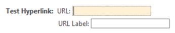

