Detailed Chart Examples
This section provides details on defining the key components of sample charts of each type.
Trend Chart
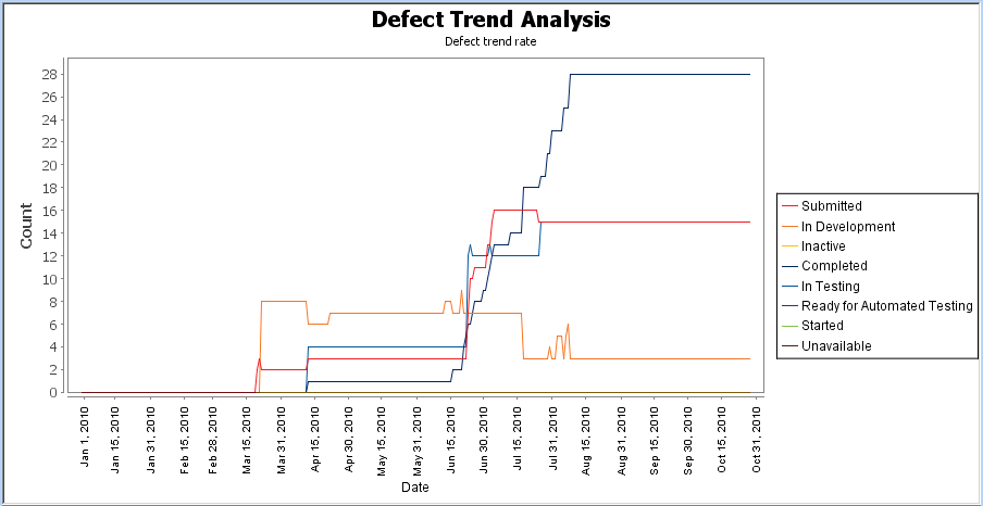
To create a trend chart that shows the number of defects created over the current year and their resolution (by state), summarized on a daily basis, do the following:
1. On the Charting Values panel, define the following values:
|
Field
|
Value
|
|---|---|
|
Start Date
|
Date, Jan 1, 2010
|
|
End Date
|
Run Chart Date
|
|
Interval Type
|
Day
|
|
State
|
State
|
|
Values
|
In Review [alias Submitted]
Assigned [alias Submitted]
In Development [alias In Development]
Inactive
Completed [alias Completed]
In Testing [alias In Testing]
Accepted [alias Submitted]
Proposed [alias Submitted]
Ready for Automated Testing
Started
Unavailable
|
|
Include Future Values
|
enabled
|
2. On the Graph tab, click the line graph icon for Graph Style.
For example, the following chart is generated:

Item Fields Trend Chart
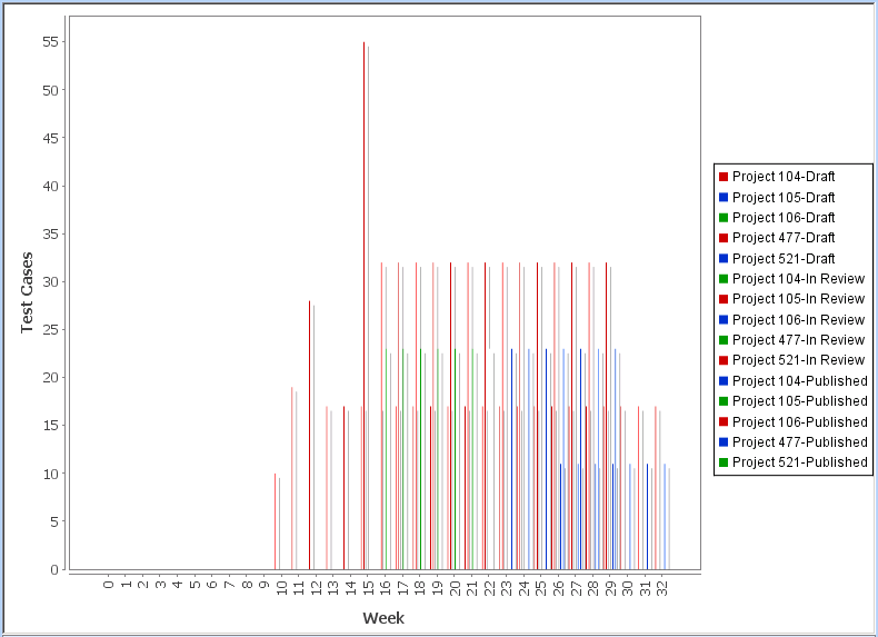
To create an item fields trend chart that reports on the progression of test authoring activity over a period of weeks, do the following:
1. On the Query tab, select a query that shows the project items that you want to chart.
2. On the Charting Values tab, under Time Values, define the following values:
Field | Value |
|---|---|
Start Date | Select Item Date Field and then Created Date in the field to the right. |
End Date | Select Calculated Date. |
Interval Type | Select Week. In the field to the right, you specify the interval value. Type52. |
3. Under Item Field Values, define the following expressions:
Numeric Field | Expression Label |
|---|---|
Test Case Content Count - Open | Draft |
Test Case Content Count - In Review | In Review |
Test Case Content Count - Published | Published |
For all expressions, Axis Label is Test Cases and Display Pattern is #,###.
4. Under Display Attributes, for Display chart values as, select Values.
5. On the Graph tab, select the vertical bar graph icon for Graph Style.
6. On the Graph tab, select the Colors tab in the lower panel. Then, define custom colors for the Draft, In Review, and Published data.
7. Click OK.
For example, the following chart is generated:

Distribution Chart
To create a distribution chart that shows the health and status of active projects per product, do the following:
1. On the Query tab, select a query that shows active project items.
2. On the Charting Values tab, under Values To Chart, select Product as the Field, and then choose active products from the Values list.
3. Enable Include Future Values and Show Zero Count Values.
4. On the > tab, define the following expressions:
Aggregate Expression | Expression Label | Axis Label | Display Pattern |
|---|---|---|---|
count() | # of Projects | Count | #,### |
max("Product Health Value") | Health | Count | none |
sum("Total Estimated Effort") | Total Estimated Effort | Days | #,##0 days |
sum("Total Actual Effort") | Total Actual Effort | Days | #,##0 days |
sum("Total Estimated Effort")-sum("Total Actual Effort") | Effort Variance | Days | #,##0 days |
5. On the Graph tab, choose the table rendering icon for Graph Style.
6. On the > tab, define the following Range Definitions for the Health computed expression:
Label | From | To | Icon | Text Style | Display Format |
|---|---|---|---|---|---|
Green | -1.0 | -1.0 | green circle image | Plain | Icon |
Yellow | 0.0 | 0.0 | yellow circle image | Plain | Icon |
Red | 1.0 | 1.0 | red circle image | Plain | Icon |
Define the following Range Definitions for the Effort Variance computed expression:
Label | From | To | Icon | Text Style | Display Format |
|---|---|---|---|---|---|
Red | -Infinity | 0.0 | red circle image | Plain | Icon & Value |
Yellow | 1.0 | 10.0 | yellow circle image | Plain | Icon & Value |
Green | 11.0 | Infinity | green circle image | Plain | Icon & Value |
7. Click OK.
For example, the following chart is generated:

Item Fields Charts
To create an item fields chart that shows effort, budget, and schedule metrics for all active projects, do the following:
1. On the Queries tab, select a query that shows active Project items.
2. On the Charting Values tab, define the following expressions:
Field Name/Expression | Expression Label | Display Pattern |
|---|---|---|
“Health Value” | Health | |
“Estimated Budget” | Est. Budget | $#,### |
“Actual Budget” | Act. Budget | $#,### |
“Budget Variance” | Budget Variance | $#,### |
“Estimated Effort” | Est. Effort | #,###.#hrs |
“Actual Effort” | Act. Effort | #,###.#hrs |
“Effort Variance” | Effort Variance | #,###.#hrs |
3. In the Item Identifier field, specify {Project} ({Product}).
4. On the > panel, define the following Range Definitions for the Health computed expression:
Label | From | To | Icon | Text Style | Display Format |
|---|---|---|---|---|---|
Green | -1.0 | -1.0 | green circle image | Plain | Icon |
Yellow | 0.0 | 0.0 | yellow circle image | Plain | Icon |
Red | 1.0 | 1.0 | red circle image | Plain | Icon |
Define the following Range Definitions for the Budget Variance computed expression:
Label | From | To | Icon | Text Style | Display Format |
|---|---|---|---|---|---|
Red | -9.99999999E8 | -100001.0 | red circle image | Plain | Icon & Value |
Yellow | -10000.0 | 10.0 | yellow circle image | Plain | Icon & Value |
Green | 10000.0 | 9.99999999E8 | green circle image | Plain | Icon & Value |
Define the following Range Definitions for the Effort Variance computed expression:
Label | From | To | Icon | Text Style | Display Format |
|---|---|---|---|---|---|
Red | 0.15000000000001 | 9999.0 | red circle image | Plain | Icon & Value |
Yellow | 1.0E-13 | 0.15 | yellow circle image | Plain | Icon & Value |
Green | -9999.0 | 0.0 | green circle image | Plain | Icon & Value |
5. Click OK.
For example, the following chart is generated:
