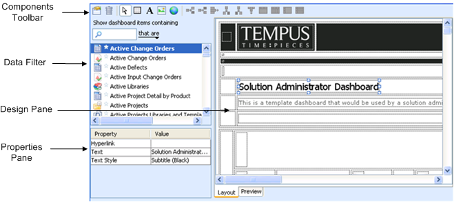
Component | Description |
Components Toolbar | Includes tools to design a dashboard. For example: • modify general properties and default styles for text, cells, and grids • select components of template, including grids, cells, and labels. • add new grid to dashboard • insert image into cell • inserts URL link into cell Certain tools can work in two modes: • clicking the tool to operate in the selected mode, for example, clicking the text tool to insert a text label into a cell • dragging the tool onto the design pane to add the selected component, for example, dragging the image tool to insert an image into a cell |
Data Filter | Allows you to locate and select objects to insert into the dashboard, such as charts, queries, and reports. |
Design Pane | Area for designing your dashboard (using images, links, and tables). |
Properties Pane | Displays properties for the selected object. |