|
Field
|
Value
|
|
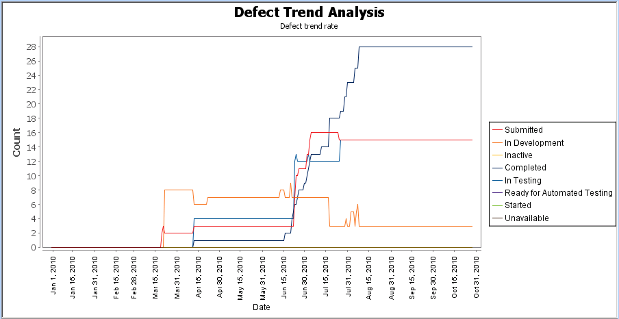
Start Date
|
Date, Jan 1, 2010
|
|
End Date
|
Run Chart Date
|
|
Interval Type
|
Day
|
|
State
|
State
|
|
Values
|
In Review [alias Submitted]
Assigned [alias Submitted]
In Development [alias In Development]
Inactive
Completed [alias Completed]
In Testing [alias In Testing]
Accepted [alias Submitted]
Proposed [alias Submitted]
Ready for Automated Testing
Started
Unavailable
|
|
Include Future Values
|
enabled
|
Field | Value |
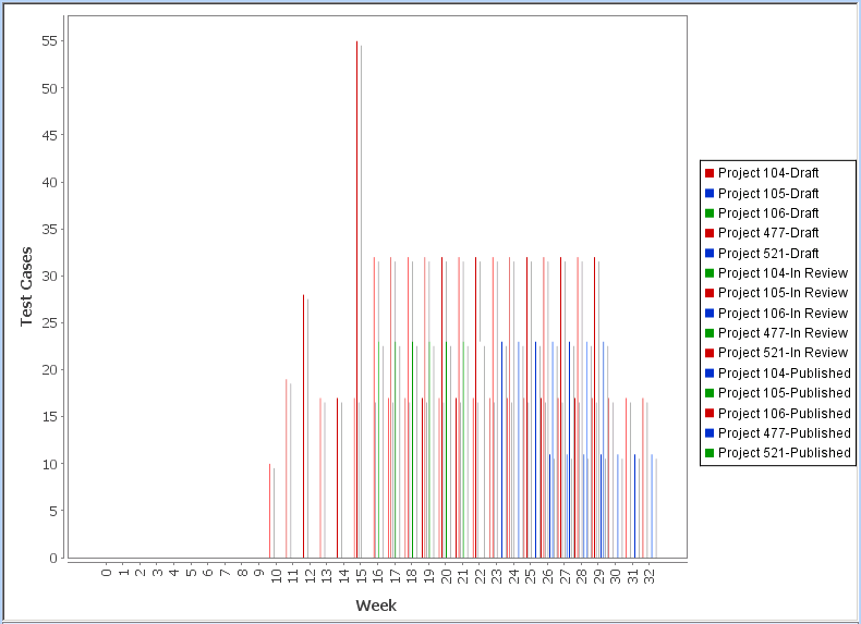
Start Date | Select Item Date Field and then Created Date in the field to the right. |
End Date | Select Calculated Date. |
Interval Type | Select Week. In the field to the right, you specify the interval value. Type52. |
Numeric Field | Expression Label |
Test Case Content Count - Open | Draft |
Test Case Content Count - In Review | In Review |
Test Case Content Count - Published | Published |
Aggregate Expression | Expression Label | Axis Label | Display Pattern |
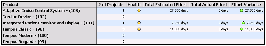
count() | # of Projects | Count | #,### |
max("Product Health Value") | Health | Count | none |
sum("Total Estimated Effort") | Total Estimated Effort | Days | #,##0 days |
sum("Total Actual Effort") | Total Actual Effort | Days | #,##0 days |
sum("Total Estimated Effort")-sum("Total Actual Effort") | Effort Variance | Days | #,##0 days |
Label | From | To | Icon | Text Style | Display Format |
Green | -1.0 | -1.0 | green circle image | Plain | Icon |
Yellow | 0.0 | 0.0 | yellow circle image | Plain | Icon |
Red | 1.0 | 1.0 | red circle image | Plain | Icon |
Label | From | To | Icon | Text Style | Display Format |
Red | -Infinity | 0.0 | red circle image | Plain | Icon & Value |
Yellow | 1.0 | 10.0 | yellow circle image | Plain | Icon & Value |
Green | 11.0 | Infinity | green circle image | Plain | Icon & Value |
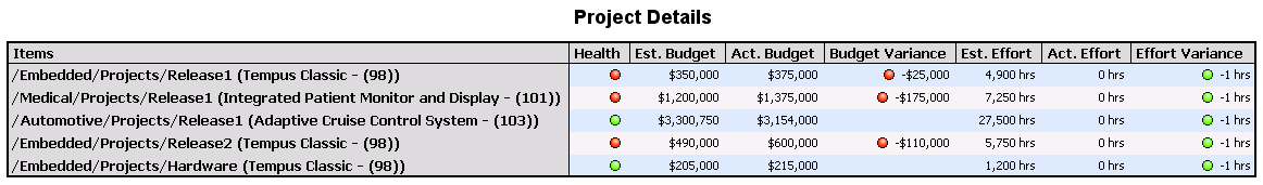
Field Name/Expression | Expression Label | Display Pattern |
“Health Value” | Health | |
“Estimated Budget” | Est. Budget | $#,### |
“Actual Budget” | Act. Budget | $#,### |
“Budget Variance” | Budget Variance | $#,### |
“Estimated Effort” | Est. Effort | #,###.#hrs |
“Actual Effort” | Act. Effort | #,###.#hrs |
“Effort Variance” | Effort Variance | #,###.#hrs |
Label | From | To | Icon | Text Style | Display Format |
Green | -1.0 | -1.0 | green circle image | Plain | Icon |
Yellow | 0.0 | 0.0 | yellow circle image | Plain | Icon |
Red | 1.0 | 1.0 | red circle image | Plain | Icon |
Label | From | To | Icon | Text Style | Display Format |
Red | -9.99999999E8 | -100001.0 | red circle image | Plain | Icon & Value |
Yellow | -10000.0 | 10.0 | yellow circle image | Plain | Icon & Value |
Green | 10000.0 | 9.99999999E8 | green circle image | Plain | Icon & Value |
Label | From | To | Icon | Text Style | Display Format |
Red | 0.15000000000001 | 9999.0 | red circle image | Plain | Icon & Value |
Yellow | 1.0E-13 | 0.15 | yellow circle image | Plain | Icon & Value |
Green | -9999.0 | 0.0 | green circle image | Plain | Icon & Value |