To specify a graph for a chart
1. In the Create Chart dialog box, click the Graph tab. The Graph panel displays.
2. Select the
Graph Style to use for the chart. The graph styles you can select vary depending on what type of chart you are creating and the chart options you specify. For detailed information on the available graph styles, see
“Chart Dialog Box: Graph Tab”.
3. To change the default color used to outline the data on the chart, click
Edit next to the
Data Outline Color field. The
Select Color dialog box displays. For detailed information, see
“Select Color Dialog Box”.
4. Select a predefined color, or define a custom color for use in the chart.
5. To change the default color used for the chart background, click Edit next to the Background Color field. The Select Color dialog box displays.
6. To use custom colors for the chart data, select Use Custom Data Colors and click Add. The Select Color dialog box displays.
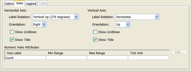
7. Click the Axes tab. The Axes panel displays.
|
|
If you choose a pie graph, the Axes tab is unavailable.
|
8. Horizontal and vertical axes are defined by the chart type or number of expressions included in the chart; however, you can edit the axes attributes. If you are creating a chart that uses numeric fields, you can also define numeric axes attributes.
| • If you specify one set of numeric axes attributes (minimum range, maximum range, and tick unit), these attributes are specified for the X and Y axes. For XY (scatter) charts, you should not set individual numeric axes attributes for the X and Y axes. • For bubble charts, you should not specify numeric axes attributes because they override the calculated values provided by the underlying expression and users have to zoom in/out to properly view chart values. |
9. Click the Legend tab. The Legend panel displays.