To create a trend chart
1. Select one of the following:
◦ >
◦ > >
The Create Chart dialog box displays the General panel.
2. For Chart Type list, select Trend.
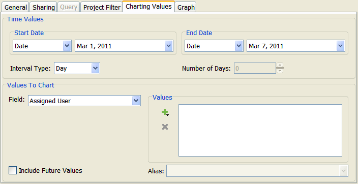
4. Click the Charting Values tab.
Under Time Values, specify a date range for the chart data. Based on the Start Date and End Date values you select, additional lists and fields become available.
The following table contains possible Start Date and End Date values:
Value | Description |
Date | Specifies an exact date, selected from the calendar field. The default is the current system date. Specifying the date is useful for creating temporary charts with an exact date range. | For the end date, selecting a date in the future uses the run date as the end date. |
|
Calculated Date | Specifies a generic date range that is calculated by an interval type and number of intervals. (See instructions proceeding this table.) Use calculated dates for frequently used charts, such as charting the weekly defect count. You can set the generic date range once, eliminating the need to manually change it each interval. |
Run Chart Date | Specifies the chart’s run date as the end date. This value is available only for End Date. |
The following table shows valid Start Date and End Date combinations:
Start Date | End Date |
Date | Date |
Date | Calculated Date |
Date | Run Chart Date |
Calculated Date | Date |
Calculated Date | Run Chart Date |
5. For Interval Type, select the interval type to use for summarizing chart data list. Possible values are: Hour, Day, Week, Month, Quarter, and Year. For example, if you select Week, the line graph generated for the chart contains a point on the graph for each week.
When using a calculated date for either the start or end date, you need to specify a value for the interval to generate that calculated date.
6. To specify a value for the interval, enter it in the field to the right. For example, if you specify 5 and the Interval Type is set to Week, a line graph chart displays data during a five-week period.
The chart’s calculated end (or start) date is determined by the product of the interval type and the specified value. For example, setting a start date of 24-Apr-2010 with an interval of 5 weeks, generates an end date of 29-May-2010.
7. Under Values To Chart, click the Field list and select the field on which you want to report. For example, if you select Type, chart data is based on the value in the item Type field. The list of field values changes to display the available values for the field you select.
8. Under Values, select the field values to chart.
| Created By and Modified By fields are not valid for trend charts and do not display in the list of fields. |
9. If you want the field value to display in the chart with a different name, select a field value in the Values list. Then, type or select the new name in the Alias field. If you want multiple field values to display on the chart combined under one name, select the field values in the Values list. Then, select or type a name in the Alias field. For example, assume that you are reporting on the following item types: Docs, Feature Request, and Defect. Also assume that you have assigned an alias of Development to both Feature Request and Defect field values. The data for these items types is combined in the chart under Development.
10. To include automatically in the chart any new values that are defined for the field in the future, select Include Future Values.
12. To finish and save your chart, click OK.