To create a distribution chart
1. Select one of the following:
◦ >
◦ > >
The Create Chart dialog box displays the General panel.
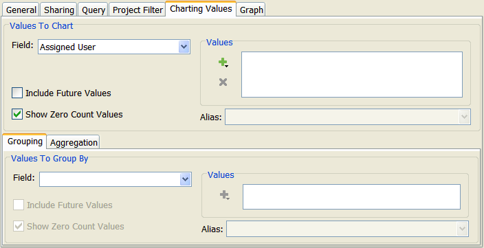
3. Click the Charting Values tab. The Charting Values panel displays.
4. Under Values to Chart, click the Field list and select the field you want to report on. For example, if you select Type, chart data is based on one or more values in the Type field.
5. Under Values, select the field value(s) to chart.
6. If you want the field value to display in the chart with a different name, select a field value in the Values list, then type or select the new name in the Alias field. If you want multiple field values to display on the chart combined under one name, select the field values in the Values list, then select or type a name in the Alias field. For example, if you are reporting on Docs, FeatureRequest, and Defect item types, and you assign an alias of Development to both FeatureRequest and Defect field values, the data for these items types is combined in the chart under Development.
7. To include in the chart automatically any new values that are defined for the field in the future, select Include Future Values.
8. If you do not want to include field values in the chart if there are no items with that value, deselect Show Zero Count Values.
| • To hide zero count values in a distribution pie chart, all values for the field being charted must equal zero. For example, if you are charting the Type and State fields and the Defect type has zero items in the Submit state and the Feature type has 10 items in the Submit state, the Defect type displays a value of 0 in the chart. • If more than one chart is produced by a single chart definition (through the use of grouping values), to hide zero count values, the total values for the field being charted must equal zero across all charts. |
9. In the Grouping tab under the Values to Group By, click the Field list and select a field to break down the data in the chart. For example, if you select State as your grouping field, a bar graph is broken down into separate bars based on the value in the State field; however, a stacked bar graph is broken down into groups of bars by state. The list of field values changes to display the available values for the field you select.
| Once you specify grouping values, a check mark displays on the Grouping tab. This allows you to see that the chart contains grouping values without having to click the tab. |
10. Under Values, select the field value(s) to group. For example, if you are charting the Type field and you select FeatureRequest and Defect, the chart only shows data for items that have either of these values in the Type field.
11. Specify an alias for a field value in the Values list.
12. To break down the chart data automatically for any new values that are defined for the grouping field in the future, select Include Future Values.
13. If you do not want to include a breakdown in the chart for grouping field values, if there are no items with that value, deselect Show Zero Count Values.
14. To perform an aggregate computation against a numeric field included in the chart and display the result in the chart, click the Aggregation tab. Aggregate computations allow you to add numeric field values, calculate the average of multiple numeric field values, retrieve the smallest or largest numeric field value in a group of items, or count the number of items returned by an existing query. The Aggregation panel displays the aggregate expression count() by default. This expression returns the number of items in the specified query. Once you create another expression, you can delete the count() expression; however, a distribution chart must have at least one aggregate computation.
If there are multiple aggregate expressions in the Aggregation panel, you can change the order of an aggregate expression by selecting it and clicking Move Up or Move Down.
To remove an aggregate expression from the chart, select it, and click Remove.
| If there is only one aggregate expression, Remove is unavailable. |
17. To finish and save your chart, click OK.