SectionHeading 내 속성 표시 사용자 정의
SectionHeading 태그를 사용자 정의하여 속성 표시를 제어할 수 있습니다. 이 단원에서는 다음 항목에 대해 설명합니다.
• 속성 그룹 표시 사용자 정의
• 표시 그룹 확장/축소
• 표시할 열 수 사용자 정의
속성 그룹 표시 사용자 정의
SectionHeading 요소에는 속성 그룹의 세부내용을 편집하는 데 사용할 수 있는 절이 있습니다. 이 절을 사용하면 디스플레이의 패널(예: 부품 작성 마법사, 기존 부품 삽입 마법사 또는 정보 탭)에서 특정 속성을 숨기거나 표시할 수 있습니다.
다음 샘플 코드에서는 하위 삽입 마법사에 사용되는 CreateChildPartTab2 속성 그룹의 SectionHeading 요소에 "allowAttrDetails=true" 절이 추가되었습니다.
샘플 코드:
<AttributeGroup id="ptc.wnc.exp.CreateChildPartTab2"
scrollable="true" displayMode="edit">
<SectionHeading allowAttrDetails="true">
<Label>
<Resource key="Properties Top"/>
</Label>
</SectionHeading>
<CellDefinition id="name">
<AttributeDefinition attributeId="name"/>
</CellDefinition>
<CellDefinition id="number">
<AttributeDefinition attributeId="number"
rendererClass="com.ptc.windchill.explorer.structureexplorer.render
er.component.PartNumberComponent"/>
</CellDefinition>
<SectionHeading allowAttrDetails="true">
<Label>
<Resource key="Properties 1"/>
</Label>
</SectionHeading>
<CellDefinition id="view">
<AttributeDefinition attributeId="view"
rendererClass="com.ptc.windchill.explorer.structureexplorer.render
er.component.ViewComponent"/>
</CellDefinition>
<CellDefinition id="folder">
<AttributeDefinition attributeId="folder"
rendererClass="com.ptc.windchill.explorer.structureexplorer.render
er.component.DefaultcontextFolderBrowserComponent"/>
</CellDefinition>
<CellDefinition id="source">
<AttributeDefinition attributeId="source"/>
</CellDefinition>
<CellDefinition id="partType">
<AttributeDefinition attributeId="partType"/>
</CellDefinition>
<SectionHeading allowAttrDetails="true">
<Label>
<Resource key="Properties 2"/>
</Label>
</SectionHeading>
<CellDefinition id="usedQuantityAmount">
<AttributeDefinition attributeId="usedQuantityAmount"/>
</CellDefinition>
<CellDefinition id="usedQuantityUnit">
<AttributeDefinition attributeId="usedQuantityUnit"/>
</CellDefinition>
<CellDefinition id="usedTraceCode">
<AttributeDefinition attributeId="usedTraceCode"/>
</CellDefinition>
<CellDefinition id="effPropagationStop">
<AttributeDefinition attributeId="effPropagationStop"/>
</CellDefinition>
<CellDefinition id="jobAuthorizationNumber">
<AttributeDefinition
attributeId="jobAuthorizationNumber"/>
<EnabledDependency inverted="false">
<Assembly assembly="wadm"/>
</EnabledDependency>
</CellDefinition>
<CellDefinition id="contractNumber">
<AttributeDefinition attributeId="contractNumber"/>
<EnabledDependency inverted="false">
<Assembly assembly="wadm"/>
</EnabledDependency>
</CellDefinition>
<CellDefinition id="phase">
<AttributeDefinition attributeId="phase"/>
<EnabledDependency inverted="false">
<Assembly assembly="wadm"/>
</EnabledDependency>
</CellDefinition>
</AttributeGroup>
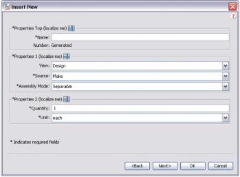
"allowAttrDetails=true" 절을 추가하면 UI에 다음 출력이 생성됩니다.
• SectionHeading을 추가하면 SectionHeading 다음에 나오는 속성 그룹 주위에 상자가 작성됩니다.
• SectionHeading의 Label 절은 상자에 텍스트를 제공합니다.
• allowAttrDetails="true" 절은 레이블 뒤에 세부내용 아이콘이 표시되도록 하고 패널에 대한 팝업 메뉴가 나타나도록 합니다.
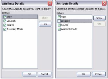
다음은 레이블 뒤의 세부내용 아이콘을 클릭하면 표시되는 세부내용 대화 상자입니다. 사용자는 개별 속성을 숨기거나 표시할 수 있지만 속성의 순서는 변경할 수는 없습니다.
예를 들어, Properties 1 섹션에서 Location 속성을 숨기도록 선택할 수 있습니다. 그러면 이 설정이 해당 사용자의 기본 설정으로 저장되고 다음에 사용자가 PSE를 로드할 때 동일하게 유지됩니다.
표시 그룹 확장/축소
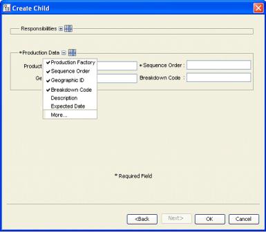
마법사의 단계나 탭에 여러 그룹이 표시되는 경우 프레임의 컨텐트가 스크롤될 수 있습니다. 최소한의 속성만 입력하려는 경우에는 불편할 수 있습니다. 제목을 사용자 정의하여 표시되는 속성 세트를 사용자가 확장/축소하도록 설정할 수 있습니다. 이 설정은 세션 간에 유지됩니다.
다음은 UI가 어떻게 나타나는지 보여주는 예입니다. "Responsibilities" 그룹은 축소되어 있으므로 그룹을 확장하는 + 아이콘이 표시됩니다. "Production Data" 그룹은 확장되어 있으므로 그룹을 축소하는 - 아이콘이 표시됩니다.
샘플 코드:
<AttributeGroup id="ptc.wnc.exp.CreateChild" displayMode="edit">
<SectionHeading id="ptc.wnc.exp.CreateChild.Responsibilities"
allowAttrDetails="true" allowCollapsable="true">
<Label>
<Resource key="responsibilitiesSectionLabel"/>
</Label>
</SectionHeading>
… cell definitions for the group here…
</AttributeGroup>
표시할 열 수 사용자 정의
SectionHeading 태그 내에 표시할 열 수를 사용자 정의할 수 있습니다. 다음 예와 같은 레이아웃을 작성할 수 있습니다.
속성 그룹 앞에 SectionHeading을 지정하면 <Label> 태그로 지정된 제목이 있는 테두리 안에 속성이 표시됩니다. <Label> 태그에 대한 자세한 내용은 속성 그룹의 표시 사용자 정의를 참조하십시오.
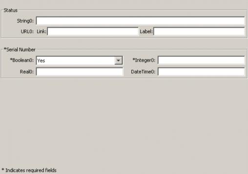
numberOfColumns를 "1"로 설정하면 단일 속성 열이 표시되고 "2"로 설정하면 두 개의 속성 열이 표시됩니다.
위의 스크린샷 예에서 URL0:은 두 개의 입력 필드를 포함하는 단일 속성입니다. 섹션의 속성이 필수 속성인 경우 테두리의 레이블도 필수로 표시됩니다.
샘플 코드:
<AttributeGroup id="ptc.wnc.exp.CreatePartTab4"
scrollable="true" displayMode="edit">
<SectionHeading numberOfColumns="1">
<Label>
<Resource key="checkoutInfoStateLabel"/>
</Label>
</SectionHeading>
<CellDefinition id="String0">
<AttributeDefinition attributeId="IBA|String0"/>
</CellDefinition>
<CellDefinition id="URL0">
<AttributeDefinition attributeId="IBA|URL0"/>
</CellDefinition>
<SectionHeading numberOfColumns="2">
<Label>
<Resource key="serialNumberValueLabel"/>
</Label>
</SectionHeading>
<CellDefinition id="Boolean0">
<AttributeDefinition attributeId="IBA|Boolean0"
required="true"/>
</CellDefinition>
<CellDefinition id="Integer0">
<AttributeDefinition attributeId="IBA|Integer0"
required="true"/>
</CellDefinition>
<CellDefinition id="Real0">
<AttributeDefinition attributeId="IBA|Real0"/>
</CellDefinition>
<CellDefinition id="DateTime0">
<AttributeDefinition attributeId="IBA|DateTime0"/>
</CellDefinition>
</AttributeGroup>