セクション見出し内の属性表示のカスタマイズ
SectionHeading タグをカスタマイズすることで、属性の表示を制御できます。このセクションは次のトピックで構成されます。
• グループ属性の表示のカスタマイズ
• 表示グループの展開/折りたたみ
• 表示する列数のカスタマイズ
グループ属性の表示のカスタマイズ
SectionHeading エレメントには、属性グループの詳細を編集できる節があります。この節を使用すると、特定の属性を表示パネルから非表示にしたり、表示したりできます。たとえば、「部品を作成」ウィザード、「既存の部品を挿入」ウィザード、「情報」タブなどです。
次のサンプルコードでは、"allowAttrDetails=true" 節が、「既存の部品を挿入」ウィザードで使用される CreateChildPartTab2 属性グループの SectionHeading エレメントに追加されています。
サンプルコード:
<AttributeGroup id="ptc.wnc.exp.CreateChildPartTab2"
scrollable="true" displayMode="edit">
<SectionHeading allowAttrDetails="true">
<Label>
<Resource key="Properties Top"/>
</Label>
</SectionHeading>
<CellDefinition id="name">
<AttributeDefinition attributeId="name"/>
</CellDefinition>
<CellDefinition id="number">
<AttributeDefinition attributeId="number"
rendererClass="com.ptc.windchill.explorer.structureexplorer.render
er.component.PartNumberComponent"/>
</CellDefinition>
<SectionHeading allowAttrDetails="true">
<Label>
<Resource key="Properties 1"/>
</Label>
</SectionHeading>
<CellDefinition id="view">
<AttributeDefinition attributeId="view"
rendererClass="com.ptc.windchill.explorer.structureexplorer.render
er.component.ViewComponent"/>
</CellDefinition>
<CellDefinition id="folder">
<AttributeDefinition attributeId="folder"
rendererClass="com.ptc.windchill.explorer.structureexplorer.render
er.component.DefaultcontextFolderBrowserComponent"/>
</CellDefinition>
<CellDefinition id="source">
<AttributeDefinition attributeId="source"/>
</CellDefinition>
<CellDefinition id="partType">
<AttributeDefinition attributeId="partType"/>
</CellDefinition>
<SectionHeading allowAttrDetails="true">
<Label>
<Resource key="Properties 2"/>
</Label>
</SectionHeading>
<CellDefinition id="usedQuantityAmount">
<AttributeDefinition attributeId="usedQuantityAmount"/>
</CellDefinition>
<CellDefinition id="usedQuantityUnit">
<AttributeDefinition attributeId="usedQuantityUnit"/>
</CellDefinition>
<CellDefinition id="usedTraceCode">
<AttributeDefinition attributeId="usedTraceCode"/>
</CellDefinition>
<CellDefinition id="effPropagationStop">
<AttributeDefinition attributeId="effPropagationStop"/>
</CellDefinition>
<CellDefinition id="jobAuthorizationNumber">
<AttributeDefinition
attributeId="jobAuthorizationNumber"/>
<EnabledDependency inverted="false">
<Assembly assembly="wadm"/>
</EnabledDependency>
</CellDefinition>
<CellDefinition id="contractNumber">
<AttributeDefinition attributeId="contractNumber"/>
<EnabledDependency inverted="false">
<Assembly assembly="wadm"/>
</EnabledDependency>
</CellDefinition>
<CellDefinition id="phase">
<AttributeDefinition attributeId="phase"/>
<EnabledDependency inverted="false">
<Assembly assembly="wadm"/>
</EnabledDependency>
</CellDefinition>
</AttributeGroup>
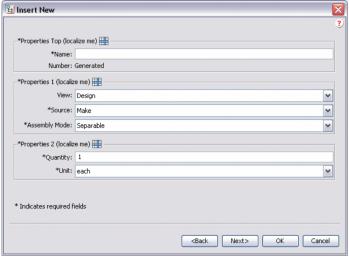
"allowAttrDetails=true" 節を追加すると、UI に以下が出力されます。
• SectionHeading を追加すると、SectionHeading に後続する属性グループの周囲にボックスが作成されます。
• SectionHeading の Label 節によってボックスのテキストが得られます。
• allowAttrDetails="true" 節は、ラベルの後の「詳細」アイコンの表示とパネルのポップアップメニューを有効にします。
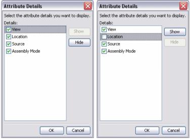
これは、ラベルの後の「詳細」アイコンをクリックすると表示される「詳細」ダイアログです。ユーザーは個別に属性を非表示または表示に変更できますが、属性の順序を変更することはできません。
たとえば、ユーザーは Properties 1 セクション内の Location 属性を非表示にすることができます。これはユーザーのプリファレンスとして保存されるようになったので、そのユーザーが次回 PSE をロードしたときも設定が維持されます。
表示グループの展開/折りたたみ
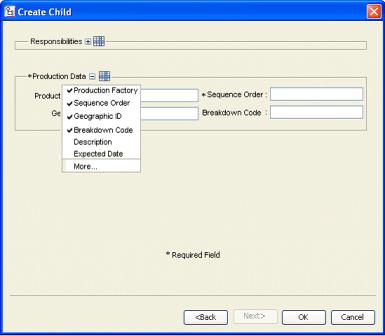
タブまたはウィザードのステップに複数のグループが表示されている場合に、フレームのコンテンツのスクロールが必要になることがあります。これは、特に最小限の属性を入力するだけのユーザーにはわずらわしいことです。そのような場合は、タイトルをカスタマイズし、ユーザーが表示される属性セットの展開/折りたたみができるようにすることができます。この設定は、セッションが変わっても維持されます。
表示される UI の例は次のとおりです。"Responsibilities" グループは折りたたまれ、展開するための + アイコンを使用できます。"Production Data" グループは展開され、折りたたむための - アイコンを使用できます。
サンプルコード:
<AttributeGroup id="ptc.wnc.exp.CreateChild" displayMode="edit">
<SectionHeading id="ptc.wnc.exp.CreateChild.Responsibilities"
allowAttrDetails="true" allowCollapsable="true">
<Label>
<Resource key="responsibilitiesSectionLabel"/>
</Label>
</SectionHeading>
… cell definitions for the group here…
</AttributeGroup>
表示する列数のカスタマイズ
SectionHeading タグ内に表示する列の数をカスタマイズできます。次の例のようにレイアウトを作成できます。
属性グループの前の SectionHeading を指定すると、それらの属性が <Label> タグで指定されたタイトルの付いたボーダーで囲まれます。<Label> タグの詳細については、グループ属性の表示のカスタマイズを参照してください。
numberOfColumns が "1" に設定されていれば、単一の属性列が表示されます。"2" に設定されていれば、2 つの属性列が表示されます。
上の図の例では、URL0: 2 つの入力フィールドを持つが単一属性です。セクション内のいずれかの属性が必須の場合は、ボーダー上のラベルにも必須とマークされます。
サンプルコード:
<AttributeGroup id="ptc.wnc.exp.CreatePartTab4"
scrollable="true" displayMode="edit">
<SectionHeading numberOfColumns="1">
<Label>
<Resource key="checkoutInfoStateLabel"/>
</Label>
</SectionHeading>
<CellDefinition id="String0">
<AttributeDefinition attributeId="IBA|String0"/>
</CellDefinition>
<CellDefinition id="URL0">
<AttributeDefinition attributeId="IBA|URL0"/>
</CellDefinition>
<SectionHeading numberOfColumns="2">
<Label>
<Resource key="serialNumberValueLabel"/>
</Label>
</SectionHeading>
<CellDefinition id="Boolean0">
<AttributeDefinition attributeId="IBA|Boolean0"
required="true"/>
</CellDefinition>
<CellDefinition id="Integer0">
<AttributeDefinition attributeId="IBA|Integer0"
required="true"/>
</CellDefinition>
<CellDefinition id="Real0">
<AttributeDefinition attributeId="IBA|Real0"/>
</CellDefinition>
<CellDefinition id="DateTime0">
<AttributeDefinition attributeId="IBA|DateTime0"/>
</CellDefinition>
</AttributeGroup>