Constructing and Rendering a Table Using the JSP Framework
Objective
You want to present the information in a tabular format and optionally execute actions on the presented data.
Background
The table common component presents information in a tabular format to help users scan, locate, compare, and take actions on related data. Users may control how to view data in the table using sorting and views.
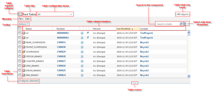
The following tables details the specific elements within a table.
|
Element
|
Description
|
|---|---|
|
Title Bar
|
The title bar area tells users what information is displayed in the table. The table title bar is located at the top of the table and may contain: a table title, an object count, the Current View pulldown list, and several action icons - Help etc.
|
|
Menu Bar
|
Tables with many actions will display a menu bar. Each menu title provides a pulldown list of actions.
|
|
Shortcut Tool Bar
|
The shortcut tool bar displays a subset of actions from the menu bar. These are actions that are frequently used. The shortcut tool bar may be used without the menu bar when a table contains few actions.
|
|
Column Header/Sorting
|
Sorting allows the user to control the presentation of table data.
|
|
Selection
|
The checkbox column allows users to select and deselect objects within the table that they wish to perform an action upon. A user can also select the rows across the multiple pages and perform the desired actions on the same.
|
|
Status Glyph Columns
|
The status glyph column(s) convey status and messaging information about individual objects in the table.
|
|
Object Icon Column
|
The object icon column displays the appropriate icon for that object.
|
|
Action Column(s)
|
The action columns in the content area of a table contain the row-level actions for specific objects in a table.
|
|
Data Rows
|
The data rows of a table contain attributes for a given object in the table. This section covers table scroll bars.
|
|
Footer
|
The table footer is located at the bottom of the table. It provides visual closure to the table and contains the paging and View All functionality, if used.
|
Scope/Applicability/Assumptions
Table common component should be used when there is a requirement to display Windchill business objects in tabular form and not just for displaying the HTML Table.
Intended Outcome
Depending upon the configuration, Table can be displayed in different formats. Following is a general layout of a Table:

Parent topic