
 displays in the toolbar of the layout definition pane.
Edit the layout element information for the attribute group. | Edit the layout element information for the attribute group by adding or modifying the Group Display Name and Group Description. These fields are both optional. The Group Display Name, if specified, displays in the user interface for the screen types where the attribute layout is used. Ensure that the value entered for the Group Display Name provides a meaningful label for the group in the end-user user interface. If the attribute group is inherited, the inheritance icon displays next to the Group Display Name field. The Group Display Name and Group Description can be changed on inherited attribute groups on an inherited attribute layout.Edit the class name in the Background CSS Class field to add or change the class from an existing custom cascading style sheet stored as a CSS file in the codebase. This field enables administrators to specify a custom cascading style sheet class when rendering a layout element in the end-user user interface. A different class can be specified for each layout element in an attribute layout. If this field is left blank, the system uses the default style sheet in PTC FlexPLM for that layout element. Edit the value of the Background CSS Class field to specify a unique string value to be used as the class attribute value on the HTML div element that acts as the visual container for the attribute group on the rendered page in the user interface. By overriding the default value of the class attribute, the administrator is able to override the CSS style rule that is applied to the attribute group. To complete the override and apply a different style to the attribute group, the administrator must use CSS class selector notation to assign a custom style rule for any HTML element whose class is the value specified in the Background CSS Class field. The new rule should be defined in the main.css style sheet. For example, if you specify a value of yellowGroup for the Background CSS Class field, the HTML renders as: <div class="yellowGroup">[attribute group content here]</div> The rule to be defined in the main.css file is: .yellowGroup { background-color: #ffff9a; }
| ||||
Make the attribute group the default group for the layout. | If you want new attributes created on the type to be automatically added to this attribute group, select the Make default group checkbox in the layout element information pane. Having a default group designated on an attribute layout is optional. There can be only one default group designated on an attribute layout.
| ||||
Add attributes to, reorder attributes within, or remove attributes from the attribute group. | Add attributes to the attribute group as needed. From the Available Attributes list, drag-and-drop individual attributes into the central attribute group display pane. When you hover over an available location with your mouse, an Add attribute to this group prompt appears. 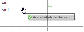 Once an attribute is used in an attribute group, it is no longer available for use in any other attribute group in the same attribute layout.
Reorder the attributes within the attribute group. To arrange the attributes in the order you would like them to appear. drag-and-drop the attribute to the appropriate location in the table. When you hover over an available location with your mouse, a Reorder attribute prompt appears. 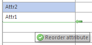
To remove an attribute from the attribute group, drag-and-drop the attribute back to the Available Attributes list. Attributes can be moved to a different attribute group in the same attribute layout using drag-and-drop. If the attribute layout is inherited from a parent type, only attributes created on the subtype are included in the Available Attributes list, and can be added or removed from the attribute group pane. Inherited attributes in an attribute group are identified with the inheritance icon . Inherited attributes cannot be removed from the group or moved to a new group, but can be reordered within the group using drag-and-drop if the display style for the attribute group is Organized in Grid. | ||||
Set the display style for the attribute group. | Select the desired display style for the group: • Organized in Grid  —Attributes can be organized in multiple columns, in any order. New columns can be added to inherited groups that have a display style of organized in grid. —Attributes can be organized in multiple columns, in any order. New columns can be added to inherited groups that have a display style of organized in grid.PTC FlexPLM types other than reusable types have a maximum of two layout columns. Reusable Table types have one layout column.
| ||||
Arranging attributes in the Organized in Grid display style | When using the Organized in Grid display style, you can further arrange the display of the attributes: • Attributes can be positioned in any open cell in the grid. Drag-and-drop an attribute from cell to cell until it is in the desired location. Blank cells can be left in the grid.
|