Product Inspector 301: Build the Property Popup
Prerequisites
Before you begin this section, make sure you have completed Product Inspector 201: Build the Part Finder.
At this point, metadata associated with the selected component is being loaded and rendered within the 2D user interface. Visual indicators highlight the currently selected item to enhance user orientation. To enable deeper inspection of the model hierarchy, you’ll integrate a property panel that dynamically displays extended metadata for the selected sub-assembly.
1. Define the following CSS for a left-side popup in > :
.left-side-popup {
  position: fixed;
  left: 0px !important;
  top: 50%;
  -ms-transform: translateY(-50%);
  transform: translateY(-50%);
  border-radius: 0px 5px 5px 0px;
  background-color: $PTC-dark-grey;
  opacity: 90%;
}
2. Navigate to the 2D canvas of the Visualization view.
3. Add a Popup widget to the canvas, and configure the following properties:
◦ Class—enter left-side-popup
◦ Studio ID—enter propertyPopup
4. Next, add a Grid Layout widget to the Popup widget.
5. With the Grid Layout widget selected, enter 10px in the Margin field in the DETAILS pane.
6. Select the column under the new popup in the project tree to display its DETAILS pane. Click Add Column under GRID ACTIONS.
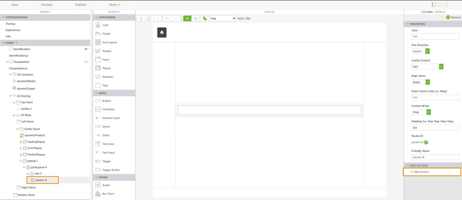
7. Select the left column, and configure the following properties:
◦ Flex Direction—select Row
◦ Justify Content—select Start
◦ Align Items—select Center
8. Add a Label to the left column, and configure the following properties:
◦ Text—enter Part Details
◦ Class—enter simple-label title-label
◦ Padding (i.e. 10px 10px 20px 10px)—enter 0px 0px 10px 0px
◦ Studio ID—enter partDetailsTitleLabel
9. Select the right column, and configure the following properties:
◦ Flex Direction—select Row
◦ Justify Content—select End
◦ Align Items—select Center
10. Add a Button to the right column, and configure the following properties:
◦ Text—enter Part Details
◦ Class—enter simple-label title-label
◦ Padding (i.e. 10px 10px 20px 10px)—enter 0px 0px 10px 0px
◦ Studio ID—enter closePartDetailsButton
11. Drag and drop the Click event of the closePartDetailsButton onto propertyPopup in the project tree. Select Hide Popup on the Select Binding Target window, and click Bind.
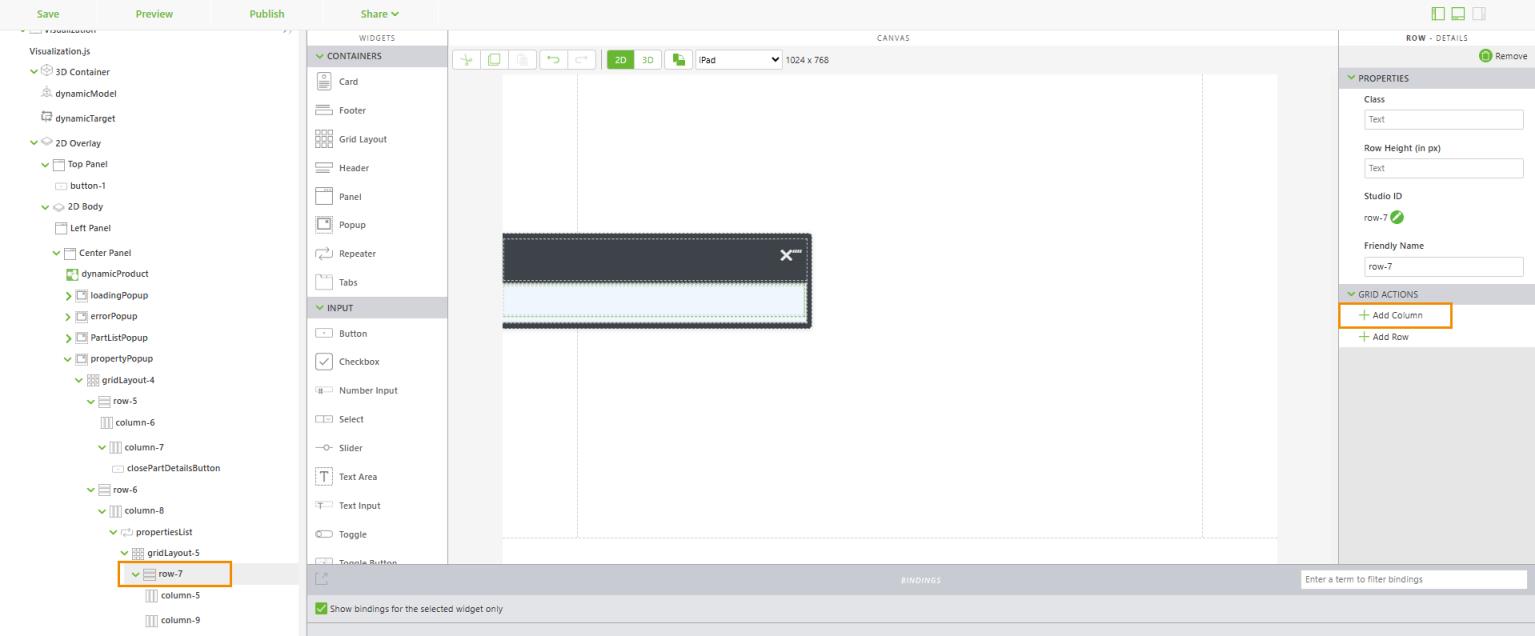
12. Select row under propertyPopup in the project tree. Click Add Row in the DETAILS pane under GRID ACTIONS.
13. Add a Repeater widget to the new row (second row). Enter propertiesList for Studio ID.
14. Add a Grid Layout widget to the Repeater.
15. Select row under propertiesList in the project tree. Click Add Row in the DETAILS pane under GRID ACTIONS
.
16. Add a Label to the left column, and configure the following properties:
◦ Text—enter {{item.name}}
◦ Class—enter simple-label simple-label--green
◦ Padding (i.e. 10px 10px 20px 10px)—enter 0px 0px 10px 0px
◦ Studio ID—enter itemNameLabel
17. Now, add a Label to the right column, and configure the following properties:
◦ Text—enter {{item.name}}
◦ Class—enter simple-label
◦ Padding (i.e. 10px 10px 20px 10px)—enter 0px 0px 10px 0px
◦ Studio ID—enter itemValueLabel
18. Define the following additional CSS in > :
.simple-label--green {
  color: $PTC-neon-green;
  font-weight: 600;
}
19. Congratulations—you’ve completed this use case! Next, check out Use Case: View Meaningful Model Data with a Product Explorer.