Value Display
What Does This Widget Do?
The Value Display widget is designed to take a simple data value and display it with context on the experience.
When Should I Use This Widget?
Use a Value Display when you want to include a simple property value from ThingWorx in an experience. For example, if a service technician is performing maintenance on a generator and you want to display the power status of the generator in the experience, you could use a Value Display widget and bind the PowerStatus property of the generator to the Value Display widget as Data.
Are There Any Special Properties, Services, Events, or Actions?
To view a list of common widget properties, services, and events, see Common Widget Properties, Services, and Events.
The following table is a list of properties that are specific to this widget.
|
Property
|
JavaScript
|
Type
|
Description
|
||
|---|---|---|---|---|---|
|
Enable State-Based Formatting
|
enableStateFormatting
|
boolean
|
Allows you to format the widget based on state definitions that have been defined in ThingWorx.
If the checkbox is selected the following properties appear:
• Dependent Field
• State Definition
For example, if a label has a State Definition value of error, the label turns red.
For more information about style and state definitions in ThingWorx, see Style and State Definitions in the ThingWorx Help Center.
|
||
|
Dependent Field
|
stateFormatValue
|
string
|
This property is visible if the Enable State-Based Formatting checkbox is selected. For more information about style and state definitions in ThingWorx, see Style and State Definitions in the ThingWorx Help Center.
|
||
|
State Definition
|
stateFormat
|
boolean
|
This property is visible if the Enable State-Based Formatting checkbox is selected. For more information about style and state definitions in ThingWorx, see Style and State Definitions in the ThingWorx Help Center.
|
||
|
Type
|
type
|
Type
|
Select one of the following:
• Inline—displays only the value and not the label
• Inline With Label—displays the value and the label
• Stacked Label—aligns the value and the label vertically
• Stacked Label KPI—aligns the value and the label vertically; a link to the widget can be provided using CSS styling
|
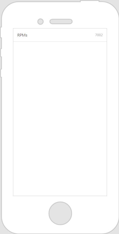
The Widget in Action
Here’s an example of what your widget might look like!
|
Minimum Steps Required for Use
|
What It Looks Like
|
|---|---|
|
1. Drag and drop a Value Display widget onto the canvas.
2. Enter the text you want displayed in the Label field. For this example, we’ve labeled this value display RPMs.
3. From the Data pane, search for the entity for which you want to add the GetPropertyValues or GetImplementingThingsWithData service to the experience.
4. Once the service has been added, find the property you want to bind to the value display under Current Selected Item and drag and drop it onto the Value Display widget. Select Value on the Select Binding Target window.
|
 |